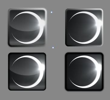
ZK logo. Left has glass, top has glassy borders, while top left and bottom right bleed over their borders.
Which elements do you prefer?
Moderators: MR.D, Moderators
it is not nice, and a logo is a shape, and sometimes a color scheme, look at Electronic Arts' logo, it changes for every game ...Saktoth wrote:Photoshop... tutorials?
Except for the background this is all vector graphics.
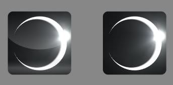
Here is the plain, no border versions:


gotta agree with thisrattle wrote:all terrible
more regrets? trans + rage and selfd :Dscifi wrote:LOL
epic now make that spring main logo and we can atract osama bin ladens folowers into spring