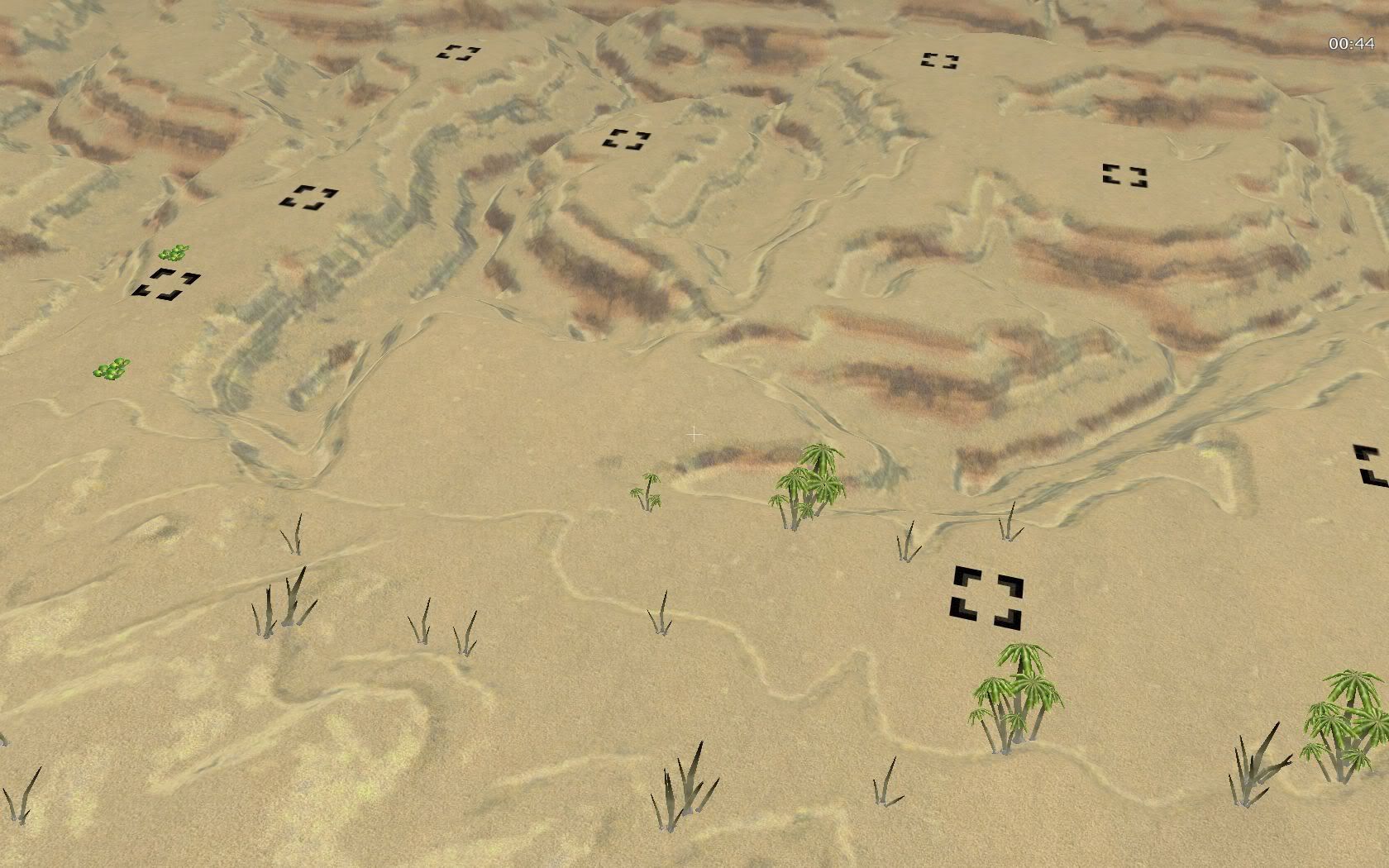
Looked at the full-size. I saw some weird things where the texture looked really pixelated and squared-off in a few spots, I assume that's a L3DT bork, and it needs to be cleaned up by hand.
Main thing I see is what I saw before, it needs items of specific interest, feels like a watercolor, and one that distinctly lacks depth, at that. This is by far your best map texture yet, Neddie, don't get me wrong, but it needs more attention to detail, imo.
I see no areas of drainage, no obvious differences in the rock formations, no clutter in the canyons.
That's pattern-stamp and mask stuff that adds a lot to the feel, easy work, just find a random tiling texture nature / rock / whatever texture of the appropriate resolution, lock in on a given area of heightmap, which is pretty easy when using platform levels like that... pattern-stamp a bit, come back with another one, keep it very subtle each pass, maybe opacity of 10-20% and flow of 50% or less- not a giant, all-out assault of texture. Just hints and bits, adding layers of subtlety. In short, add areas that are different from others visually simply to break things up, create landmarks and areas of real interest. Make it feel like a real place, not just an abstract of a landscape.
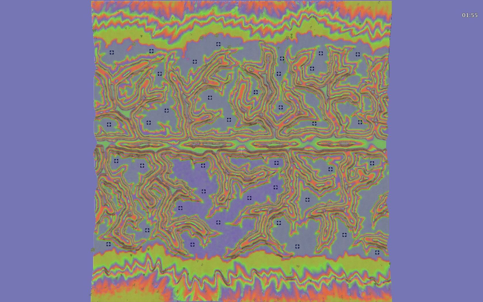
Here, try looking at this stuff.
Anyhow, many apologies if this seemed like more critique than you wanted, I think you're really getting close though, and I'm excited for you