A 320x240 flash video that shows off stillframes with no control over size length period etc, and music that plays at a bad framerte is not as good as proper fullsized images linked via thumbnails where I can pick images I look at how I look at them and for how long.
That videos just too small to make any proper judgements from.
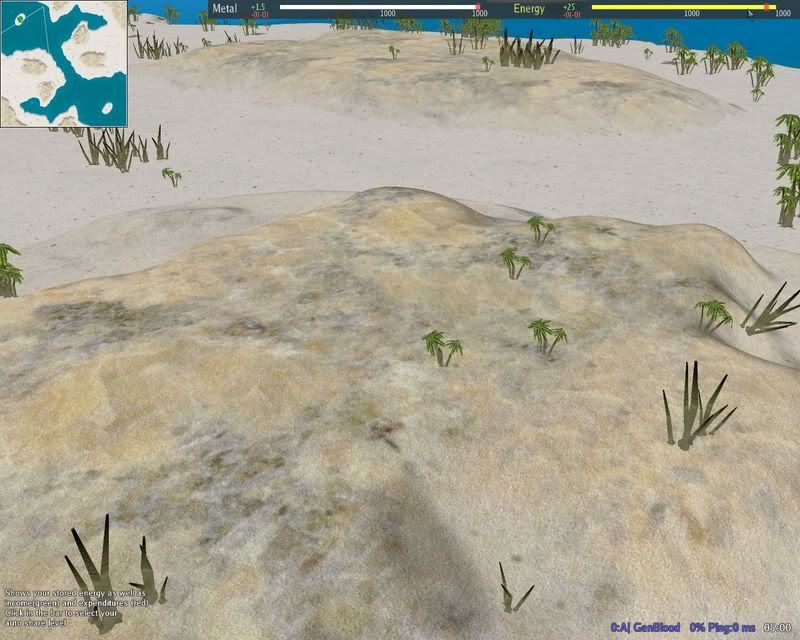
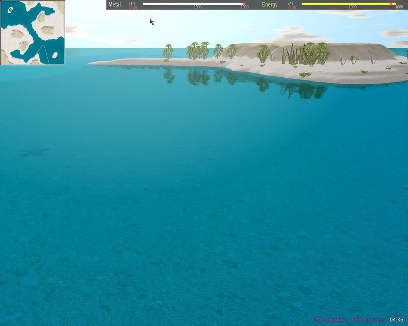
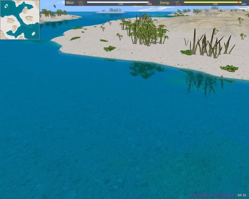
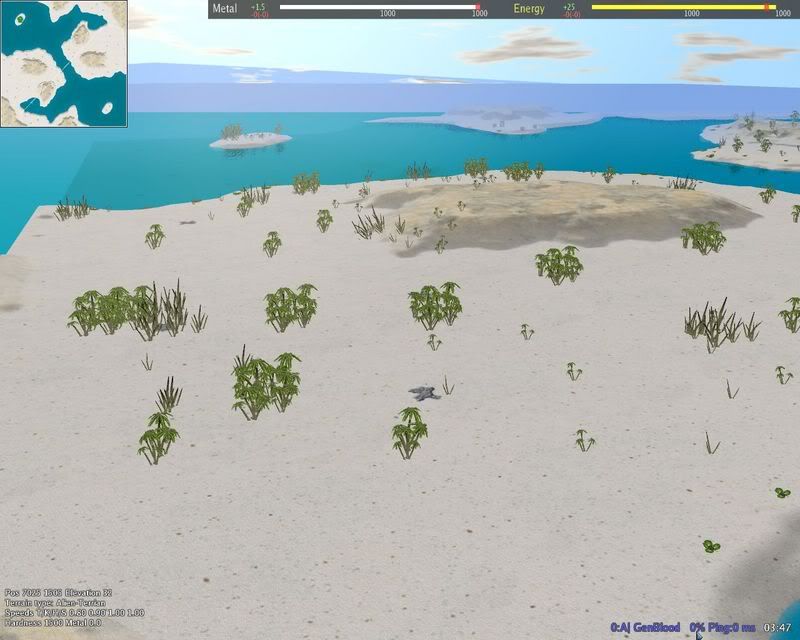
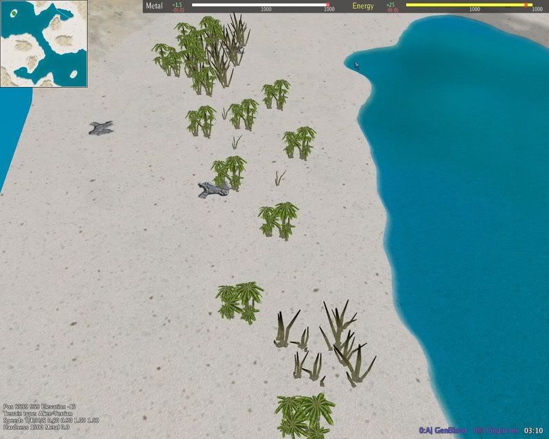
Also with rgards to foliage and trees, try to clumps them mroe together and nearer to the bottom of the slopes on the raised bits on the two land masses, atm it looks like you just quickly moved your mouse in a line while clicking.
Before you modify the map in that screenshot, make a backup.
Uusually you make a good version and then people give feedback, you change it and it gets worse. You've currently reached the good version, back it up, release it as a v1 even, just make sure that whatever you do from now on can be undone.
Yeah, it's amazing to see that, after all those bad maps of your early days, you're now making what is, shockingly, a good map!
- There is some relief, some cliff and tiny mountain range to keep it interesting.
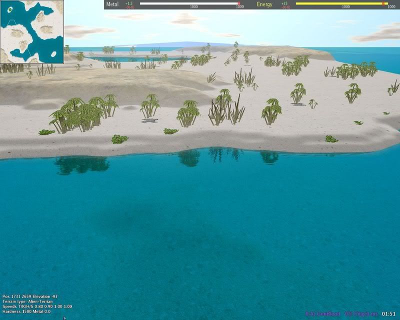
- There is enough flat area and plateau so we can build and move on it.
- I like how the impression of roughness on the plateau is achieved more with the texture than with the heightmap: it makes it looks like it's a hilly plateau, while still keeping that area free to build and move on.
- Symmetrical, so should be balanced for 1v1, 2v2, and whatever team games.
- Doesn't use any Cavedog tiles.
- The layout is reminiscent from the best Cavedog maps, yet isn't copied from any map.
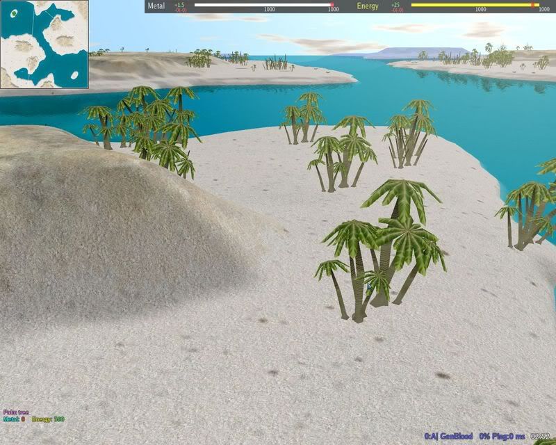
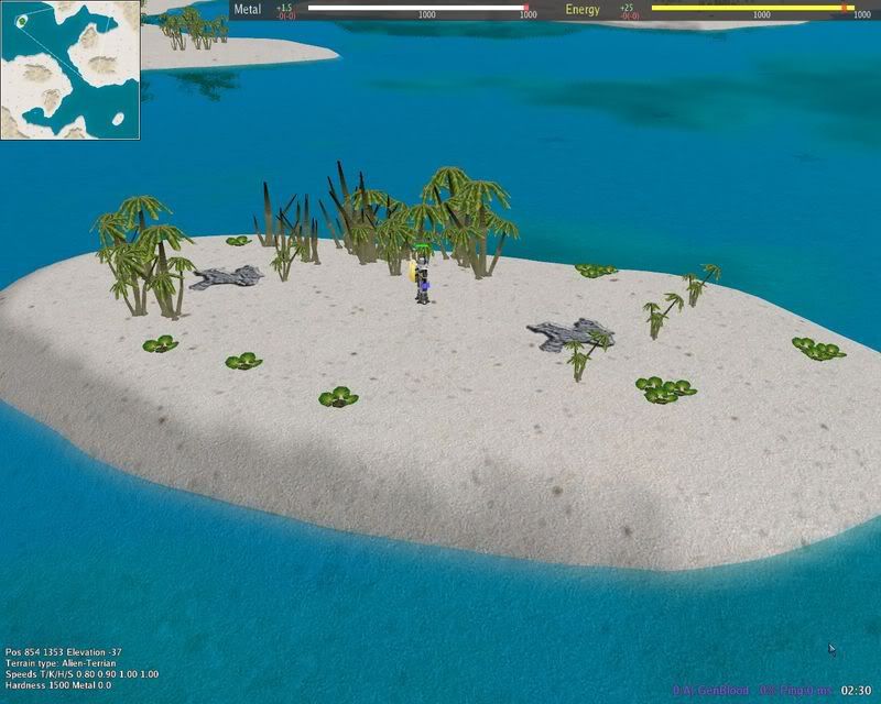
- Good looking features, using enough to liven up the map, but sparingly enough to not detract from actually playing on that map.
- Doesn't try to hard to use special texture that don't fit and make it look patchworky: the sandy yellow-white is simple but effective.
- No hard edge on the heightmap, it's all smooth and natural.
- Still the heightmap is artificial just enough to make it a playable map and not a pretty scenery.


