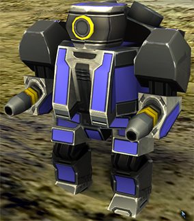
red is a bad idea because it is an area of focus. you have foreground colors, your reds and background colors your blues. You also can use the bar stuff to try and get some kind of colors so your red aura around the pewee would probably need to go. also the the white lines need to go. leaving the color for the font which is in the foreground. The logo would probably need to be simplified. I would brainstorm with behe or other guys on the desired unit as the new peewee doesn't look like that:
One thing you could do is sample each faction and do a half and half yenyang kind of thing being that these factions are from opposite philosophies and use a central color for core and a central color for arm.
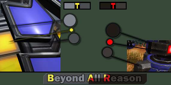
I chose red and yellow based on the lights but that is BAD because colorblind people exist and have become an very loud minority. So in all color usage never do something like yellow = 1,1,0 and red = 1,0,0 because colorblind. Mix it up.
Use a gold instead of yellow.
There are better ways to do this but I am in a hurry and wanted to just get a basic example. I think for the icon, you need to find something that could be a solid color. 3 colors max. A gradient is nice if you want to look like a spring(tm) product.. you know like how for a long time all the iphone products use the same icon style? But I don't think that you want this.
reducing the amount of colors can make the icon pop.

VS

There is nothing wrong with shadows as far as icons go

if the icon is simple enough

Here we have the icon is prominently displayed and the title is done in a similar illustrated style. It matches the in game art style.
Supreme commander is another fun example:

The logo always includes the wings.

I always liked how they integrated the FA into the wings.
I would look at making the font appear 3d
Make it lower in contrast add a gradient and ONLY the highlight portion of a HARD bevel. Make the font grey. we are dealing with giant metal robots after all.

by going with a grey instead of black your logo can now more readily be placed on top of images. By adding a black edge around only certain parts and connecting it to the letters, you create a 3d effect. I had to use heavy photoshoping of your image so I resized it to fight the heavy compression you used. Always PNG for this sort of stuff. I don't know the font you used but it would be good to pick a free font or one that you have a professional license for otherwise bar could be in trouble down the road..
So I dunno if this helps or not but yah.


 I couldn't find out a more accurate translation for what I meant. Those writings weren't intended to be more than a writing on loadpages, wallpapers, websites or something...


