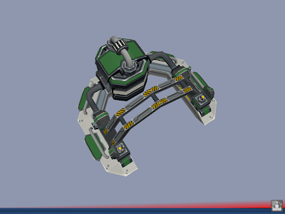
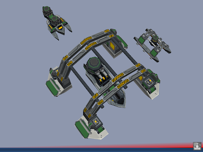
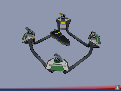
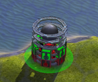
ARM Amphibious Complex WIP

@Funkencool
I like how the build options are horizontally aligned and at the bottom, making them closer to the middle of the screen.
Also I'd try to approximate a movie screen; keep the sides clear as much as possible to generate a bit of a cinematic feel. So I'd move the commands down as well.
Gajop is right I think, though the unit-icons are acceptable to me. The colours are strong though, but work-with/compliment the colours of the command-icons.
If I was to re-do one of 'em, I'd try to keep this colour-relation, but also would try and tone it done. I'd use cooler(and not so much warmer) colours for both types of icons.
I suspect the UI will be customisable up to a point for users. Mainly being able moving boxes about. I think that is a very good thing, but I would create a solid looking UI non the less. I'd try to make it look like a fixed/non-moveable UI maybe with atmospheric hand-painted borders (and then maybe an option to dissolve the borders or un-lock box position.)
So in example: I don't like Warcraft 1&2 UI-scheme these days, but Warcraft 3 kept the sides clear which was a smart step I think. Overall warcraft3 ui-scheme (referring to the cinematic feel) would be excellent in my book if one could click a (sort of go-pro) button making the boxes movable/customisable.
I'm not saying the UI should/must be like this, but just trying to a bit of constructive brainstorming


