
Woah, that is AWESOME! It looks like it's breakdancing!
The new one really gives a better feel of how your leg design works. It's great!
If you texture/animate this one...
Random WIP 2006-2011
Moderators: MR.D, Moderators


Re: Random WIP
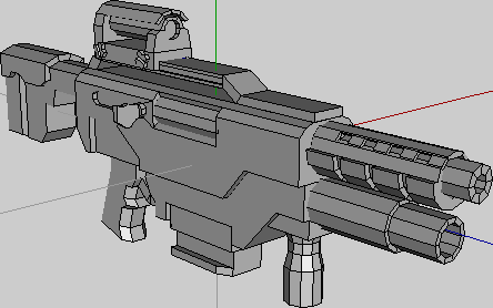
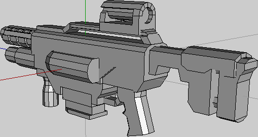
Urgh, I will never actually finish this thing. Been passively modeling it for... 6 months? Moar? Just pick it up for a few hours a week and change it around some. Maybe that will change when school is actually over.
1,728 tris
1,728 tris
-
Warlord Zsinj
- Imperial Winter Developer
- Posts: 3742
- Joined: 24 Aug 2004, 08:59
Re: Random WIP
Daan, are those two different units, or is the first one progress on the second one? I think I prefer the first one.
-
SwiftSpear

- Classic Community Lead
- Posts: 7287
- Joined: 12 Aug 2005, 09:29
Re: Random WIP
That's pretty good.Snipawolf wrote:Urgh, I will never actually finish this thing. Been passively modeling it for... 6 months? Moar? Just pick it up for a few hours a week and change it around some. Maybe that will change when school is actually over.
1,728 tris
Any specific project it's vaugly sort of for? The barrel looks a little odd if it's a conventional firearm, that thick steel will add alot of weight to the gun, and weight is usually something that is avoided. But if it's a plasma rifle or something I suppose it can easily be argued away.

Re: Random WIP
Hope that's 256 because it isn't very sharp for a 512.
Looks decent so far, though.
AZZ!
Looks decent so far, though.
AZZ!
-
Guessmyname

- Posts: 3301
- Joined: 28 Apr 2005, 21:07
Re: Random WIP
Yeah, it's 256. I completely screwed up with the UV scaling though; important bits are low res whilst random bits are high *facepalm*
Re: Random WIP
If you want to keep it looking nice, you may want to redo the UVs then. It's your choice in the end.
-
Guessmyname
- Posts: 3301
- Joined: 28 Apr 2005, 21:07
Re: Random WIP
Nah, it's not that noticeable. It's just something to kick myself over and bear in mind in future
Re: Random WIP
Swifty, my model is mostly based on look, not functionality. The bottom barrel is a grenade launcher, and IRL, unless there was some crazy machinery in there, the loading of the grenades would screw the clip and loading of regular bullets up. The grenades could be muzzle loaded, but I find it better to have the grenade launcher be able to fire 3 off consecutively, then reload.
Also, it could just be a built-in silencer/flash suppressor or something.
Also, it could just be a built-in silencer/flash suppressor or something.
-
bobthedinosaur

- Blood & Steel Developer
- Posts: 2702
- Joined: 25 Aug 2004, 13:31
Re: Random WIP
gmn, i had my doubts with tho untextured model, but wow. it looks good! good job is what i mean to say, even if some of the textures and uv's aren't what you'd like them to be.
-
Warlord Zsinj
- Imperial Winter Developer
- Posts: 3742
- Joined: 24 Aug 2004, 08:59
Re: Random WIP
GMN, I think you should double the texture, I don't think 256 is adequate.
Otherwise it's looking good, but I think you need to think a bit more about the overall layout of the texture; At a distance that will turn into a green blob with bright TC bits. You should break up various segments into totally different tones and shades. It'll look better, and it will also help the legibility of the unit at a distance.
edit: A good rule of thumb is to make the chassis/core/torso dark, with the extremities lighter; alternatively the inverse can work as well. Give the head some sort of clear patterning or distinctive element for extra character.
Last edited by Warlord Zsinj on 05 Apr 2009, 06:05, edited 2 times in total.
-
Forboding Angel

- Evolution RTS Developer
- Posts: 14673
- Joined: 17 Nov 2005, 02:43
Re: Random WIP
I agree, the texture should be raised to 512, 256 just doesn't cut it here.
-
SwiftSpear
- Classic Community Lead
- Posts: 7287
- Joined: 12 Aug 2005, 09:29
Re: Random WIP
Meh, guns firing conventional munitions look better when the barrels are more reminiscent of conventional firearms IMO. Ya, the magazine (clip is what was used in WW2 era rifles, it was more a rail the bullets clipped onto then a self contained machine that pushed the bullets up into the chamber) thing would drive me insane if it was my modelSnipawolf wrote:Swifty, my model is mostly based on look, not functionality. The bottom barrel is a grenade launcher, and IRL, unless there was some crazy machinery in there, the loading of the grenades would screw the clip and loading of regular bullets up. The grenades could be muzzle loaded, but I find it better to have the grenade launcher be able to fire 3 off consecutively, then reload.
Also, it could just be a built-in silencer/flash suppressor or something.
Oh, in terms of noise/muzzle flash suppressors. Those things generally look really cool. If you think the model should have one, model one on, don't try to make an excuse that it's built into the barrel.
-
Guessmyname
- Posts: 3301
- Joined: 28 Apr 2005, 21:07
Re: Random WIP
256 probably could cut it, I reckon, had I remembered to scale the uv map properly >_>Warlord Zsinj wrote:GMN, I think you should double the texture, I don't think 256 is adequate.
Otherwise it's looking good, but I think you need to think a bit more about the overall layout of the texture; At a distance that will turn into a green blob with bright TC bits. You should break up various segments into totally different tones and shades. It'll look better, and it will also help the legibility of the unit at a distance.
edit: A good rule of thumb is to make the chassis/core/torso dark, with the extremities lighter; alternatively the inverse can work as well. Give the head some sort of clear patterning or distinctive element for extra character.
-
Warlord Zsinj
- Imperial Winter Developer
- Posts: 3742
- Joined: 24 Aug 2004, 08:59
Re: Random WIP
If I was texturing that I would definitely go for 512, unless I intended the unit to be built in huge numbers. And if I intended the unit to be built in huge numbers, I would never have modelled it so detailed.
It just has too many different parts, many of which are articulated, meaning they have many exposed sides.
I think given that you're just learning to texture, you should make it a lot easier on yourself and go with 512 - and don't forget, you can always scale down to 256 later (we ended up doing that with a number of our units in IW), but you can't go the other way.
-
SwiftSpear
- Classic Community Lead
- Posts: 7287
- Joined: 12 Aug 2005, 09:29
Re: Random WIP
Scale the UV map properly and still use 512. It's just easier to texture with more space to work with. You don't have to deal with the frustrating problems of not having enough space to express the detail you want. It's much easier to scale a texture down than it is to scale a texture up.Guessmyname wrote:256 probably could cut it, I reckon, had I remembered to scale the uv map properly >_>Warlord Zsinj wrote:GMN, I think you should double the texture, I don't think 256 is adequate.
Otherwise it's looking good, but I think you need to think a bit more about the overall layout of the texture; At a distance that will turn into a green blob with bright TC bits. You should break up various segments into totally different tones and shades. It'll look better, and it will also help the legibility of the unit at a distance.
edit: A good rule of thumb is to make the chassis/core/torso dark, with the extremities lighter; alternatively the inverse can work as well. Give the head some sort of clear patterning or distinctive element for extra character.

Re: Random WIP
GMN, those thick black lines on the texture look very bad.

Re: Random WIP
My first attempts at modeling:
I would like to make features for maps, got these two so far:


I know the one on the left has a too thick trunk, and the right one looks like an overgrown marijuana bush :)
Left is 150 tris, and right is 300.
How can i make it so that both sides of a poly have the same texture? And how can I delete a face in wings3d? if i hit hide, upspring still shows it
I would like to make features for maps, got these two so far:
I know the one on the left has a too thick trunk, and the right one looks like an overgrown marijuana bush :)
Left is 150 tris, and right is 300.
How can i make it so that both sides of a poly have the same texture? And how can I delete a face in wings3d? if i hit hide, upspring still shows it