Random WIP 2006-2011
Moderators: MR.D, Moderators

Re: Random WIP
I think I've already written enough very lengthy posts about this topic, you can find my essay about this, with illustrations, if you want to learn. Short version: it's unbalanced. Fix it 

Re: Random WIP
@Krogoth: I just thought that the eco icons all look a bit 'busy' (dion't get me wrong they look great, but they might take a bit of getting used to, e.g. what is E store, what is wind, etc.
My personal preference (which isn't worth much) would be for classes of structures or units to have some sort of theme. For example, air could be a triangle, land a circle, sea a half circle, structures squares etc. Then the icons would then be customised from that base. Energy structures, for example, might be a square with one of the cool power/spark icons, then withing that, a wind might be a square, witht eh sperk in, with a little cross on top, solar with a little sun on top etc. My issue ios that there's a lot of variety in the icons, which is nice but might be unclear for new players exactly whats what. With themes/classes then maybe it would be easier to guess what an icon is based on its similarity with other icons, which makes it easier for new players to learn them... I liek what you've done tho, I just think some things could be a little clearer/more consistent.
My personal preference (which isn't worth much) would be for classes of structures or units to have some sort of theme. For example, air could be a triangle, land a circle, sea a half circle, structures squares etc. Then the icons would then be customised from that base. Energy structures, for example, might be a square with one of the cool power/spark icons, then withing that, a wind might be a square, witht eh sperk in, with a little cross on top, solar with a little sun on top etc. My issue ios that there's a lot of variety in the icons, which is nice but might be unclear for new players exactly whats what. With themes/classes then maybe it would be easier to guess what an icon is based on its similarity with other icons, which makes it easier for new players to learn them... I liek what you've done tho, I just think some things could be a little clearer/more consistent.
-
[Krogoth86]
- Posts: 1176
- Joined: 23 Aug 2007, 19:46
Re: Random WIP
@Acidd_UK:
I find what you say a bit contradictory. In your first paragraph you say that it might need some work to get used to the symbols for in this case the eco structures. In your second paragraph you then talk about creating different symbols for winds, solars & so on. How does this fit when you say it might take a bit to get used to a lightning symbol, a lightning symbol with a radiation warning and a "battery" symbol? That's just three symbols for power plants & energy storages - if you think that's already a bit much to learn how should this work when doing symbols for each type of power plant?
Concerning your suggestion to base everything on a geometric code i.e. triangles are this, squares are that and some additional details in it make clear what exact kind of unit it is: That's probably a way for a system where you can see the very specific kind of unit you're dealing with. My primary goal is to give a good overview about everything of major importance so you get the idea what power plants are, where anti-nukes are located and so on. For that reason I tried to use "self-evident" symbols you pretty much understand immediately like that lightning for power plants or the wrench for constructors. Things only got more specific where I think it might make sense like a symbl for scouts, bombers or gunships (plus "warning symbols" for things like Juggernauts, Flagships, Annihilators, Berthas and so on)...
I also saw that geometric approach you suggest used in CA and just found it pretty bad. Well they didn't use sort of real symbols in their generic shape but put other basic geometric shapes on top so you get "layered" combinations of different squares, triangles and so on. That might work if you want to learn all this stuff but even if you do imo it doesn't really help the overview and at least when it's about icons for combat units it didn't add much advantage. If you don't learn it it's rather more of a hurdle than a real help and that's why I want to stay rather basic with symbols that are easily accessible and shape forms for the more important stuff. So in the end I disagree with you that a "theme based" code for radar symbols by using geometric bases that get a slight detail is easier to understand for a new player than a code of "self-explaining" symbols which are rather rough in term of different sub-classes. A bit of the work of recognizing enemy incoming units imo also is a player's job (by looking at velocities and so on)...
Re: Random WIP
I like them. Wouldn't take too long to learn, certainly not for a new player - they just learn a unit's radar dot as part of the process of learning about each unit.

Re: Random WIP
I like the idea of what otherside is modeling, but the implementation is garbage.

Re: Random WIP
I like that I don't have to say anything. I can sit back and he catches flak.that being said we shouldn't be total pricks to the guy.
look otherside, find the center of your mass in the upper torso and looking at it if you drew an invisible line from that center of mass it wounldn't meet the center of mass for your feet which are the supports. I still hate the concept but that is why it looks off balance.
look otherside, find the center of your mass in the upper torso and looking at it if you drew an invisible line from that center of mass it wounldn't meet the center of mass for your feet which are the supports. I still hate the concept but that is why it looks off balance.

Re: Random WIP
Still baawing about the concept cos ur AK got more flak than wen it was the storm modelsmoth wrote:I like that I don't have to say anything. I can sit back and he catches flak.that being said we shouldn't be total pricks to the guy.
look otherside, find the center of your mass in the upper torso and looking at it if you drew an invisible line from that center of mass it wounldn't meet the center of mass for your feet which are the supports. I still hate the concept but that is why it looks off balance.
Re: Random WIP
That model looks great otherside. I don't get whats the deal with center of mass here, ever heard of weights people? Not like every cubic inch of the mech weights the same. It looks very fine as it is.
EDIT: remove the bobble on head, skin it, animate it, and it looks ready for CA imo.
EDIT: remove the bobble on head, skin it, animate it, and it looks ready for CA imo.
Re: Random WIP
Storm model?Otherside wrote:Still baawing about the concept cos ur AK got more flak than wen it was the storm model
Re: Random WIP
hey man, just trying to help the guy out, no one else was explaining what was wrong with it beyond "it looks off balance." His response was to flame the guy who gave him some more detailed feedback.Regret wrote:That model looks great otherside. I don't get whats the deal with center of mass here, ever heard of weights people? Not like every cubic inch of the mech weights the same. It looks very fine as it is.
EDIT: remove the bobble on head, skin it, animate it, and it looks ready for CA imo.
-
bobthedinosaur

- Blood & Steel Developer
- Posts: 2702
- Joined: 25 Aug 2004, 13:31
Re: Random WIP
models where the design is trying to capture an already established concept (such as battletech or ww2 or gundam) seem to be frustrating to me. when i dont have such an artistic freedom id really like to just make what ever come to mind instead be bound to a low-mid poly version of a piece that is the standard.

Re: Random WIP
Brawler Mk2


No texture or UV map for it yet. It might still need some tweaks before I start to texture it, what do you think?
No texture or UV map for it yet. It might still need some tweaks before I start to texture it, what do you think?
Re: Random WIP
Is that a render? or are your normals/smoothing SERIOUSLY f'ed up?
-
Warlord Zsinj
- Imperial Winter Developer
- Posts: 3742
- Joined: 24 Aug 2004, 08:59
Re: Random WIP
Looks like a render with bad lighting settings.
When rendering, it's a good rule of thumb to have at least 3 lights placed around the object. Pick one primary light, which is the strongest, and two secondary ones that will backlight your object. These should have the ability to cast shadows off, and are usually far dimmer then the main light.
From what I can see there, you've also picked a point light (that's ok), but you've also used some sort of light strength drop off, such as inverse square, which you shouldn't really use for this purpose.
Re: Random WIP
Admittedly the lighting was a bit rushed. I used 2 spot lights, one on either side. It was done using wings 3D with work mode but with lighting on, I don't like wings3Ds smoothed rendering too much. What do you think of the actual model though?
Re: Random WIP
looks pretty cool.
Somehow the nose seems awkward, even though the rounded nose was intentional.
Somehow the nose seems awkward, even though the rounded nose was intentional.
Re: Random WIP
Ordinary screenshots in are fine, these renderers always ignore how you set up the normals

Re: Random WIP
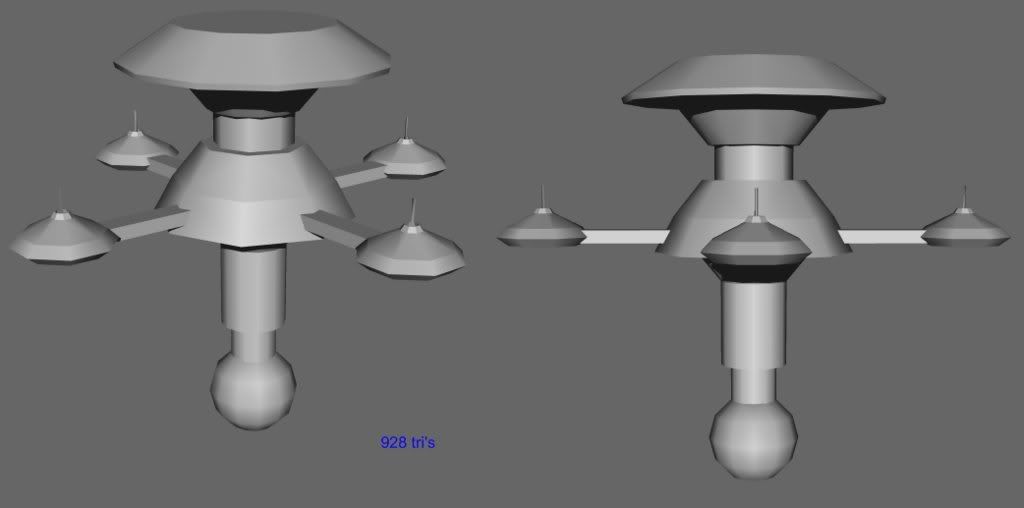
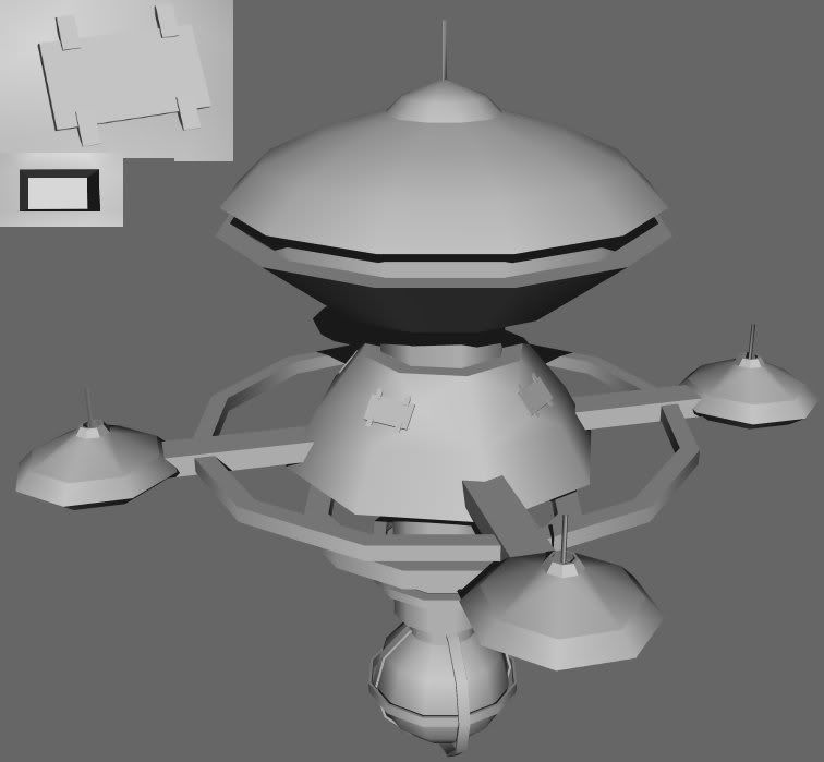
Wip
Meant to be a robot space station.
I think it looks a bit strange, does anybody think the same? Anything that can be improved?
Re: Random WIP
looks like an altered carbon copy of a federation starbase (StarTrek)...