The beige metal is to shiny, and the metal bars need more preshading, but this is a taste of whats to come.
Also, I notice that the team color appears faded compared to a 3do model. Say, the Arm Commander. But from what Ive seen all s3o models have this effect, so I presume its unfixable.
There needs to be more of a believable transition/edge between the vertical wall and the horizontal top. When I first glanced at it I thought it was a 3do.
Try to avoid pasting down generic textures - it's an early mistake, and it will stop you making really nice textures. Pretty much everyone does this at the start. I did it - even Mr.D was guilty of it in his earlier textures a little.
Try to texture each part specifically and intentionally. hand painting, or atleast tweaking your source references so that they match the geometry.
Right now you have a situation where there are clear seams, you have bits of textural information stopping and starting at edges (rather then wrapping around, or addressing the edge in any way), and the texture seems noisy and non-specific.
You need to get into detail, zoom in and imagine how those parts are likely to be built - what things are likely to go there. Armour plating? (how is the armour plating divided up?) Wires? Greebles? Some large identification numbers? How is it weathering? Where is water likely to be catching and running down? Where are impact scratches likely to occur?
On the positive side, I think your actual visual break-up of the design is very good. A lot of people are afraid of putting in large areas of contrast, and end up making very dull all-grey type units. I think it's good that you've specified some different coloured areas (the blueish armour tone is working well, I think). I'm not sure about the beige (it is a bit of a wussy colour), but having a lighter colour there is a good idea.
Teamcolour wise, I'd say you've perhaps copped out a bit. You have the chance to do something very interesting with teamcolour, but at the moment it's a bit of an afterthought. You should be thinking about teamcolour from the start of the texture. You've got some large flat surfaces on the side that are just asking for some interesting teamcolour patterning (doesn't have to be overly complicated - could be a bunch of simple angled stripes etc)
In terms of the practicalities of teamcolour application. Obviously you change the opacity of the teamcolour through the value of the alpha layer. However, TC also interacts with the surface underneath - if you paint black or dark grey underneath your teamcolour surfaces you will get a much clearer teamcolour.
I know some people like to paint a bit of glow under their TC to bring it forward. I personally don't like that approach much, because it can create unrealistic lighting situations (and glow + specularity = pure white), but it's another option.
Also, if you are showing slightly weathered metal on your surfaces, don't forget to slightly weather your teamcolour as well! (chip away paint, etc)
teamcolour needs to be put on top of pure black (or very dark grey). otherwise the colour underneath leaks through and poisons the teamcolour. i also tend to use high saturations of teamcolour (75%+)
I concur with the thoughts about the edge transitions, but don't just think about the sharp ~90 degree ones, the bent metal on the front doesn't look very natural either.
Well I can already tell this ones gonna take a few tries to get right.
Ok, more seamless edges, less 3doism, more details, hand edit individual panels more, black below teamcolor... I'll give it a shot.
I'm reasonably happy with the design for this metal storage.
I think TA's approach the storages was a good one, and as I imagined them. The metal was stored in a volatile storage that required a bulky, heavily reinforced structure.
This model reminds me of that. The only thing that bothers me about this particular structure is it's size - it's so squat. It could easily be twice as tall.
I am a fan of bigness though - but I do think Spring gives us the possibility of having huge variations in scale that many other RTS's just can't deal with. There are issues related to footprint - a big footprint can make a building annoying to place - but in terms of vertical height there are very few limiters other then pure aesthetics.
Warlord Zsinj wrote:This model reminds me of that. The only thing that bothers me about this particular structure is it's size - it's so squat. It could easily be twice as tall.
the OTA storages *were* twice as tall. the AA storages got squished :/
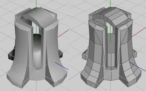
*edit* pic for proof
OTA on the left, BA on the right
*edit2* Zsinj, your screenie shows some really pastely looking teamcolour >_> (unless that was the teamcolour you chose, but im guessing its supposed to be standard Spring blue)


