RE:
http://www.wolfegames.com/TA_Section/typical_screen.jpg
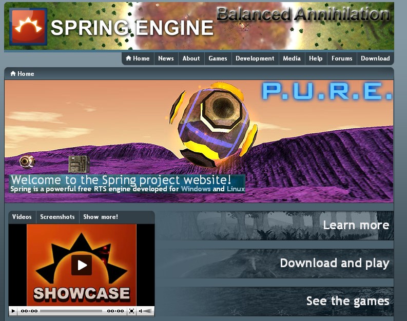
Agreed with roflcopter, I think this looks really bad (not because of the images). In both of the images provided in that link, the mod titles are vying for attention with the more important title text, which is the 'spring engine' title, and the 'welcome' title.
There definitely has to be standards for images.
In my opinion, there should be
no big text on
any images -
especially the banner image up the top (where there shouldn't be any text at all).
On the big images, in my opinion, you should only be allowed a simple 12 point text stating the name of the mod, located in the bottom right hand corner of an image.
Opening up the site design to a bunch of people who are trying to promote their personal mod is a good way to get work done, but it's also a good way to have the website look like the streets of tokyo, with lots of bright images all vying for attention. The result is ugly, and the overall layout of the website is ruined, and to the user it either looks unprofessional, or the images are just filtered out as 'noise' the same way you filter out ads on a website.
Keep the focus on the content of the images, that's the Spring engine - that's what we're selling here.
I'm not even sure if we should be allowing people to adjust the images in photoshop, as argh seems to have done to some images, which look very hot - that sort of seems like false advertising.


