umm thats not my model, its a 3rd party model for old old school counter strike that didnt like my animations too much and had contorted arms while aiming. more of a test thing.
also wolf, just my opinion but the gun should probably have no team color and maybe a slightly different metal shade to highlight the separate piece, well if it is separated from the body?
Random WIP 2006-2011
Moderators: MR.D, Moderators
-
Guessmyname

- Posts: 3301
- Joined: 28 Apr 2005, 21:07
Re: Random WIP
I knew it was from Counterstrike! What were testing? A new infantry script?
Re: Random WIP
porting a cs model to spring i bet...
-
Wolf-In-Exile

- Posts: 497
- Joined: 21 Nov 2005, 13:40
Re: Random WIP
Gnome: Thanks, i'll do that.
smoth: Ok, i'll make an alternate version of the teamcolour covering more of the body.
I'm not quite sure how to solve the monochromatic-ness though, I followed the original's colour (or rather, lack of it) as I figured its the general texture scheme. Any suggestions on what colour to use for the tint?
And yes, i'm adding a reflective layer, the effect will be similar to the one on the Espo Walker in SW:IW.
Re: Random WIP
Wow, awesome wolf! Pity the joints arent actually designed for that degree of articulation.
Ill second what most other people are saying, more contrast (esp in the light/dark areas, not so much in the noise texture that people wont see at a distance) might be good. It looks like your original render actually had more contrast.
Lines of teamcolour tend to fade into the texture at a distance. Even if you did zebra-stripes where 50% of the model was teamcoloured, thats not going to be as bright or evident at a distance as if you had a few full, solid plates of teamcolour. But id have to see it in game and at a distance, it seems to have a fair amount of team colour already.
The eyes could also probably use a bit of a glowing appearance.
The monochromaticness is just sort of a result of my lazy texturing. I went for a look of smooth, quasi-plastic-metalic armour plates because its easy. We could go for bluish metal or khaki-tan style arm look, what really matters is getting high quality art- once we have high quality art we can follow its artistic style.
Dont worry, this texture wont match -any- unit in the game. Its far too good hahah. We're more likely to try and copy whatever you do.
Ill second what most other people are saying, more contrast (esp in the light/dark areas, not so much in the noise texture that people wont see at a distance) might be good. It looks like your original render actually had more contrast.
Lines of teamcolour tend to fade into the texture at a distance. Even if you did zebra-stripes where 50% of the model was teamcoloured, thats not going to be as bright or evident at a distance as if you had a few full, solid plates of teamcolour. But id have to see it in game and at a distance, it seems to have a fair amount of team colour already.
The eyes could also probably use a bit of a glowing appearance.
It had a slight blue tint on the armour plates, and a stronger blue tint on the mechanical parts (joints, neck stuff, etc).I'm not quite sure how to solve the monochromatic-ness though, I followed the original's colour (or rather, lack of it) as I figured its the general texture scheme. Any suggestions on what colour to use for the tint?
The monochromaticness is just sort of a result of my lazy texturing. I went for a look of smooth, quasi-plastic-metalic armour plates because its easy. We could go for bluish metal or khaki-tan style arm look, what really matters is getting high quality art- once we have high quality art we can follow its artistic style.
Dont worry, this texture wont match -any- unit in the game. Its far too good hahah. We're more likely to try and copy whatever you do.
-
Warlord Zsinj
- Imperial Winter Developer
- Posts: 3742
- Joined: 24 Aug 2004, 08:59
Re: Random WIP
Wolf, the reflection map on the espo that you did, or that I did?
Another way to get teamcolour to be brighter is the trick that Mr.D uses - that is, putting glow in teamcolour areas.
It can look a bit 'candy cane' if not done well, but with caution it can work very well.
Another way to get teamcolour to be brighter is the trick that Mr.D uses - that is, putting glow in teamcolour areas.
It can look a bit 'candy cane' if not done well, but with caution it can work very well.

Re: Random WIP
eh, just use a dark background for the teamcolor areas and ur fine, anything beyond 122-122-122 RGB and you get Pastel colors.
-
Wolf-In-Exile
- Posts: 497
- Joined: 21 Nov 2005, 13:40
Re: Random WIP
Bob: Done, darkened the gun.
Mr D.: Thanks alot for the tip, set the teamcolour band to that.
Zsinj: I'm referring to the one I did, but I didn't know you edited that layer so it'll probably have a lower reflective value.
Sakoth: Ok, Bumped up the contrast, tell me if this looks ok. And yeah, i've added a high self-illumination to the the 'eyes', in these renders they're all just using the diffuse tex.
Also added a small render of how it will look like (more or less) when zoomed out.

-
bobthedinosaur

- Blood & Steel Developer
- Posts: 2702
- Joined: 25 Aug 2004, 13:31
Re: Random WIP
niiiiiice


Re: Random WIP
win  looks so evil tho
question does its eye change with team color ?
question does its eye change with team color ?

Re: Random WIP
oh yea..tha is awsome.
Isthat the Model CA used for peewee? if so did you retexture it to be a peewee?If you did than is it a part od a style of textures for ARM?
Isthat the Model CA used for peewee? if so did you retexture it to be a peewee?If you did than is it a part od a style of textures for ARM?
Re: Random WIP
That style would be great if arm got it.

-
[Krogoth86]
- Posts: 1176
- Joined: 23 Aug 2007, 19:46
Re: Random WIP
@Wolf:
Ha - I managed to spot a con on the texture...
Imo the "ammo part" of the gun shows some bullets which look like general pistol ammunition (although I cannot really spot it on the pictures so I may be wrong). As there are used some kinds of energy weapons that shouldn't be so...
It's the only thing I found not to fit on your awesome texture though...
Re: Random WIP
they might be small energy batteries... not bullets.
-
clericvash

- Posts: 1394
- Joined: 05 Oct 2004, 01:05
Re: Random WIP
thats some hot shitWolf-In-Exile wrote:Bob: Done, darkened the gun.
Mr D.: Thanks alot for the tip, set the teamcolour band to that.
Zsinj: I'm referring to the one I did, but I didn't know you edited that layer so it'll probably have a lower reflective value.
Sakoth: Ok, Bumped up the contrast, tell me if this looks ok. And yeah, i've added a high self-illumination to the the 'eyes', in these renders they're all just using the diffuse tex.
Also added a small render of how it will look like (more or less) when zoomed out.
Re: Random WIP
Krogoth: EMG (or whatever the fluff will call it) looks prettymuch like tracer fire. Thats a rotating magazine so the fact it has bullets is fine/good.
Gota: Is it arms texture style? It is now!
As utterly amazing as it looks up close though (best unit in all of spring id say ^_^), im not sure about the isometric view. Here is the new peewee (left) vs the old. Details like the bright head in the dark collar, bright shoulders, chest, upper arms and thighs, with very dark points at all the joints especially knees, hips and waist.
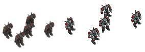
It looks like the new peewee is rendered with anti-alaising though, which is probably going to muddy it up a little.
Gota: Is it arms texture style? It is now!
As utterly amazing as it looks up close though (best unit in all of spring id say ^_^), im not sure about the isometric view. Here is the new peewee (left) vs the old. Details like the bright head in the dark collar, bright shoulders, chest, upper arms and thighs, with very dark points at all the joints especially knees, hips and waist.
It looks like the new peewee is rendered with anti-alaising though, which is probably going to muddy it up a little.
-
SwiftSpear

- Classic Community Lead
- Posts: 7287
- Joined: 12 Aug 2005, 09:29
Re: Random WIP
The major differences in those two images are almost entirely rendering settings.
One of the PCs has alias on, and most likely is rendering on a darker map.
One of the PCs has alias on, and most likely is rendering on a darker map.