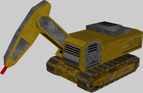
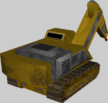
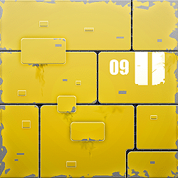
Snipa, I think the two things that can be improved on that texture are;
- The yellow is nice, and it's good that it has some noise rather then a flat tone, but I think there needs to be some larger tonal variations on the yellow, as well as scratches and breaking up of the yellow paint. You've done it to an extent near the tracks; the problem is there that the scratching feels a little 'fake' - you're unlikely to see metal peel away in neat blobs like that (though it's not too bad). I think you're more likely to see more glancing scratches then clear chunks missing.
pic.
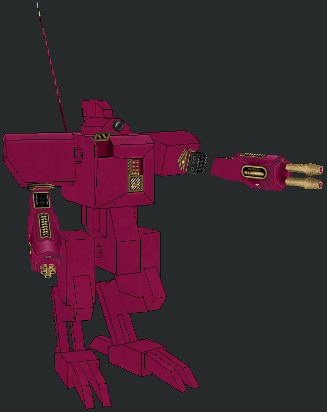
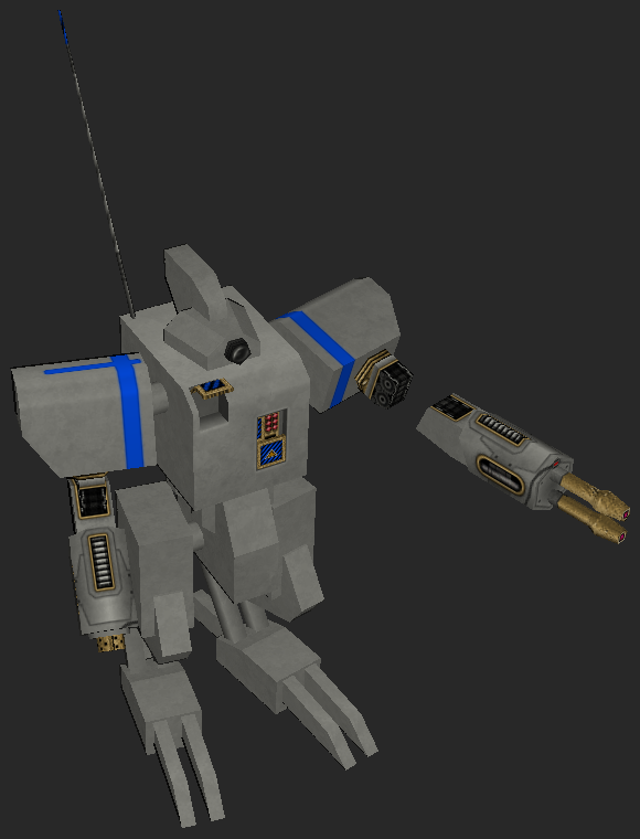
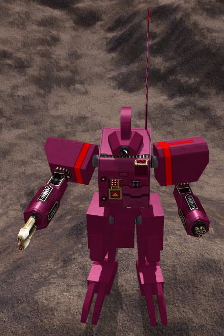
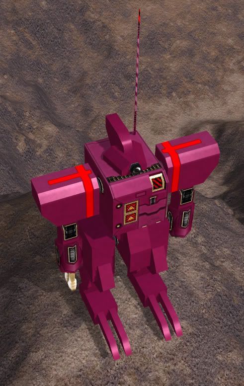
- Secondly, the edges definitely need to be highlighted. A good way to do this is to use your base layer (make sure it's got some noise and contrast so that you get a more speckled highlight - if it doesn't, use a rough brush initially), then grab the dodge tool at low strength (I use photoshop, don't know if you do, so hope this is relevant), with a large brush, set to 'midtones'. I'll brush up and down all edges intersecting at that point a few times (obviously thinking about where the light is coming from; but most edges can do with some sort of highlight, if not the strongest), then shrink my brush, repeat. Once my brush is pretty small, I switch the dodge tool to pick up 'highlights', and continue. You should get a nice speckled line highlighting that edge, as well as risidual highlights from the larger earlier brushing. You can see the effect on
the image I posted earlier. Most of the highlights you see there are painted on, rather then generated by spring, and it really helps to give definition to geometry.


