Random WIP 2006-2011
Moderators: MR.D, Moderators


It already has more polycount than I wanted, due to problems with Rhino's mesher, and I have a lot more to do.
Wanna remodel it and jazz it up? You see the basic idea here- so long as it's a wide, flat flying-wing, with recessed engine nacelles, I'm fairly open to a redesign, although I must admit that the idea of redoing all of those frickin' rivets does not excite me. I thought about putting on some winglets or other scifi greebles, but quite frankly it's over polycount and I didn't want to try to squeeze more stuff into the space. I may come back to it later.
Wanna remodel it and jazz it up? You see the basic idea here- so long as it's a wide, flat flying-wing, with recessed engine nacelles, I'm fairly open to a redesign, although I must admit that the idea of redoing all of those frickin' rivets does not excite me. I thought about putting on some winglets or other scifi greebles, but quite frankly it's over polycount and I didn't want to try to squeeze more stuff into the space. I may come back to it later.
<shrugs> well, I may come back to it later on, when everything else is done. I have a long way to go, frankly.
Here's a nice shot, for those of you who don't understand what "Recalculate vertex normals, 3DO style" is for (it's under the Object menu in UpSpring, in case this is all sounding like a foreign language):
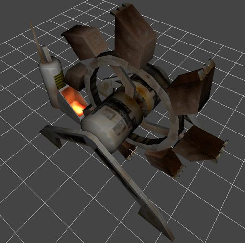
Here, you can see this piece after recalculating the vertex normals, or applying "Spring smoothing" to the meshes. As you can clearly see, if you compare with the previous mesh, the flat-sided columns now look smoothly rounded, there are distinct curves that weren't really apparent in the first shot, etc. The reflection map brings it out, and the glowmap adds some interest to what might otherwise be a fairly dull object (and I'll use some animations and FX, but meh, you can see that in the game).
The upshot of all of this is pretty obvious, but there is one smallish catch: Spring doesn't like to properly smooth stuff if you don't apply at least a very slight amount of reflectivity (I think this has something to do with the tesselation stage, but I dunno for sure). At any rate, if you want something to have nice soft curves, then make sure to add at least 1 value of green to the final reflect/glow/hopefully alpha-trans-if-Trepan-ever-gets-around-to-putting-that-cool-stuff-he-keeps-showing-me-into-SVN!
<cough> er, sorry there... been waiting the better part of five months for him to put something he keeps telling me is "trivial" into Spring, so that I can finally start using bump / normal maps and maybe (with LUA) get going with shader integration...
Here's a nice shot, for those of you who don't understand what "Recalculate vertex normals, 3DO style" is for (it's under the Object menu in UpSpring, in case this is all sounding like a foreign language):
Here, you can see this piece after recalculating the vertex normals, or applying "Spring smoothing" to the meshes. As you can clearly see, if you compare with the previous mesh, the flat-sided columns now look smoothly rounded, there are distinct curves that weren't really apparent in the first shot, etc. The reflection map brings it out, and the glowmap adds some interest to what might otherwise be a fairly dull object (and I'll use some animations and FX, but meh, you can see that in the game).
The upshot of all of this is pretty obvious, but there is one smallish catch: Spring doesn't like to properly smooth stuff if you don't apply at least a very slight amount of reflectivity (I think this has something to do with the tesselation stage, but I dunno for sure). At any rate, if you want something to have nice soft curves, then make sure to add at least 1 value of green to the final reflect/glow/hopefully alpha-trans-if-Trepan-ever-gets-around-to-putting-that-cool-stuff-he-keeps-showing-me-into-SVN!
<cough> er, sorry there... been waiting the better part of five months for him to put something he keeps telling me is "trivial" into Spring, so that I can finally start using bump / normal maps and maybe (with LUA) get going with shader integration...

-
Guessmyname

- Posts: 3301
- Joined: 28 Apr 2005, 21:07
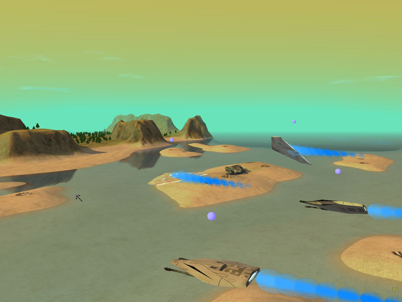
Still using the teamcolour ball things from nanoblobs? Wouldn't it be better (and possible) to do that in LUA now? Sorta like those teamcolour pallette things
Other than that, they look kinda Aeon-ish, only less shiny and more funky.
I'd also recommend making the engine thrust particles slow down as they shrink, so that you don't get gaps in the beam thing
Other than that, they look kinda Aeon-ish, only less shiny and more funky.
I'd also recommend making the engine thrust particles slow down as they shrink, so that you don't get gaps in the beam thing
-
Warlord Zsinj
- Imperial Winter Developer
- Posts: 3742
- Joined: 24 Aug 2004, 08:59
They actually have a sort of homeworld-ish look about them...
Particularly these
http://www.wolfegames.com/TA_Section/teaser74.jpg
And these:
http://dille.yagr.com/hw2/index.php?sho ... e=25022003
Which is great, I love the homeworld art!
Particularly these
http://www.wolfegames.com/TA_Section/teaser74.jpg
And these:
http://dille.yagr.com/hw2/index.php?sho ... e=25022003
Which is great, I love the homeworld art!


-
Warlord Zsinj
- Imperial Winter Developer
- Posts: 3742
- Joined: 24 Aug 2004, 08:59


-
[KnoX]ElementalGizmo
- XTA Developer
- Posts: 266
- Joined: 24 Aug 2006, 01:33
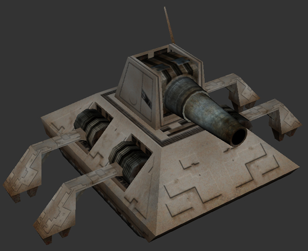
just started to texture units, first being the unit from simbase by peet! very basic atm im afraid but its a nice start i thought..


as you can see very basic but im rather pleased with the greeble i done all the same..

Ive yet to do team colors or any serious detail, and the model you are looking at is lacking the triangle tiled atm.
im getting closer to finishing this but rl is getting in the way big time [looks at bottle] ill post a few dev shots when i "think" its finished to see what u dudes think n what needs to be done to improve its quality....may replace the popup model in xta eventually.
thoughts so far ?
as you can see very basic but im rather pleased with the greeble i done all the same..
Ive yet to do team colors or any serious detail, and the model you are looking at is lacking the triangle tiled atm.
im getting closer to finishing this but rl is getting in the way big time [looks at bottle] ill post a few dev shots when i "think" its finished to see what u dudes think n what needs to be done to improve its quality....may replace the popup model in xta eventually.
thoughts so far ?
AF:
I already said, "it's not the final", I just rigged it up for the shots, frankly.
ElementalGizmo:
Not bad for your first stuff at all Here are my critiques:
1. Spend more time on the geometry. The gun is just a repeating series of barrel shapes, and that's the most interesting part of the whole model. While the texture can do serious heavy lifting and add a great deal of life to the piece, you've gotta have somthing more interesting to start with as the basic form.
The big areas that stick out, for me at least, is the turret's base, which would look cooler even if you just made it slope slightly from top to bottom (or the inverse), and the "popup box", which should get some greebles around those corners, or something, to give it a little more oomph. I like the cannon itself, although you really need to use the vertex-normals stuff that I described in the post above this one to make it look fully round in Spring.
2. Use more than one color. While the steel texture you used is nice, and you did a good job keeping the scale about right everywhere, it's boring. Break it up- even if you want everything to feel like it's bare steel, bare steel can have an amazing variety of albedo, reflectivity, and color, based on how it was finished and treated during construction (I used to cut sheet steel for a living, so I know a lot about steel, lol). Give it variety.
3. Lastly, you've got two major choices, in terms of final touches here: go for a cartoon / illustrative look, with aggressive preshading and blacklining, or go for a more realistic approach, and add weathering and other details to give the object the look of a real object. Neither approach is invalid- personally, I think it'd be really cool if all of CA's OTA models were done in a toon style, as that'd fit the rest of the feel of the game. That requires a different approach to texturing the object, though, with more explicit treatment of light and shadow and greater contrast on highlights, and much less noise on the textures (although, it must be said, toon-shaded stuff looks just as good as the realism school if you add weathering- it still feels anime, just weathered).
Overall though, great job!
Oh, and while I'm posting... did somebody call for a siege tank?
I already said, "it's not the final", I just rigged it up for the shots, frankly.
ElementalGizmo:
Not bad for your first stuff at all
1. Spend more time on the geometry. The gun is just a repeating series of barrel shapes, and that's the most interesting part of the whole model. While the texture can do serious heavy lifting and add a great deal of life to the piece, you've gotta have somthing more interesting to start with as the basic form.
The big areas that stick out, for me at least, is the turret's base, which would look cooler even if you just made it slope slightly from top to bottom (or the inverse), and the "popup box", which should get some greebles around those corners, or something, to give it a little more oomph. I like the cannon itself, although you really need to use the vertex-normals stuff that I described in the post above this one to make it look fully round in Spring.
2. Use more than one color. While the steel texture you used is nice, and you did a good job keeping the scale about right everywhere, it's boring. Break it up- even if you want everything to feel like it's bare steel, bare steel can have an amazing variety of albedo, reflectivity, and color, based on how it was finished and treated during construction (I used to cut sheet steel for a living, so I know a lot about steel, lol). Give it variety.
3. Lastly, you've got two major choices, in terms of final touches here: go for a cartoon / illustrative look, with aggressive preshading and blacklining, or go for a more realistic approach, and add weathering and other details to give the object the look of a real object. Neither approach is invalid- personally, I think it'd be really cool if all of CA's OTA models were done in a toon style, as that'd fit the rest of the feel of the game. That requires a different approach to texturing the object, though, with more explicit treatment of light and shadow and greater contrast on highlights, and much less noise on the textures (although, it must be said, toon-shaded stuff looks just as good as the realism school if you add weathering- it still feels anime, just weathered).
Overall though, great job!
Oh, and while I'm posting... did somebody call for a siege tank?