Gundam logo poll. - Page 3

Gundam logo poll.

Discuss game development here, from a distinct game project to an accessible third-party mutator, down to the interaction and design of individual units if you like.

Moderator: Moderators

Which logo do you like the most..

1
21
50%
2
5
12%
3
8
19%
4
7
17%
mine!(if you choose this option post your gundam logo)
1
2%
 
Total votes: 42

User avatar
smoth
Posts: 22309
Joined: 13 Jan 2005, 00:46

Post by smoth »

sorry rattle, if you read my reply below your image... I said I cannot use it. The reason being is that it is not drawn by hand.. but I did incorporate the gold in one of the new logos.

The logos need to be drawn by hand because I want to avoid the possible issue of someone getting pissed about my mod having stolen art from them.


so that we do not lose track...

Seems that choice 1+3 was popular... so here is a fusion of the two...

A:
Image
B:
Image

Are these better? if so... which do you prefer?
User avatar
rattle
Damned Developer
Posts: 8278
Joined: 01 Jun 2006, 13:15

Post by rattle »

Now if I used a shape mask derived from the logo, does it count as hand drawn too? Yeah I'm lazy, because there's no decent Gundam like font out there (or I just couldn't find one).


B, clearly.
User avatar
Maelstrom
Posts: 1950
Joined: 23 Jul 2005, 14:52

Post by Maelstrom »

The first one of the new set, but im not a fan of the white G. It just doesnt look right.
User avatar
krogothe
AI Developer
Posts: 1050
Joined: 14 Nov 2005, 17:07

Post by krogothe »

smoth wrote:sorry rattle, if you read my reply below your image... I said I cannot use it. The reason being is that it is not drawn by hand.. but I did incorporate the gold in one of the new logos.

The logos need to be drawn by hand because I want to avoid the possible issue of someone getting pissed about my mod having stolen art from them.


so that we do not lose track...

Seems that choice 1+3 was popular... so here is a fusion of the two...

A:
Image
B:
Image

Are these better? if so... which do you prefer?
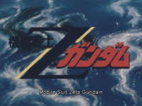
starting to look nice now. The first one with a bit less contrast between the G and the undam (make it darker maybe and more Rattle-ish)
User avatar
Das Bruce
Posts: 3544
Joined: 23 Nov 2005, 06:16

Post by Das Bruce »

smoth wrote:A:
Image
User avatar
Cheesecan
Posts: 1571
Joined: 07 Feb 2005, 21:30

Post by Cheesecan »

A is the best looking of those two.
User avatar
Charlemagne
Posts: 174
Joined: 18 Apr 2005, 17:59

Post by Charlemagne »

A, definately.
Egarwaen
Posts: 1207
Joined: 27 Feb 2006, 21:19

Post by Egarwaen »

B. Looks more "Gundam"y.
User avatar
Erom
Posts: 1115
Joined: 25 Apr 2006, 05:08

Post by Erom »

A is damn slick. B is a little more Gundamy, but ...<pause while he runs off and starts up a game of Gundam, hooray for working from home on Fridays>... your UI isn't overly Gundamy at the moment anyway, so I would go with A.
User avatar
SwiftSpear
Classic Community Lead
Posts: 7287
Joined: 12 Aug 2005, 09:29

Post by SwiftSpear »

A, B is just ugly.
User avatar
Aun
Posts: 788
Joined: 31 Aug 2005, 13:00

Post by Aun »

B - It looks more like a Gundam logo. =P

Image

Image
User avatar
Drone_Fragger
Posts: 1341
Joined: 04 Dec 2005, 15:49

Post by Drone_Fragger »

I still think mines* the best.


*By mine I mean number 1
User avatar
Muse
Posts: 21
Joined: 01 May 2006, 00:53

Post by Muse »

TheRegisteredOne wrote:!!!!!!!!!1
i choose number 1 without the hollow G, for some reason. good job on these btw, all of them :)
Imagei bet you dont know what this means :P
yes I do!
User avatar
Nemo
Spring 1944 Developer
Posts: 1376
Joined: 30 Jan 2005, 19:44

Post by Nemo »

A.
User avatar
rattle
Damned Developer
Posts: 8278
Joined: 01 Jun 2006, 13:15

Post by rattle »

B^infinity!

At least try to use capital letters for the other characters, you can use different sizes in a text layer in PS

like GUNDAM
Post Reply

Return to “Game Development”