Random WIP 2006-2011
Moderators: MR.D, Moderators


I don't really plan on upgrades. Can't even think of anything meaningful for that. I guess some units could use REALTIME WEAPON CHANGE!!1!1 and spells/special weapons but this one doesn't. I could make the missiles a special weapon but I think I'd rather keep them a regular weapon so the unit can stay at a distance, firing missiles and only using the tankcannon if anything gets too close. Maybe the missile launchers could be exchanged for independent shoulder turrets for shortrange engagements?

Funny, I was planning a similar project, until I found out how freakishly hard it was to model such complex stuff.KDR_11k wrote:I don't really plan on upgrades. Can't even think of anything meaningful for that. I guess some units could use REALTIME WEAPON CHANGE!!1!1 and spells/special weapons but this one doesn't. I could make the missiles a special weapon but I think I'd rather keep them a regular weapon so the unit can stay at a distance, firing missiles and only using the tankcannon if anything gets too close. Maybe the missile launchers could be exchanged for independent shoulder turrets for shortrange engagements?

-
Guessmyname

- Posts: 3301
- Joined: 28 Apr 2005, 21:07

-
Warlord Zsinj
- Imperial Winter Developer
- Posts: 3742
- Joined: 24 Aug 2004, 08:59
-
TheRegisteredOne

- Posts: 398
- Joined: 10 Dec 2005, 21:39

Strategic Plasma Cannon:

Model and paint by me. Yes, it's my contest entry from aeons ago, finally painted up. It looks badass in-game, too. Rawr.
RocketTurret:

Original model design by Guessmyname, with a fair amount of rework by me, paint by me. Nothing was wrong with GMN's design, just ended up saving time by re-using the body / legs from the AutoTurret, but with a different teamcolor schema so that it looks distinct, even at a distance.
RocketTank:
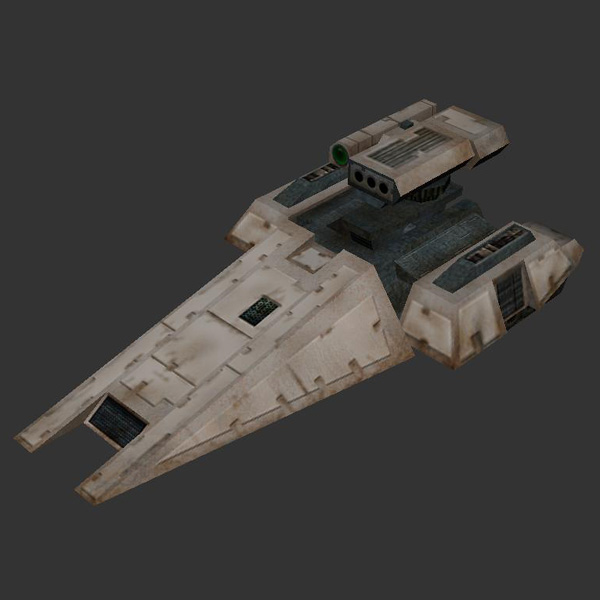
Model by Guessmyname with some editing by me, paint by me. Main changes I made included dropping some columns and a very thin piece of "armor", and replacing it with a simple box, and reducing the 4 tracks to 3 (since we'll hardly ever see the front one, it just made more sense to cut it to one, saving tricount and also keeping it thematically similar to the Tank). This model is great in-game, with a distinct design that still fits the rest of the PURE style for vehicles.
Model and paint by me. Yes, it's my contest entry from aeons ago, finally painted up. It looks badass in-game, too. Rawr.
RocketTurret:
Original model design by Guessmyname, with a fair amount of rework by me, paint by me. Nothing was wrong with GMN's design, just ended up saving time by re-using the body / legs from the AutoTurret, but with a different teamcolor schema so that it looks distinct, even at a distance.
RocketTank:
Model by Guessmyname with some editing by me, paint by me. Main changes I made included dropping some columns and a very thin piece of "armor", and replacing it with a simple box, and reducing the 4 tracks to 3 (since we'll hardly ever see the front one, it just made more sense to cut it to one, saving tricount and also keeping it thematically similar to the Tank). This model is great in-game, with a distinct design that still fits the rest of the PURE style for vehicles.

Er, um, could ya maybe get a closer shot of the turret, and a better profile view? I must say, though, that even in that shot, other than what looks like over-strong teamcolor, that that is looking way better than any of your earlier stuff, and definitely feels grungy and fairly realistic. Only major thing that I can see, from that small shot, is that preshading needs to be stronger.
-
TheRegisteredOne
- Posts: 398
- Joined: 10 Dec 2005, 21:39
Meh, I'd rate that lower than the LandFactory, the Tank or the Sniper Shell (formerly, "Mandroid", yes it's been officially axed, thank goodness).
Still, it went well, and quickly- the best part for me, is that once the style settled into something coherent and viable (the Tank was probably the defining piece, for me) then it became easier and easier, because I'm just following rules at this point, not having to be all that creative (which may sound weird, but it's not- creating a whole style is hard, executing a style once you know the rules is easy.
I could've done the RocketTank in my sleep, frankly. Yet it feels better, because instead of having to think through "this is the method I'm using, this is how I will use contrast to break up the shapes", etc., I can just concentrate on execution...
The SPC was a lot trickier, because of the sheer size (it's TALL) and the amount of preshading needed to carry it off, but otherwise pretty straightforwards- I think the only really interesting bits, artistically, would be the interiors of the "honeycomb" holes, which really add a lot by drawing the eye to what would normally be a fairly irrelevant area, and the preshading on the metallic platform the cannon rests on, which is just delicate enough that it doesn't look too heavy-handed.


Pure unadulterated hawt SEX, sheekel.
And yeah I'll back up what TRO said, Argh's texture work is getting slightly better with each picture.
I'm a total noob when it comes to understanding how textures work in Spring, so don't take this the wrong way but my main gripe with your textures Argh is there always seems to be large areas where the texture appears to be badly stretched (or it seems that way due to it being so blurry) Each of your textures to my eye has areas that are nice and clean and sharp, and there are other parts where the edges/shading seems really blurry as if a strong gaussian blur has been applied.
I think you're textures could benefit a lot from "sharper" all round texture quality, if that's at all possible. Is this related to the UV mapping of the models? Besides that, I feel like the texture work could also benefit from a little more contrast, mainly on the beige coloured areas, but thats largely personal preference.
@Sheekel:
"Preshading" is when you darken areas that aren't typically well-lit to create artificial contrast, or to suggest permanent shadows on areas of a model that don't move. Look at the Strategic Plasma Cannon, at the big metal plate under the gun. If you look, you'll see that the area under the gun is subtly darker than the areas to either side. Also, I used preshading on the "legs" where they meet up with that platform- you can clearly see that the texture there is darker than lower down, suggesting some shadow.
On the RocketTank, the sides of the front are preshaded, to make sure that the sides don't feel flat when viewed from above.
And go look at Warlord Zhinj's texture on the Imperial Guard, where he used very strong preshading to suggest whole details that don't actually exist in the model's geometry.
Basically, preshading is artificial lighting in reverse. Used with subtlety, it can really help make the edges of the model "pop" out at viewers, and prevent your objects from feeling flat. Of course, if you exaggerate it too much, then it'll look bad, but that's avoidable.
To preshade, simply use an airbrush with a darker version of your main shade and a very light setting on the sides and bottom faces, darkening more or less, depending on the angle- the closer to 90 degrees it gets, the more preshading it should have.
Just a wee bit of it here and there can really make a model feel a lot more 3-dimensional. I know it seems strange to say that, when the model is 3D, and Spring renders it in 3D, but Spring's treatment of light is not terribly accurate, and preshading helps a lot. I know it may sound weird, but try it- try making, for example, the back piece of your turret, which I see is a seperate bit of the uvmap, darker than the top parts, then go and hit the sides. Use a darker version of the base blue, about half-again towards black or even darker, and a very slow, large airbrush- maybe 3%, 60+ pixels, given that that texture looks like it's probably a 512.
The little round greeble under the main turret, sitting on the baseplate, especially sticks out. It should be darker, even on the top side, than the top of the turret above it, due to being "in the shade" to some extent.
The only other things that are really popping out at me is that the lines of some of the panels look a bit less than straight- may be some distortion caused when unwrapping, pretty much impossible to fix now, without having to reskin a lot of it, and most people won't see it.
Also, you have a couple of areas where you didn't add your edge greebles suggesting wear at all, which stick out very obviously. Like, for example, the rectangle behind the guns, is totally clean, but the facet right above it is all dirty and grungy. Needs to be made more consistent.
Overall, this is a much better skin than I've seen from you before, though, and I hope to see more great stuff like this in the future
@Demo:
Yes, some of the texture is going to show slight differences in detail levels- this is related directly to the amount of "square footage" assigned to that area of the map. Basically, it's really simple- in an ideal world, you'd assign everything equal amounts of square footage. Some people do it that way. I prefer, instead, to minimize some areas so that I can pack more detail into others. This looks much better in-game, imo, because big areas, like the front hull of the RocketTank, feel really nice and detailed, whereas other areas may be a bit blurry when seen at point-blank, but at typical distances they're fine. And stuff like the under-faces of things, which hardly ever get seen, I give tiny amounts of texture space to, because lavishing precious texture space on things you won't see, or will rarely ever see for more than a very short time, is a total waste of resources.
There's nothing wrong with scaling all of the non-bottom faces exactly the same, but I think that it works out better to mix scales to some extent, so that I can have super-high detail in some areas, but not others.
And, frankly, except at extreme-closeup zoom levels, you simply cannot tell where I've cheated a bit, frankly, because of anisotrophic filtering and mipmaps.
Default zoom.

Twice default zoom
Four times default zoom

And, um, who actually plays at default zoom? I sure as heck don't. I don't think anybody who knows what they're doing does, either.
In this last shot, you can maybe see slightly blurrier textures on the top of the turret, for example, which has a lower resolution than the top of the hull. But it's barely noticable. And I hate to put it this way, but if you zoom in this close to any model in a professional game, you're going to see the same compromises and cheating. Go get an unaltered shot of SupCom models at that zoom... with shadows on, running on a ATI 9600, no less
As for the contrast... it works fine in-game, I think. These shots are on Islands In War, which is fairly darkly lit- on brighter maps, the contrast really pops.
"Preshading" is when you darken areas that aren't typically well-lit to create artificial contrast, or to suggest permanent shadows on areas of a model that don't move. Look at the Strategic Plasma Cannon, at the big metal plate under the gun. If you look, you'll see that the area under the gun is subtly darker than the areas to either side. Also, I used preshading on the "legs" where they meet up with that platform- you can clearly see that the texture there is darker than lower down, suggesting some shadow.
On the RocketTank, the sides of the front are preshaded, to make sure that the sides don't feel flat when viewed from above.
And go look at Warlord Zhinj's texture on the Imperial Guard, where he used very strong preshading to suggest whole details that don't actually exist in the model's geometry.
Basically, preshading is artificial lighting in reverse. Used with subtlety, it can really help make the edges of the model "pop" out at viewers, and prevent your objects from feeling flat. Of course, if you exaggerate it too much, then it'll look bad, but that's avoidable.
To preshade, simply use an airbrush with a darker version of your main shade and a very light setting on the sides and bottom faces, darkening more or less, depending on the angle- the closer to 90 degrees it gets, the more preshading it should have.
Just a wee bit of it here and there can really make a model feel a lot more 3-dimensional. I know it seems strange to say that, when the model is 3D, and Spring renders it in 3D, but Spring's treatment of light is not terribly accurate, and preshading helps a lot. I know it may sound weird, but try it- try making, for example, the back piece of your turret, which I see is a seperate bit of the uvmap, darker than the top parts, then go and hit the sides. Use a darker version of the base blue, about half-again towards black or even darker, and a very slow, large airbrush- maybe 3%, 60+ pixels, given that that texture looks like it's probably a 512.
The little round greeble under the main turret, sitting on the baseplate, especially sticks out. It should be darker, even on the top side, than the top of the turret above it, due to being "in the shade" to some extent.
The only other things that are really popping out at me is that the lines of some of the panels look a bit less than straight- may be some distortion caused when unwrapping, pretty much impossible to fix now, without having to reskin a lot of it, and most people won't see it.
Also, you have a couple of areas where you didn't add your edge greebles suggesting wear at all, which stick out very obviously. Like, for example, the rectangle behind the guns, is totally clean, but the facet right above it is all dirty and grungy. Needs to be made more consistent.
Overall, this is a much better skin than I've seen from you before, though, and I hope to see more great stuff like this in the future
@Demo:
Yes, some of the texture is going to show slight differences in detail levels- this is related directly to the amount of "square footage" assigned to that area of the map. Basically, it's really simple- in an ideal world, you'd assign everything equal amounts of square footage. Some people do it that way. I prefer, instead, to minimize some areas so that I can pack more detail into others. This looks much better in-game, imo, because big areas, like the front hull of the RocketTank, feel really nice and detailed, whereas other areas may be a bit blurry when seen at point-blank, but at typical distances they're fine. And stuff like the under-faces of things, which hardly ever get seen, I give tiny amounts of texture space to, because lavishing precious texture space on things you won't see, or will rarely ever see for more than a very short time, is a total waste of resources.
There's nothing wrong with scaling all of the non-bottom faces exactly the same, but I think that it works out better to mix scales to some extent, so that I can have super-high detail in some areas, but not others.
And, frankly, except at extreme-closeup zoom levels, you simply cannot tell where I've cheated a bit, frankly, because of anisotrophic filtering and mipmaps.
Default zoom.
Twice default zoom
Four times default zoom
And, um, who actually plays at default zoom? I sure as heck don't. I don't think anybody who knows what they're doing does, either.
In this last shot, you can maybe see slightly blurrier textures on the top of the turret, for example, which has a lower resolution than the top of the hull. But it's barely noticable. And I hate to put it this way, but if you zoom in this close to any model in a professional game, you're going to see the same compromises and cheating. Go get an unaltered shot of SupCom models at that zoom... with shadows on, running on a ATI 9600, no less
As for the contrast... it works fine in-game, I think. These shots are on Islands In War, which is fairly darkly lit- on brighter maps, the contrast really pops.
I like those screenshots Argh, really helps to judge the actual application of your texture work in game (duh). Frankly, I never thought your units would look as good as that in-game, basing my opinion from your renders.
Please do this more often. Looks really promising. Keep up the good work.
EDIT: Oh, and nice allocation of team colour btw.
Please do this more often. Looks really promising. Keep up the good work.
EDIT: Oh, and nice allocation of team colour btw.
I don't show the in-game shots because that's cheating, imo, and not helpful to people wanting to learn. Seeing an uber-sexy screenshot that's all posed, with the light and camera angle perfect is like seeing your Significant Other only after they've spent an hour primping and are in their sexiest clothing, on a good hair day in perfect sunlight.
My shots try to show something like reality. I think even raytraces of anything but the raw mesh (which I use, because I think it shows the lines of the geometry really clearly) is cheating.
If it doesn't look good in flat-shaded, with no help from the rounding shader, glow and reflectionmap, then it will not be saved by those tricks. Improved, but not really saved.
At any rate, that was for demonstration purposes only, to prove a point, I will not be showing more in-game renders except when necessary or once I'm ready to actually start promoting PURE...
[Edit]Actually, the teamcolor is rather inconsistant- on earlier stuff, I faded it out too much, later stuff is stronger. Still a learning process, and I'm not entirely happy yet. But I think that the stronger teamcolor, in smaller amounts (lines, small blocks) works much, much better than lots of it but in vague smears. I try to use as little as I can get away with, though.