P.U.R.E. 0.55
Moderators: Moderators, Content Developer

Re: P.U.R.E. 0.55
Um, Kloot's working on a fix for the music, so I guess that's about it- other "minor" stuff, like finally writing the storyline down, a basic unit guide, etc., can get done during the alpha / beta testing phase...

Re: P.U.R.E. 0.55
Argh before you release I would fix the following issues:
- A: There is no website fo any kind, Im not saying you need a huge portal site, a mini site with a home page, an about, a gallery and a download page would suffice. 4 pages
- If you release requiring svn spring your alienating your target audience. As a result most people cant use P.U.R.E and are put off by the prospect of having to emss with various spring installs. By the time normal spring catches up with a release its too late and youve lost your momentum.
- You've wasted unnecessary space by putting resources stored and maximum resources in seperate entries in the GUI, whereas it would be more convenient to use the '/.' seperator aka 10/20 or 15/20
- Move your button panel downwards so its nearer the bottom bar for a more consistent GUI.
- Your comment on the artillery and stop+hold fire is no excuse. Theres nothing stopping you from programming this as a lua gadget that only runs when under an AI player, this is a prime example of lua enhancing an AIs gameplay by filling in the gaps. I would also argue this should be done for human players too as they shouldnt have to be told these sorts of things and its needless micromanagement.
- You should make a gadget that shows little baloon popups over structures and buildings with help messages, only they appear to new users then they dont show again. An example would be 'Capture these for resources using an engineer' on your floating cubes.
- Release world builder ahead of schedule as a standalone entity where possible.
- Under your cubes put a dust blowing effect or other outwards radial sfx as if theyre exerting downwards thrust to keep themselves afloat
Re: P.U.R.E. 0.55
I totally agree, and it's next on the agenda, after the last Alpha's been released for testing and evaluation, and assuming there are no horrible problems found that delay entry into Beta.* A: There is no website fo any kind, Im not saying you need a huge portal site, a mini site with a home page, an about, a gallery and a download page would suffice. 4 pages
It's going to get done, before any sort of general release. I've simply been holding off on it until the game is essentially done. I != great website designer (look at my site, duh) nor do I want to put up some crummy PHP-driven thing that will drive me crazy, either. I'll bang out some dead-simple HTML and revamp the entire 'site to reflect where things are, but not yet. Soon, though.
It won't get released to a general audience before 0.77b is released. I agree, that'd be a mistake, given that it's completely unplayable in 0.76b.* If you release requiring svn spring your alienating your target audience. As a result most people cant use P.U.R.E and are put off by the prospect of having to emss with various spring installs. By the time normal spring catches up with a release its too late and youve lost your momentum.
My objective is to get this out of Alpha testing, which will probably start tomorrow night when I've had time to sit down and test Kloot's patch for music and do other minor crap, and have tested it all, one last time.
Then Beta, with as many people as apply to test it using SVN builds, then general release.
That said, I think it's more a matter of when Tobi wants to call a halt and push a release out, than that there's a major reason to wait (at least, that's the impression I'm under, given the current stability of the current beta, but meh, I don't even pretend to understand what may be transpiring on that end all of the time- the number of new features / fixes that have come in the last week is like watching some weird digital avalanche, tbh, and I have no idea if major new things are still pending).
Convenient, how? That sounds more confusing than helpful, at first glance- I want users to see these two things, which aren't the same thing, in a straightforward way, and I don't want them to be confused, or to have to explain what that "/" is for, when they can just read a stone-simple label, instead.* You've wasted unnecessary space by putting resources stored and maximum resources in seperate entries in the GUI, whereas it would be more convenient to use the '/.' seperator aka 10/20 or 15/20
And what's that space supposed to get used for, otherwise? It's not like "saving space" is a priority, given that it displays everything people need to know already, and quite clearly imo. And it takes up slightly more total screen area than the current UI, so I have no real burning desire to make it smaller for the sake of- if there's anything I hate, it's a UI that you cannot read, because everything's too small.
I may tweak it a bit. In the main, though, that's for users to change, through their control panel options files, just like they've been able to do for awhile now.* Move your button panel downwards so its nearer the bottom bar for a more consistent GUI.
I'm not at all keen on enforcing an entirely mod-controlled UI for stuff like the button displays, which are meant to be non-static in design, and I cannot do what you're describing without poking into GPL'd UI source, which I am not going to do, short of writing an entirely new UI.
Basically, this is an overhaul and visual improvement of Spring's standard UI, not a rewrite, and I haven't touched Trepan's code, nor do I hook into it. I have no plans for doing a rewrite prior to release. Rattle already brought this up, and it's simply not worth the time investment- planning and executing an entirely new UI is entirely out of scope.
While I agree that it's needless micromanagement, and is annoying and counterintuitive and probably one of the major reasons users have not made proper use of this unit, I have no idea how to detect whether a given Team is controlled by an AI or by a normal player. I'll investigate this when I get home again, if nobody has a simple method that will give me that result.* Your comment on the artillery and stop+hold fire is no excuse. Theres nothing stopping you from programming this as a lua gadget that only runs when under an AI player, this is a prime example of lua enhancing an AIs gameplay by filling in the gaps. I would also argue this should be done for human players too as they shouldnt have to be told these sorts of things and its needless micromanagement.
Then there's the problem of disabling a feature, in such a context- since AIs cannot use this feature, because they don't understand what it does, I'll need to disable it, so that AIs can continue to function normally. That's probably pretty simple though.
If you or anybody else knows how I can detect that, I'll gladly change this and use a variant of the Gadget I'm already using for a somewhat-similar unit on the Resistance side...
That's a whole new set of Gadget code, basically a major new feature. I'm not convinced that it's a great idea, either, although I'll mull it over.* You should make a gadget that shows little baloon popups over structures and buildings with help messages, only they appear to new users then they dont show again. An example would be 'Capture these for resources using an engineer' on your floating cubes.
I've been thinking of writing a Widget that displays additional information about Units when they're selected- somewhat like CA's use of IceUI, but without the needless layers of complexity they've piled into it (imo, and not to disparage their efforts- I simply think their UI is more complex than I personally favor). It would be designed to give players more in-game information and fluff.
However I'd prefer it if we had a working campaign design system, even a crude one, to develop some training materials with- I'd rather handle the main problem, which is learning-curve, that way, frankly.
I'm not doing that.* Release world builder ahead of schedule as a standalone entity where possible.
It confers no advantages, and would create headaches- it's not something you just wave a magic wand and use, and I haven't exactly written documentation yet, nor do I want to distract myself with that job while doing everything else I need to do.
The Lua part's pretty straightforward, imo, and the code's very readable, but there's a lot more involved than just Lua, and I don't even wanna try supporting mappers and modders while getting the game done at the same time, or watch people complain that Feature X sucks, even though I'm still working on it for the release of P.U.R.E.
Basically, World Builder is a lower priority than P.U.R.E., and that's how it should be, from my perspective.
That, and I tend to go back and forth, improving the polish of both. I'd rate World Builder as about as finished as the rest of the project- somewhere in the 90th percentile, but not 100% yet. I don't want either seen until it's down to game balance for the game and teensy polish issues (tweaks of FX, sounds, other minor stuff) and World Builder feels complete minus minor tweaks and additional content.
Basically, I'd like to release the whole thing, say, "Here's P.U.R.E., and here's World Builder, they're a team but you can use World Builder without in any way using P.U.R.E., and here's documentation on World Builder, and procedures for accepting new content into the official build" etc., etc., rather than burden myself with a bunch of product-support issues that are, ultimately, less important than the game that uses it. World Builder's a bunch of concepts and tech demos, albeit complete and functional ones, not just eye-candy or code with no specific purpose. I've just piled it all into the demo map, for now, to keep things simple development-wise, because as I've said, it's not worth distracting myself from the main issues.
They don't exert any thrust. Pretty much all I have to say about that.* Under your cubes put a dust blowing effect or other outwards radial sfx as if theyre exerting downwards thrust to keep themselves afloat
Meh... wall-of-text... sorry in advance, if any of it seems flamey or whatever, I'm just in a hurry.
Re: P.U.R.E. 0.55
There is always the lua/ctrlpanel.txt file that can be overridden, and you yourself dont have to build the site, you can always ask for help.
As for the popups it should be a matter of drawing a quad and writting text on it on the world map.
Also cultural conventions would dictate that x/y is the preferred viewing method because it is a ratio, 1/2 is half etc so I have a capacity to hold 2 units, and 1 is being used. As for why UI space isnt cheap? Just look at most RTS games nowadays, theyre either tiny UI or pullout drawers. Galciv and supcom have lots of little drawer buttons to contract and expand unused panels, its everywhere.
Re: P.U.R.E. 0.55
Tbh, I hate both of their UIs, they're messy, unintuitive, and in Supcom's was uniformly thrashed by players for eating screen real-estate. Causing a player to actually do something other than to hit a hotkey to shut a window is always complete fail, too.Galciv and supcom have lots of little drawer buttons to contract and expand unused panels, its everywhere.
Ever see Dawn of War's UI? Simple, small and clean... I wish I had time for that, but I don't, and it takes serious genius to write a UI that nice, which I lack- just getting what I have now working took nearly a week
Nah, I was going to do this as an experimental... nvm, I'll just try to code it sometime next week, go from there. It's actually like the expanding info area in DoW.As for the popups it should be a matter of drawing a quad and writting text on it on the world map.
Re: P.U.R.E. 0.55
I wasnt talking about the heavyweight original supcom GUI (although you did contradict yourself there), I wasnt even talking about the mini UI they added in the patches, I was talking about the forged alliance UI which is mostly small panels that can be docked and hidden and collapsed into smaller panels.
The same drawer effect is in CC3, Homeworld 2, anmd various other games. You need to pay attention to cultural convention. It may not make total sense and it may not be the prettiest convention but it is the defacto standard because of user familiarity.
This is why most GUIs for RTS games tend to follow with a bar along the side or a bar along the bottom with the same general regions, such as the minimap or the command buttons etc..
Re: P.U.R.E. 0.55
No, I need to pay attention to developments in UI design that work. I do not blindly follow convention, especially in games that aren't top-tier, and I'm totally uninterested in what people currently consider daring and innovative, if it isn't obviously superior to what's already been done.You need to pay attention to cultural convention.
I didn't mention how much the UI of SupCom improved- I merely remarked that it was poorly designed from the offset, and that I wasn't about to emulate its design philosophy. It's like they built a car with six wheels, people thought it sucked, so they made one with five. It's still nowhere near as good as the DoW UI, which can do everything from tell you exact stats of your units to find idle builders, navigate the minimap, etc., etc.... all within a bar that's no larger than the one I built, and is quite clear and easy to read.
I suck too much at programming in Lua still to even pretend I can write one that nice. Of all of the features of DoW, I think it's probably the strongest.
So basically I'm a lot more influenced by the UI designs of DoW, AOE, StarCraft and Kohan, which I personally think were all better games than SupCom, in no small part because they resisted the urge to include the ------- sink in their UIs.
The SupCom UI was improved a great deal, to be sure, but I think it still suffers from over-complexity and a lack of focus on the essentials of RTS UI development- concise detail, no vital elements that require any separate manipulation (i.e., no drop-down menus, no elements that have to be moved or resized, aside from the minimap, and even that's very sketchy- I'd probably lock it to "small" and "almost full-screen" if I designed a new UI).
IOW, I do not like that trend, I'm not interested in emulating it, I think it's bad design and will not go that way. GalCiv's is even worse, imo- it has sub-menus galore, etc., which is Ok in a TBS, if cumbersome, but totally unsuitable as a model for a RTS, imo.

Re: P.U.R.E. 0.55
Nice speech, argh. Reminds me of:

I have to say I agree 110%, I really hate submenus and "little drawers", and multiple clicks to do something. It drives me nuts in 3d modeling applications, in games it's just beyond madness. MOO3 comes to mind.
I have to say I agree 110%, I really hate submenus and "little drawers", and multiple clicks to do something. It drives me nuts in 3d modeling applications, in games it's just beyond madness. MOO3 comes to mind.
Re: P.U.R.E. 0.55
Indeed galcivs sub menus and dialogues are not what i was talking about, they do nto belong in an RTS and I thought it was quite obvious that I was only referring to it in the sense it has a bar along the bottom a minimap and a pull-out button to hide it.
Also the forged alliance does not have all those pull out menus etc, the only exception being there's a drop down menu that allows you to customize what details are shown on the mini map, something a power user would use. Otherwise the panels stay as they are. Sure you can collapse them if you want or move them around but that's not necessary and most users never do.
The whole point being that they do not hide the map underneath them, nor do they waste space by having ellaborate graphics around them.
As for conventions argh, what you are doing by ignoring them and chasing after your personal rpeferences is called UI design suicide.
I've read tonnes of on-line material and a lot of books on UI design and usability design in general, and there are some important thigns regarding conventions.
Cultural conventions for example are things like red for stop green for go etc. Then there are natural conventions such as those dictated by human anatomy and ergonomics.
Here in the RTS world, we have our own conventions. Resource counters tend to go at the top of the screen or in the main UI bar, usually at the top left/right or centre of the screen or in a column at the side of the bottom bar.
Mini maps are found in the corner of the screen, unit tool tips and descriptions are found at the left hand side either at the bottom or resting on top of a horizontal bar as a pop up, or in the centre of the bar next to the unit commands. Left click selects, right click gives actions, scroll wheel zooms, sides of the screen scroll, and so on.
These conventions are common across 99% of all realtime strategies and there's a reason they're so common, convention, familiarity, its a huge usability issue and any games that deviate from this require the user to relearn the changes to the GUI.
It is tempting to ignore all this and go after what you think is pretty though, which doesn't necessarily mean your right. I used to put the tabs in NTai toolkit along the bottom because I thought it looked nice, and I did it with AFLobby alphas too, but people didn't like it, they expected the tabs at the top so when they wanted to change tabs they look up not down. People complained that the theme for AFLobby didn't match the rest of windows and I had to change that too.
Basically you shouldn't be giving the suer extra work, and you should be able to justify your decisions. With regards to usability aesthetics come second not first.
In some US office blocks they thought it was nice to put in glass doors that where just glass panels. They would have two sets of doors, to keep the heat in, and it looked very pretty. That is until you tried to enter the building. For one how could you tell which piece of glass was a door and which was a side window? Which way did the glass doors open? Did they open from the left or the right? Do you push or pull? Is it the same for both sets of doors?
In a book I read there was a rather amusing story about someone in this predicament who got trapped between the two sets of doors because he couldn't figure out how to use the doors and ahd to wait quite a while for someone to use them so he could see how they did it. Bathroom taps are another popular example of designers putting aesthetics first and making pretty but totally confusing taps.
Don't design for yourself, don't design for your sense of art, design for usability, then beautify the usable interface afterwards. Remember it is the end user who is using your interface, and if they need a tutorial or find it hard or need to be told how to use it effectively then that's a failure on your behalf. As of yet you have yet to justify any of your design decisions nor have you attempted to consult on the usability of your GUI. That is the main principle of making good UIs, knowing why your have done something and testing it out.
Now I'm not saying you should use drawers and sub menus, that is not my point and shame on anyone who responds with an attack on drawers and sub menus in order to derail my point. I myself don't like them, its one of the reasons I believe the build bar widget has a love hate relationship with users.
So lets look at the GUI in more detail, and Id like to see answers to the following:
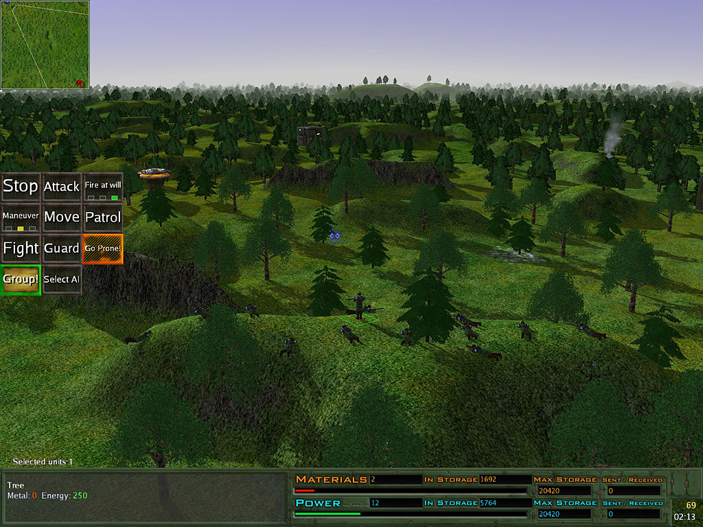
- Why do you have a horizontal bar across the bottom?
- Why do you have full resources bars across half the screen at the bottom instead of in their classic locations as expected?
- Why does storage capacity have its own dedicated field?
- Why is it to the right of the bars?
- Why does the current filled capacity not have a separate field too at the right instead of floating above the bar?
- Why is the current stored resources not aligned correctly with the resource bar?
- Is the In storage label for the field on the left of the label or the field on the right of the label?
- Is the Materials label for the fireld on the left the bar below or for a collection of fields?
- Is the top resource bar a power bar or a resource bar?
- Why is it below and not above or alongside?
- What is the field next to the material and power labels if the in storage field refers to the field to the right? '2'? 2 what? 2bannanas? 2 apples? +2 apples? -2 apples? 2 units? 2 power producers? 2 power users? 2 power being produced? 2 power left over after income - cost? 2 power per second? per minute? per frame?
- Why is there a sent/recieved field? Does the value indicate sent power or recieved power? Is it a ratio? Sent to whom? What units is it in? Sent in the last second or the last minute? Or through the whole game? Or is it the percentage of resources you've set to share like the red marker in the default resource bar you've replaced?
- Why is the text for emterial orange and the bar red?
- Why is power cyan blue but the bar is green?
- Is that bar red because resources or low or because red is associated with materials?
- Why have you used that font and smallcaps?
Re: P.U.R.E. 0.55
I always thought that UI:s like homeworld 2 and supcom where the exception, not the rule?
I agree with following the conventions of where and what to put up tough. But I do prefer a static UI that could be hidden completly with a hotkey for screenshot/video purposes.
I agree with following the conventions of where and what to put up tough. But I do prefer a static UI that could be hidden completly with a hotkey for screenshot/video purposes.
Re: P.U.R.E. 0.55
Those tiny collapse buttons on each panel onyl tend to get clicked the first game and usually by the pro elite who want to customize it all, rather than the average user whose fine with a hide all button that hides everything like the f5 toggle in spring.

Re: P.U.R.E. 0.55
Quoting this again because it's so many pages back that it's hard to take a look at.Argh wrote:
I don't like your bottom bar. You basically took the slim grey bar on the top and made it into a huge panel on the bottom. Sure, big panels at the bottom are common in RTS but usually they house the minimap and all command buttons, not just the resource counter. I think that panel will interfere with common widgets (like idlebuilders) without any gain.
-
Guessmyname

- Posts: 3301
- Joined: 28 Apr 2005, 21:07
Re: P.U.R.E. 0.55
I'd also suggest arranging the order buttons in two coloumns rather than three, simply because they line up with the minimap better (makes it look less like they're sticking out into the screen)
Re: P.U.R.E. 0.55
or perhaps making them 1 row tall and positioning them directly above the bar at the bottom? That would be similar to how TA Kingdoms did build menus..
-
Guessmyname
- Posts: 3301
- Joined: 28 Apr 2005, 21:07
Re: P.U.R.E. 0.55
Eh, I hated that. Build menus should be at the side...

Re: P.U.R.E. 0.55
Use three columns, force the minimap to match that width. Might require movement of the columns, however.
The bottom bar of the GUI isn't a terrible idea, but it doesn't use the space effectively. Currently you have different sorts of columns and text size for no reason, and I think you can do more with it...
Maybe some lua buttons for things like X-Ray, Idle Builders, Information, etc.
The bottom bar of the GUI isn't a terrible idea, but it doesn't use the space effectively. Currently you have different sorts of columns and text size for no reason, and I think you can do more with it...
Maybe some lua buttons for things like X-Ray, Idle Builders, Information, etc.
Re: P.U.R.E. 0.55
<grumbles>
I'm way, way, way too tired to answer all of this at length at this time- I've driven 9 hours, and participated in two birthday parties, I'm toast.
That said, here's the very short answer:
1. I am not writing a new UI before release. Period. I may revise what I've got, and some of the suggestions I've read make sense, although reconciling them with all of the possible combinations of user preferences and UI Widgets is flat-out impossible, but I will review them and implement the ones that are practical and genuinely improve the design, without requiring major changes.
I'm not repeating my previous statements about why a major UI rewrite is not within scope, and I'm not changing the plan, which is already in train- I have a checklist of things to do, and it's rather daunting. Too much work already lies before me, over the next two weeks, and I'm not turning that into a month-and-a-half, or longer, to do a major rewrite of Spring's UI.
I'm probably kidding myself about even that timeframe, given my significant lack of knowledge about many of the things that would be required, tbh. Meltrax could do it, Quantum or jK could probably do it, but this is almost certainly too far outside my skillset. It's not like learning some Lua, enough to get a few things done, has made me into a coding wizard, people. I still suck, I just suck less than I did three months ago.
2. If somebody wants to do some actual... work... as opposed to writing walls of text and complaints... I would be willing to spend one day of my time this week, building a visual mockup and feature explanation of what I would consider a proper, final UI design. If what I ask for is delivered at some future date feature-complete, code-wise, then I will make the additional time required to implement it into my game design and polish it, during the beta period, or in a future release.
If I do not have a reasonable belief that action will result on item 2, I will not spend a minute more on this issue until after release, other than addressing the reasonable requests that do not go out of scope.
Re: P.U.R.E. 0.55
For starters I'll suggest to undo the resbar changes, it's a change for the worse IMO.
Re: P.U.R.E. 0.55
tbh you've already demonstrated the ability to fix this by doing it in the first place. Sure you have to learn more lua and OGL to do fancy other stuff, but nobody said you needed to do the fancy stuff, you have already learnt all the skills necessary for a half decent static GUI by doing that bar across the bottom.
The test here is not lua skill, its thinking through and justifying your design choices from a usability standpoint then beautifying those choices afterwards. No programming skill is needed to design good GUIs, although it helps implement them ^_^
The test here is not lua skill, its thinking through and justifying your design choices from a usability standpoint then beautifying those choices afterwards. No programming skill is needed to design good GUIs, although it helps implement them ^_^
Re: P.U.R.E. 0.55
Short of any final disasters occurring, the Alpha release will be this evening. Beta will proceed when I've gotten feedback from the people viewing Alpha.
If you'd like to participate in the Beta, please let me know.
If you'd like to participate in the Beta, please let me know.