
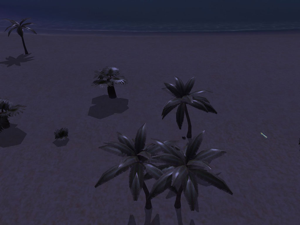
aGorm's trees have double-sided leaf sections, so that they can be seen from the bottom side, among other things. A single palm tree runs around 600 triangles. When you combined that + 512 + 1024 maps... it's ouch-time. The stuff in BlackLake Swamp was (with a few exceptions) optimized a lot better for polycount, by comparision.
I guess I could remodel them, and lose the bottom sides of the leaves (which, on the bushes at least, are practically never seen anyhow).
I studied the techniques used for trees in Realm of Chaos the other day- I'm hoping I can apply some of the things they were doing there to make stuff that's a little less... ouch. But it's hard, frankly. Trees are one of the very few natural structures that are very resistant to cutting down on triangles. You go to a certain point, and it starts looking very artificial. So I've just gone and looked at fillrate instead. I'm hoping that eventually I have a faster way to draw these sorts of objects, frankly.
P.U.R.E. 0.8 RC3
Moderators: Moderators, Content Developer
-
Warlord Zsinj
- Imperial Winter Developer
- Posts: 3742
- Joined: 24 Aug 2004, 08:59
Re: P.U.R.E. 0.8 RC3
Mmm, 600 per palm tree is total overkill though, even if they do look good. For 600 polies I'd expect bloody coconuts 
I understand the issue with the trees though. Spikedhelmet's trees, for example, are often gorgeous when viewed from above, but when viewed from lower angles you see right through the faces as if you were looking down the pages of a book, and it looks pretty odd.
Rome: Total War had excellent trees that were low poly, could be viewed from tight low angles, and generally looked pretty decent.
Re: P.U.R.E. 0.8 RC3
They have coconuts (non-bloody though).I'd expect bloody coconuts
Removing the lower faces reduced the polycount by about 25-40% per tree, so I'm keeping them that way.
I think that the main thing with trees is not their polycount, and is only partially fill-rate (obviously, low is better), but how they're being drawn. Spring's default 3D trees actually are fairly high-poly, but they're drawn with a fragment shader, so they draw lightning-quick. If I had a working model loader, I'd probably go the same way, and even omit having them cast shadows, frankly.
-
Warlord Zsinj
- Imperial Winter Developer
- Posts: 3742
- Joined: 24 Aug 2004, 08:59
Re: P.U.R.E. 0.8 RC3
step 1, remove coconuts
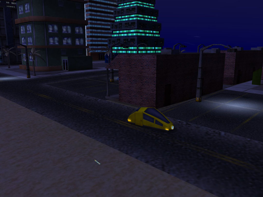
street lights look much better btw. Now stick them infront of cars as headlights
street lights look much better btw. Now stick them infront of cars as headlights
Re: P.U.R.E. 0.8 RC3
Doing headlights is pretty trivial. Sure, why not, since the little robot cars will be driving around anyhow? Just don't expect them to deal with slopes in a realistic fashion, that's too CPU-intensive right now.

Re: P.U.R.E. 0.8 RC3
WTB a GTA original remake (Top down)for spring
Re: P.U.R.E. 0.8 RC3
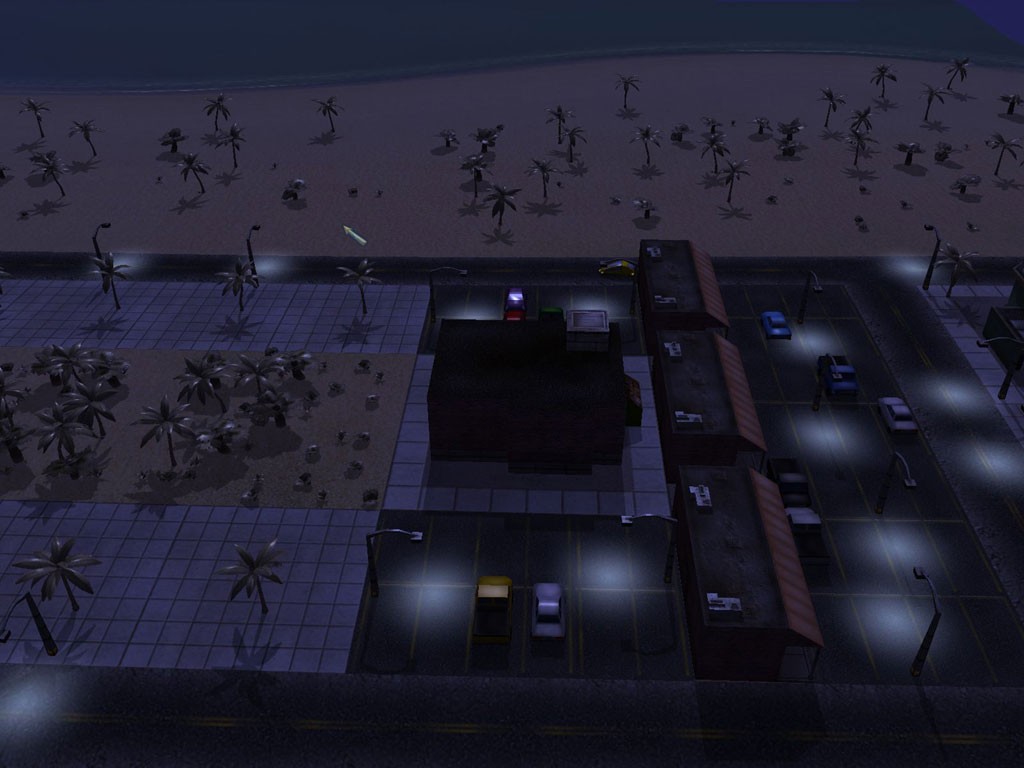
are we going to be able to blow up all these pretties?
Re: P.U.R.E. 0.8 RC3
Yes, you can blow all of this up, and it's pretty
Re: P.U.R.E. 0.8 RC3
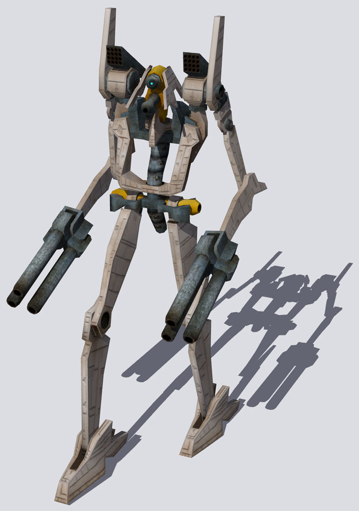
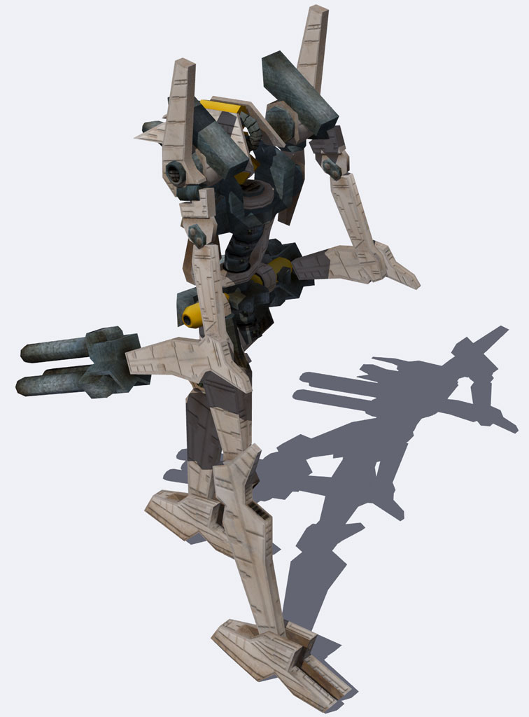
Sometimes, I get done with something, and it actually feels like it was worth the time spent. This is one of those times.
The Overlord. Model by Guessmyname, with minor changes by me, paint by me. Click to enlarge.
Oh, and... I'm sure somebody will ask, "why is part of it yellow?"... that's the "brass" that you've seen on models like the LaserCannon and the new Assault Shell. This model will, in short, be even more ridiculously cool in Spring, I didn't want to stay up another 45 minutes making glow / reflect stuff for a render, it's already Very Damn Late, and I must sleep.
Re: P.U.R.E. 0.8 RC3
very cool model my faiv PURE model by a longshot well this and the sniper shell.
Why does it have ARM logo greebles for nipples ?
Why does it have ARM logo greebles for nipples ?
-
clericvash

- Posts: 1394
- Joined: 05 Oct 2004, 01:05
Re: P.U.R.E. 0.8 RC3
That is fracking awesome, this just gets better and better :D:D
Re: P.U.R.E. 0.8 RC3
Looks great, cant wait for ingame shots!
-
Guessmyname

- Posts: 3301
- Joined: 28 Apr 2005, 21:07
Re: P.U.R.E. 0.8 RC3
Just to let you know, I've 'retired' from working on PURE. Since it's more or less done and I have other projects (SWS, writing, some HL2 stuff, not to mention upcoming exams), I'm withdrawing from the project. It's been fun, and I've enjoyed coming up with from beautifully insane unit designs, but since I'm no longer needed so much, I'm off.
Re: P.U.R.E. 0.8 RC3
Your help to me has been incredible, GMN. Thanks for everything.
One funny part is that I have quite a lot of models by you that still aren't skinned, and may show up some day. So you're not really "done", I'm just behind
One funny part is that I have quite a lot of models by you that still aren't skinned, and may show up some day. So you're not really "done", I'm just behind

Re: P.U.R.E. 0.8 RC3
posted in your moddb news post. I work tonight though.

Re: P.U.R.E. 0.8 RC3
New model looks pretty cool except for the gun-hands - aside from being inconsistent visually (thin arms --> giant guns? on a model where almost everything has a pretty clear mechanical explanation, its a bit of a discrepancy - where does the ammo/power come from?), and really stick out (in a bad way) from the rest of the model, as if they were tacked on in retrospect. Just my thoughts.
Anyways, GMN, if you ever have some free time and feel like flexing your wild modeling muscles, I've got a few concepts to run by you (just 3, actually >_>)
Anyways, GMN, if you ever have some free time and feel like flexing your wild modeling muscles, I've got a few concepts to run by you (just 3, actually >_>)
-
Warlord Zsinj
- Imperial Winter Developer
- Posts: 3742
- Joined: 24 Aug 2004, 08:59
Re: P.U.R.E. 0.8 RC3
The model is very cool, though I do agree that the gunhands are a little odd, it's like every mega mech these days has to have guns on the end of it's arms (see: TA commanders, SupCom Commanders, SupCom's Galactic Collossus, battletech...).
Anyway, my main area of criticism is with the texture. I like your 'meta' approach to the design, I think all the respective pieces are very nicely delineated, and it makes the whole thing read pretty well, despite the chance for such a spindly bitsy design to be a jumbled mess.
Most good texture artists that I know sometimes struggle with doing that meta design stuff - but on the other hand, their detailed design is impeccable.
I think the texture is a little let down on the detailed side. The panelling, specifically on the arms and legs, feels generic - like you've got a basic emboss layer and are pasting in different shapes (or more specifically, are cutting away from a bigger shape). They don't seem to be saying much about the surface itself other then generic filler greebles. I've seen this elsewhere on PURE stuff, but it's fine there because they are on smaller vehicles, and it doesn't seem odd - also, you're only one person with a huge texture job to do, so it makes sense to cut corners on the smaller units with that sort of mass area greeble noise - but I think on a mega unit like this, a bit more attention to detail would go a long way.
However, I'd say that the panelling isn't the weakest area of the model, it's at least very much in keeping with the style of the rest of your textures. Certain areas - the guns, the missile pods, other darker metal bits - don't really have any detail to speak of at all, but rather a grainy, vaguely metal texture overlayed. The guns have a bit of charring, but it does feel like you need some sort of detail there - barrel delineation, muzzleflash holes, wiring, edge highlights, etc.
Seems like on a big mecha unit like this, with a really ingenuitive model, it is worth putting in the extra attention to detail.

Re: P.U.R.E. 0.8 RC3
"meta design"? I think you mean the low frequency detail?