
That texture is exceptional. Care to give me a few pointers?
Random WIP 2006-2011
Moderators: MR.D, Moderators
Re: Random WIP
That texture is exceptional. Care to give me a few pointers?

Re: Random WIP
naked daemon dude:
the new eyes are much cooler, the older ones reminded me of gay goth makeup tbh.
Spherezeus:
cool, maybe add some isolationthingies (http://img.directindustry.de/images_di/ ... 218007.jpg) or radiators (http://www.helihausen.de/images/EA-031.jpg) on his back and arms?
might go well with the electric gun image.
-
Guessmyname

- Posts: 3301
- Joined: 28 Apr 2005, 21:07
Re: Random WIP
Yeah, make it look more like a walking electric generator / transformer / whatever that isn't very happy with you.

Re: Random WIP
I've made a start on skinning my evil daemonic cube of ultimate PAIN 

Seriously though, how mad does that look (okay, couple of glitches but it's only my second 3D model ever) - I'm so psyched! Way better than the "Fugly Tank" (tm). You know what, perhaps I'll actually be able to pull this off
Hmm - I won't post this on my thread because I post too many images: I'll wait till it's finished
Oh yeah, so it's basically like an armoured teleporting transport thingy: a possessed cube that's bigger on the inside than the outside. The sides are separate so I can animate it opening up and so on.
Let me know what I can improve/what you think

Re: Random WIP
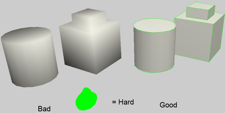
You should fix the normals using hardness>soft/hard in edge mode.
See the picture? If you don't understand I can explain it
See the picture? If you don't understand I can explain it
Re: Random WIP
hmmm?
I actually made the face smooth on purpose because, well, it looks better smooth. You're saying I can't have a smooth face
You make me very sad
Or are you saying a missed a few liney-thingeys? That's a possibility...
I actually made the face smooth on purpose because, well, it looks better smooth. You're saying I can't have a smooth face
You make me very sad
Or are you saying a missed a few liney-thingeys? That's a possibility...
Re: Random WIP
What I'm saying is:
-Make the 90 degree angles on the box hard
-Make the edges that go from the box to the mask hard (where it's attatched)
The rest can be soft.
-Make the 90 degree angles on the box hard
-Make the edges that go from the box to the mask hard (where it's attatched)
The rest can be soft.
Re: Random WIP
Ah! Gotcha - I think this texture will explain my choice of edges:

It's sort of bubbling out of the sides of the box you see, hence the smooth edges...
This was the concept:

What do you think of the finished model?
It's sort of bubbling out of the sides of the box you see, hence the smooth edges...
This was the concept:
What do you think of the finished model?
Re: Random WIP
Edges are good now. If you want it bubbeling you can make the edges where the box and face meets soft, but then you should make them flow into the box more.
But it looks good like this, I wouldn't change it.
But it looks good like this, I wouldn't change it.

Re: Random WIP
@ maackey
fireworks vectors!
lets talk about the upper arm, that's a fairly "simple" part that uses the skin motif.
1st) with doing biological stuff... seam placement is very important. make sure to hide your uvw seams in areas they wont be seen. every part of the upper arm is connected as much as possible, except where the seams are... in the joints, and on the back part of the arm so that it's hidden when the unit stands with its arm at its side. the uvws for the shoulder are set up very much like the results of a "cylindrical unwrap) with flesh, pixel-perfect proportions on your uvws are not nearly as important as minimizing the number of seams.
2nd) really it's all about pre-shading to get the shape of the musculature. firstly, made a large shape covering all of the shoulder uvws with a 2 pixel gutter to stop from having any bleeding. second, i deduced where the "top" and "bottom" of the arm would be. i applied a radial gradient to the shape, with a yellowish color as the high point and a brownish color as the low point. i adjusted the centre-point of the gradient (black arrow in fireworks) so that the brightest part would be the top of the shoulder.
3nd) for the detailling (lets go with the shoulder muscle) i copypasted the fill information of the arm onto a circular vector shape, and adjusted the gradient within it (you can stretch the length of the gradient further than the bounds of the object in order to "skip" some parts of the gradient) in order to blend the muscle shape with the rest of the texture, i gave it an edge value of "feather : 3"
also i figured some texture might be nice on the skin, so i duplicated the "background" for the arm, selected the one on the lower layer, made it solid black, selected the one above, and gave it a texture of "plaster" with an intensity of 25 and transparency set to true (gives a nice faked bump map effect)
the beauty of working with vectors, is you can click-drag the shapes the way you want... trial and error is very, very easy to do because you can always go back, you can always reshape, and you never have to erase.
if you'd like, i can share the source png with you (you'd have to open it with fireworks in order to see what im going on about with some of the attributes and options i described, fireworks png is more like a psd than a "true" png) you can get a fireworks 30 day trial from the website with full functionality. however, you could do all of this i think with photoshop paths, just not super familiar with the method.
something else worth researching if you're having trouble is the method of painting fantasy miniatures, my knowledge of which i attribute my success here to.
@ willbefast : i like it. i think you've made a lot of progress, even over the course of two models. you might benefit from pre-shading also.
@ all : would anyone benefit from a "fireworks & texturing" tutorial aimed at fast results? certainly could make one.
Re: Random WIP
Thanks Kaiser, but what's pre-shading? Is that like ambient occlusion? There was a post about that on the Wolfire blog a while back...
BTW - I have almost no idea what you're talking about, but it sounds really clever - well done
BTW - I have almost no idea what you're talking about, but it sounds really clever - well done
Re: Random WIP
pre-shading is an artistic technique commonly used on painting scale miniatures. the
idea is to figure out where the light will hit the unit, and exaggerate it, so that regardless
of the lighting condition, the model will still appear to be being hit with light from the
same angle.
for instance, that text is colored in a gradient indicating light at the top, and shadow at the bottom. if you were to turn the monitor 90 degrees clockwise, the light would appear to be coming from the right.
of course, when applied to game models, you have to be conscious of all of the possible angles the unit could be viewed at... with your box for instance, it flips and turns as it moves around the battlefield, so directionally pre-shading isn't really an option; it would look strange once the box has flipped 180 degrees, because the light would be coming from the ground.
what i would suggest is to look at the relief of the surfaces of each face (so for each side of the cube) and highlight the parts that are furthest from the centre of the model while darkening the ones that are closest... so you'd be highlighting protruding elements like the lips, eyelids, cheekbones, edges of the cube and soforth, while darkening the inset parts such as the mouth, the eyesockets, and the line determining where the "face" meets the "cube".
sounds complicated, and there is no real set-in stone rule to applying this technique to 3d models for games... in fact, many people simply skip the step. however, if you play around with it, i think you'll find it's fairly easy to learn, and certainly enhances the look of your work.
and because a picture is worth 1000 words...

this is PROBABLY how i would approach highlighting / darkening your model, not sure exactly because i dont have the model itself... just worked on the face area as best i could. for lightening areas, i used a "value" brush of pure white with blurred edges, for the darkening i used the same but pure black. im sure you can do a much better job of it; this was just an attempt to illustrate my example.
idea is to figure out where the light will hit the unit, and exaggerate it, so that regardless
of the lighting condition, the model will still appear to be being hit with light from the
same angle.
for instance, that text is colored in a gradient indicating light at the top, and shadow at the bottom. if you were to turn the monitor 90 degrees clockwise, the light would appear to be coming from the right.
of course, when applied to game models, you have to be conscious of all of the possible angles the unit could be viewed at... with your box for instance, it flips and turns as it moves around the battlefield, so directionally pre-shading isn't really an option; it would look strange once the box has flipped 180 degrees, because the light would be coming from the ground.
what i would suggest is to look at the relief of the surfaces of each face (so for each side of the cube) and highlight the parts that are furthest from the centre of the model while darkening the ones that are closest... so you'd be highlighting protruding elements like the lips, eyelids, cheekbones, edges of the cube and soforth, while darkening the inset parts such as the mouth, the eyesockets, and the line determining where the "face" meets the "cube".
sounds complicated, and there is no real set-in stone rule to applying this technique to 3d models for games... in fact, many people simply skip the step. however, if you play around with it, i think you'll find it's fairly easy to learn, and certainly enhances the look of your work.
and because a picture is worth 1000 words...
this is PROBABLY how i would approach highlighting / darkening your model, not sure exactly because i dont have the model itself... just worked on the face area as best i could. for lightening areas, i used a "value" brush of pure white with blurred edges, for the darkening i used the same but pure black. im sure you can do a much better job of it; this was just an attempt to illustrate my example.
Re: Random WIP
Aw man! You even did a picture - I like pictures
Very informative - definitely something I'm going to have in mind from now on. This was my first texture bar the Fugly Tank (which was, well, Fugly), up till now all my computer artwork has been 2D pixel art-

and 'toon sprites:
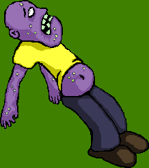
All done in Paint-style image editors, rather than photoshop-style ones like Gimp.
The latter's got some very amateur shadows and highlights, so sort of like what you were talking about only on a 2D image (when animated, the moving lights and shadows really bring it to life - sadly I lost the high-res versions of those sprite during a hard-disk fail), the problem with textures is that I have trouble getting my head around what goes where when it's unwrapped - I was happy to get the eyes and mouth in the right places, and also to get the skin looking like skin (with translucency, veins, warts, etc) and the metal looking like metal.
Thanks as always for the help
Very informative - definitely something I'm going to have in mind from now on. This was my first texture bar the Fugly Tank (which was, well, Fugly), up till now all my computer artwork has been 2D pixel art-
and 'toon sprites:
All done in Paint-style image editors, rather than photoshop-style ones like Gimp.
The latter's got some very amateur shadows and highlights, so sort of like what you were talking about only on a 2D image (when animated, the moving lights and shadows really bring it to life - sadly I lost the high-res versions of those sprite during a hard-disk fail), the problem with textures is that I have trouble getting my head around what goes where when it's unwrapped - I was happy to get the eyes and mouth in the right places, and also to get the skin looking like skin (with translucency, veins, warts, etc) and the metal looking like metal.
Thanks as always for the help

Re: Random WIP
Looks great! That will look really good when the glow / reflect is applied with tex2

Re: Random WIP
one day I will finish this stuff...

- Attachments
-
- Untitled-1.png
- (63.09 KiB) Downloaded 215 times
Re: Random WIP
Nice one smoth
@KaiserJ: I found the post I was talking about:
http://blog.wolfire.com/2009/09/ambient ... haracters/
Essentially ambient occlusion is a technique that creates a texture map with highlights and shadows automatically. If nothing else this makes different parts of the model a lot easier to identify (I've been using polygon outlines and drawing marks, then refreshing the texture to see where the mark is, to get my bearings).
I'm not entirely sure how it's done though - they mention a program called "xNormal" in the comments. Whatever the case I'm fairly certain that it'll accept .obj or .3ds files - they're pretty much the standard I think. Not that I know anything about 3D modelling.
Of course, there's a good chance that low-polygon models, which are given the illusion of detail by their texture, don't benefit much. I'd be game to give it a try though - sounds a lot like cheating

Re: Random WIP
The Dev build of Wings can bake Ambient Occ to the UV Map, (though it works better with a high polly model...)
aGorm
aGorm

Re: Random WIP
Smoth:
That was for a DS modlet originally, wasn't it?
That was for a DS modlet originally, wasn't it?

Re: Random WIP
concept of arm phalanx replacement, suggestions?
- Attachments
-
- phalanx.JPG
- (52.14 KiB) Downloaded 138 times