Guess i need some sort of logo now, and some fancy title to copy paste into my screenshots. Damn, if i wouldnt have been so demanding on other mods, i wouldnt have those damnending for nearly damnanything.

KaiserJ is nice, but sorry, not what im searching for.
It should have a colourschme like this, or website and shiny purposes, while a even moar boring monochromatic thingy is waiting to be copy pasted into screenshots. Its got to be really realy clear, and boring, extremely easy to read, so that attention-whoring of the eyecandy simply dereferences towards the source.

Here is the colourscheme, and even thats to fancy for screenshots. Thats just good enough for webpages, who you only see once or twice- for adds who need desperatly to grab your attention. If you look, and remember those titles who left the best impression- you return to the best solution, simple white text, that is easy to read, in a distinguishable, pure font, its the japan design philosophy of purity of lines. It transports seriousness, calmness, the boredom of a professional. No Teenagers in the company, except as cofeeboys and playtesters.


Love this version, but even that looks immature.

Black background (always for a subconcious_splitseconds causes the fear of computer-shutdown) White text, only one symbol/logo representing everything, repeating.


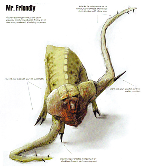
Problem is I even lack a symbol- out of the standardsymbolcatalogue, no new thing, just something that always was there, and that gets reconnected with my mod. Got to transport the clash of nature and synthetic/techno, the dark horror mood, you cant transport with rts.