
i'm amazed...
What a details, and made so fast, 2 hours?
It looks cool, complete, colorfull and well thought of.
but it hasnt got the pro-look in my opinion.
SpringFiles v3.0 Preview
Moderator: Moderators

Re: SpringFiles v3.0 Preview
Jazcash wrote:
jj wrote:but it hasnt got the pro-look in my opinion.
Needs more web 2.0 style wet glass smooth border buttons.

Re: SpringFiles v3.0 Preview
1) Why?TradeMark wrote:Looks cool.
Few fixes to make:
1) make max width to 1000. (adverts width not counted).
2) smaller font for titles, it looks ridiculously large compared to plaintext font size.
3) rename "map filters" to "list maps by type" or something more informative about the action you do when you click it. actually, i dont think that has to be at the front page at all, could be put in a search page instead. I actually never used this feature on jj's site...
4) remove percents from "most downloaded files".
5) latest downloaded files is useless information that serves no purpose.
6) statistics at front page is waste of space. except "total files" etc is nice to see, or that bandwidth thing jj had before.
7) remove polls, they are useless, if needed, make them small and merge them in the news portion.
sorry for "whining"
2) I think the big titles make it more clear and easier to identify the sections a lot easier
3) When you click on the images, they would highlight in perhaps a white tint and would act as kind of selection items so you would be able to select multiple filters using Ctrl or something
4) Yeh, will do
5) Well, I use the one on the current SpringFiles.com page every now and then when I'm in a game on some map I don't have, if others don't have it either, chances are they used SpringFiles to download it, that means as soon as I go on to SpringFiles.com, I can see the link to the map right on the homepage, regardless of how hard it is to find using Search.
6) I dunno, I think they're interesting to read every time I visit a site that displays stats on its homepage. Gives people a good idea of the kind of site it is and what it deals with.
7) Maybe...
When I was thinking of items to put on the homepage, I did struggle for half of it, just ended up shoving those things on cause I couldn't think of much else to put on there. I appreciate your feedback
jj wrote:but it hasnt got the pro-look in my opinion.
So more shiny shiny?Hoi wrote:Needs more web 2.0 style wet glass smooth border buttons.
Re: SpringFiles v3.0 Preview
Hmm, yeah I'll give you that, well I can't be bothered to redesign the whole thing again as that would take quite a while seeing as most of it is blocky so I'll save curves for the next web design I do for something Spring-relatedjj wrote:it's blocky

Re: SpringFiles v3.0 Preview
1) because not everyone has huge resolution like you do. and it is more readable as well.Jazcash wrote:1) Why?TradeMark wrote:Looks cool.
Few fixes to make:
1) make max width to 1000. (adverts width not counted).
2) smaller font for titles, it looks ridiculously large compared to plaintext font size.
3) rename "map filters" to "list maps by type" or something more informative about the action you do when you click it. actually, i dont think that has to be at the front page at all, could be put in a search page instead. I actually never used this feature on jj's site...
4) remove percents from "most downloaded files".
5) latest downloaded files is useless information that serves no purpose.
6) statistics at front page is waste of space. except "total files" etc is nice to see, or that bandwidth thing jj had before.
7) remove polls, they are useless, if needed, make them small and merge them in the news portion.
sorry for "whining"
2) I think the big titles make it more clear and easier to identify the sections a lot easier
3) When you click on the images, they would highlight in perhaps a white tint and would act as kind of selection items so you would be able to select multiple filters using Ctrl or something
4) Yeh, will do
5) Well, I use the one on the current SpringFiles.com page every now and then when I'm in a game on some map I don't have, if others don't have it either, chances are they used SpringFiles to download it, that means as soon as I go on to SpringFiles.com, I can see the link to the map right on the homepage, regardless of how hard it is to find using Search.
6) I dunno, I think they're interesting to read every time I visit a site that displays stats on its homepage. Gives people a good idea of the kind of site it is and what it deals with.
7) Maybe...
2) relating to the above: not everyone has huge screen like you do, for you the font might look ok, but on my 1680x1050 / 22" screen it looks too huge, its hard to read and get a grasp on the content on a single glance. now i have to hover over each of the titles to find what i want, normally i would instantly see where the link is since they would be near each other in a list format, thats why a list type of menu is the best as well, although, i dont mind about those horizontal menus either. but for a content site like downloads site, its easier to add a new item in a list type of menu, than redesign the site every time because theres not enough horizontal spacing. horizontal menus should be used for main categories that have sub categories in them only.
3) for what purpose? if i want to find a map, i usually know what im going to search, therefore i should have options for that query im going to make, no need to put the options everywhere and prevent me from seeing any other type of map all the time until i choose otherwise.
4) ok
5) rule number 1: never fix bugs by adding new features. if the search function was like on mapinfo.adune.nl there would have never been such a problem.
6) yeah, true, but it shouldnt take that big space on the site, and it should mostly be on front page only, also, did you think how the page would change when i open a map page? my version doesnt have any of these problems we have found so far, so i wonder why not make it that way...
Yeah, I appreciate your work as well.Jazcash wrote:When I was thinking of items to put on the homepage, I did struggle for half of it, just ended up shoving those things on cause I couldn't think of much else to put on there. I appreciate your feedback

Re: SpringFiles v3.0 Preview
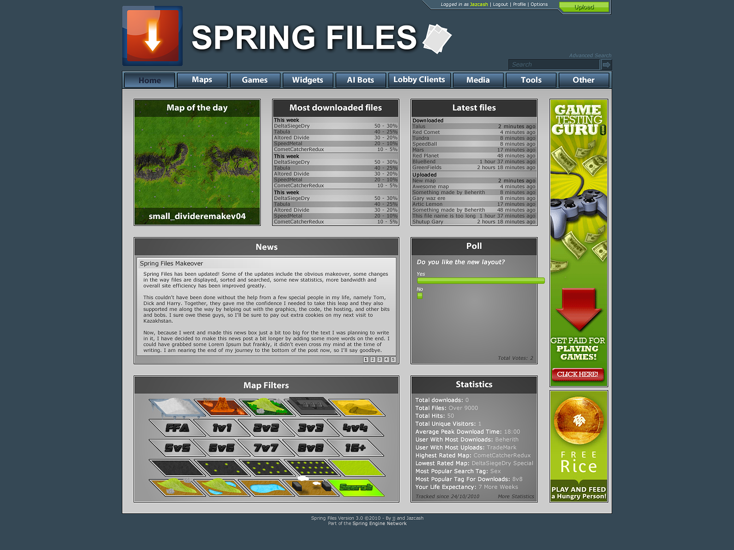
- The bits of paper next to the title look redundant, they should be incorporated into the logo to better fit with the logo, right now it violates the logo brand spec and it doesn't feel right.
- The black text on the current page menu item doesnt look right, its not particularly readable
- The very name spring files is misleading if its going to host supcom glest etc stuff
- The table in most downloaded etc needs more padding, and is hard to read. Needs more contrast between the text and the background, especially at the sides.
- Most text is far too small.
- The isometric shape of the map filters etc seems a little gimmicky, and serves no purpose. Surely there's a better way of representing filters
- small_divideremakev04 - This isnt nice to look at, provides no meaningful information, use the proper title!
- Search is almost invisible
- The top of the logo is misaligned with the little thing sticking out the top with the login etc, give it more vertical padding at the top
Re: SpringFiles v3.0 Preview
You would be the only one to complain about the logo not meeting the specified guidelinesAF wrote:
- The bits of paper next to the title look redundant, they should be incorporated into the logo to better fit with the logo, right now it violates the logo brand spec and it doesn't feel right.
That's because it's supposed to have a "pushed in" effect as if the button is indented, in which case the text would get darker, and it isn't black, it's dark blue.AF wrote:
- The black text on the current page menu item doesnt look right, its not particularly readable
Not my problem, and also, I don't think it should be hosting files for either games anyway, but that's not my decision either.AF wrote:
- The very name spring files is misleading if its going to host supcom glest etc stuff
Agreed.AF wrote:
- The table in most downloaded etc needs more padding, and is hard to read. Needs more contrast between the text and the background, especially at the sides.
I dislike lots large text when it comes to trivial information. Big text is for headings, and important information regarding navigation, post titles and the like.AF wrote:
- Most text is far too small.
Well, it was intended to help when it came to making the map-related ones actually look a bit like maps. Then when I finished them, I actually quite liked the concept anyway cause they looked a bit like layers. So when it comes to using them, you select a layer and it builds a nice filter sandwichAF wrote:
- The isometric shape of the map filters etc seems a little gimmicky, and serves no purpose. Surely there's a better way of representing filters
Not an awful lot I can do about that if the map's author doesn't want to name there maps in a friendly way. I myself certainly wouldn't want to have to change all the map's names to be user friendly just so it looks nice on the home page.AF wrote:
- small_divideremakev04 - This isnt nice to look at, provides no meaningful information, use the proper title!
Erm, I disagree? For one thing, it's a lot more obvious than having a shoutbox and a searchbox directly next to each other. Have you even seen the amount of map names in the searchbox before? People got confused daily. Once you know where the searchbox is once though, you'll remember for the next time. I suppose if I added a magnifying glass icon or something in there though it would help.AF wrote:
- Search is almost invisible
It's not supposed to be aligned, in any way.AF wrote:
- The top of the logo is misaligned with the little thing sticking out the top with the login etc, give it more vertical padding at the top
Thanks for the feedback. Sorry if I appear a little hostile, I just struggle to be nice when disagreeing
Last edited by Jazcash on 26 Oct 2010, 01:55, edited 1 time in total.

Re: SpringFiles v3.0 Preview
I like it very much.
-
Sucky_Lord

- Posts: 531
- Joined: 22 Aug 2008, 16:29
Re: SpringFiles v3.0 Preview
It looks nice, but the current version is fine aswell! :)

Re: SpringFiles v3.0 Preview
Is SpringFiles open source? I would like to reuse code that determines what is map about (like sea, hilly, ffa)
Re: SpringFiles v3.0 Preview
Spring files is Closed-source for the masses, but open-source for everyone who would want to cooperate.
-
SirArtturi

- Posts: 1164
- Joined: 23 Jan 2008, 18:29
Re: SpringFiles v3.0 Preview
Imo your mock up is great Jaz. It simple yet pleasing and easy for eye. Definitely servers the purpose.
Theres however few things I like to comment:
Download icon's arrow could be broader. I think its too thin, arrowish, and makes me feel like the site isnt actually broadband file sharing site...
Search box is a bit invisible. You could paint the search text and search button arrow lime green as you did for login information.
I think you dont need to put those "files" image after the header. The site isnt actually about "files" or documents of those sort.
And yes, the paragraph font is too small while rest is relatively big. It makes it hard to read...
However, as AF said, isometric style may not work very well. At least I had hard time to understand what all the images meant.
Theres however few things I like to comment:
Download icon's arrow could be broader. I think its too thin, arrowish, and makes me feel like the site isnt actually broadband file sharing site...
Search box is a bit invisible. You could paint the search text and search button arrow lime green as you did for login information.
I think you dont need to put those "files" image after the header. The site isnt actually about "files" or documents of those sort.
And yes, the paragraph font is too small while rest is relatively big. It makes it hard to read...
Well, not necessarily need to be in front page, but definitely needs to be in browse & search. I've used this function many times when I just wanted to browse, for example sea maps or high wind maps etc...TradeMark wrote: 3) rename "map filters" to "list maps by type" or something more informative about the action you do when you click it. actually, i dont think that has to be at the front page at all, could be put in a search page instead. I actually never used this feature on jj's site...
However, as AF said, isometric style may not work very well. At least I had hard time to understand what all the images meant.
It serves a purpose and thats the purpose of latest downloads. So clear. I use it when I want to grab the file that is just downloaded. That is for example situation jaz mentioned.TradeMark wrote: 5) latest downloaded files is useless information that serves no purpose.
It's not waste of space when theres nothing more important to fill in.TradeMark wrote: 6) statistics at front page is waste of space. except "total files" etc is nice to see, or that bandwidth thing jj had before.

Re: SpringFiles v3.0 Preview
I really like it and I really rather dislike jaz so it must be good 
Re: SpringFiles v3.0 Preview
No, you search for the file you need, you dont hope someone downloaded your file in order you to get the link!!SirArtturi wrote:It serves a purpose and thats the purpose of latest downloads. So clear. I use it when I want to grab the file that is just downloaded. That is for example situation jaz mentioned.TradeMark wrote: 5) latest downloaded files is useless information that serves no purpose.
-
SirArtturi
- Posts: 1164
- Joined: 23 Jan 2008, 18:29
Re: SpringFiles v3.0 Preview
Why should I search if I can grab it right away from latest downloads? It's easier. Cant see the problem. First I hope and if my wish comes true, Im lucky to do it easier way...TradeMark wrote:No, you search for the file you need, you dont hope someone downloaded your file in order you to get the link!!
Re: SpringFiles v3.0 Preview
Yeah. Why not make every link randomized, so whatever you ever need, just click somewhere on the page and hope you go to what you wanted, and then some search box if that failed... fail trollSirArtturi wrote:Why should I search if I can grab it right away from latest downloads? It's easier. Cant see the problem. First I hope and if my wish comes true, Im lucky to do it easier way...TradeMark wrote:No, you search for the file you need, you dont hope someone downloaded your file in order you to get the link!!
Re: SpringFiles v3.0 Preview
GotchaSirArtturi wrote: Download icon's arrow could be broader. I think its too thin, arrowish, and makes me feel like the site isnt actually broadband file sharing site...
Hmm ok, I'll see what I can doSirArtturi wrote:Search box is a bit invisible. You could paint the search text and search button arrow lime green as you did for login information.
I might try and make them look like Spring files in some way, but I still think an image needs to go there of some description, just to give the header a bit more guts.SirArtturi wrote:I think you dont need to put those "files" image after the header. The site isnt actually about "files" or documents of those sort.
Maybe I'll consider boosting up the font size by one but I think it suits its purpose for the most part. Although, when coded, fonts lose their smoothness and will be a lot more readable, as is usually the case when I come to converting my mockups to actual sites.SirArtturi wrote:And yes, the paragraph font is too small while rest is relatively big. It makes it hard to read...
Again, thanks for the feedback, I'll try and come up with a minor rework some time, cba to make everything curvy and shiny though.
Re: SpringFiles v3.0 Preview
What? I've used the latest downloaded files a fair few times in my Spring-life. I don't see what the problem is...TradeMark wrote:Yeah. Why not make every link randomized, so whatever you ever need, just click somewhere on the page and hope you go to what you wanted, and then some search box if that failed... fail trollSirArtturi wrote:Why should I search if I can grab it right away from latest downloads? It's easier. Cant see the problem. First I hope and if my wish comes true, Im lucky to do it easier way...TradeMark wrote:No, you search for the file you need, you dont hope someone downloaded your file in order you to get the link!!
Re: SpringFiles v3.0 Preview
- I was in work, and I have 2 monitors, one is considerably newer than the other. On the second monitor, it was literally invisible, on the main one, it was hard to see but visible, nonetheless visibility was poor. There isnt a shoutbox there anyway, and we have the opportunity to move the shoutbox now anyway.
- It should be aligned because it would be more aesthetically pleasing in a way that is subtle, yet most people will not know to do this, or realise. It makes things flow more and things feel more natural
- The logo spec is not me making random rules, it's there because it helps with coherence, consistency, and aesthetics, and makes our lives easier at the end of the day. Your version of the logo feels odd and awkward because you've modified it but then you've lumped an arbitrary graphic on the end. If you put that graphic in place of the download arrow, it would be a massive improvement. Make the gray parts of the documents the same colour as the golden glow and make the whiter parts luminous white like the logo
- There is no point displaying home at all if its unreadable to a large proportion of people, either because they lack the contrast, theyre colour blind, or their monitor is improperly set up. Make it a light gray, so its obviously different, but still readable. It will help with the aesthetics and usability.
- It is not obvious that the filters are to be interacted with, or how to interact with them. The design also doesn't scale well.