New Spring site design, I need your feedback.
Moderator: Moderators
-
SwiftSpear

- Classic Community Lead
- Posts: 7287
- Joined: 12 Aug 2005, 09:29

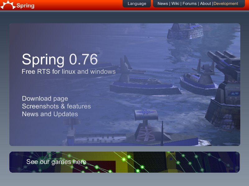


Short, sweet, to the point... I think I like it... I'd like to see some concepts of what it would look like "inside"... also
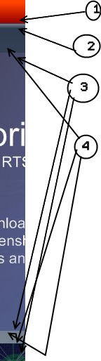
I really like 1, your header... not sure on the color thinking something more camo-or khaki
I don't like 2, the "web 2.0" roundiness here... I think a drop shaddow for the stuff "on the top"
3 should be "shiny rounded" like you have 2 instead.
I would lik to see "drop shaddows" at 2 and 4 instead of just matte... it might be going too far though...
Last edited by SinbadEV on 02 Dec 2007, 05:21, edited 1 time in total.
I would have added drop shadows on the rounded boxes but I didn't know how in paint .net. Remember this isn't html+css it's mouse+paintbrush. I just wanted to show sort of what I had in mind, so don't treat it as a photographic representation.
So yah, the boxes need something on the edges like a shadow and a better detail on header and the menu bar/buttons need actual detail etc. That would be in the html version. But for now this is just concept art not work in progress.
So yah, the boxes need something on the edges like a shadow and a better detail on header and the menu bar/buttons need actual detail etc. That would be in the html version. But for now this is just concept art not work in progress.

That's sort of the point, it's a front page not a news column, so you want big eye catching text, and not much of it.
For example:
http://www.mozilla.com/en-US/
Something more like that would work much better for our front page than walls of text aligned in boxes with the odd thumbnail and emoticon.
The top banner I put as red because it matches the new logo artwork I did for the installer and the icons, and it serves as the highlight colour to the 2 shades of complimentary blues.
-
CarRepairer

- Cursed Zero-K Developer
- Posts: 3359
- Joined: 07 Nov 2007, 21:48

I made a more metallic-looking spring logo, instead of the big plain text. How U like?
http://www.unknown-files.net/spring/3854/Spring_Logo/
I like the design concept, but I'd rather put the three main choices in big buttons that are next to each other under the spring logo, and when I say big I mean BIG.
http://www.unknown-files.net/spring/3854/Spring_Logo/
I like the design concept, but I'd rather put the three main choices in big buttons that are next to each other under the spring logo, and when I say big I mean BIG.
-
Complicated

- Posts: 369
- Joined: 06 Jun 2007, 18:51
