Identity, and Identity Guidelines
Moderators: MR.D, Moderators
-
Warlord Zsinj
- Imperial Winter Developer
- Posts: 3742
- Joined: 24 Aug 2004, 08:59
Re: Identity, and Identity Guidelines
agreed re: bubbly font. I'm not a huge fan of it either.

Re: Identity, and Identity Guidelines
I was hoping Tobi might comment in here. I didn't want to get all up in his grill, without developing anything first.

Re: Identity, and Identity Guidelines
So you've changed your mind about this just being a 'community initiative' that we could use or loose if we wanted? ^_^
Re: Identity, and Identity Guidelines
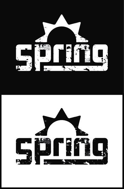
Ugh, finally done with the school year and what summer I had, and now I'm settled down at an internship. So, I still don't have any time, but I talked with Tobi a whooping single time about three weeks ago, and he appeared to like the idea of starting a graphics team and he felt the current logo I'm pitching could lead us to a solution.
If you need a refresher, here is the logo in question. As it has sit with most of you for a while, you might have different feelings since you've last seen it. I would appreciate your current thoughts.
If you need a refresher, here is the logo in question. As it has sit with most of you for a while, you might have different feelings since you've last seen it. I would appreciate your current thoughts.
Re: Identity, and Identity Guidelines
Like smoth said the last time, that font is too bubbly. It goes well with the rounded sun but... it's too cute for the wear and tear
Re: Identity, and Identity Guidelines
If your logo is as flexible as it needs to be then you should be able to drop it into the new site as a simple png. I'd like to see how you'd try this, as I'm generally unwilling to spend a lot of time going through the whole template design process all over again.
You've also yet to demonstrate any reason why we should go with this design rather than ratifying the existing red sun logo that currently emblazons the new site, the icons, and the installer in spite of a sizeable proportion of the community expressing preference.
I think for now rather than chase the flashy orange logo, it may be worth time doing the clean up I wanted to do on the red logo and producing a set of buttons banners and images for fan art. It shouldnt take long, I've just been focusing on other things.
I would also suggest that in the case of tasclient, rather than forcing satirik to totally redesign his splash screen, I say he can use the logo as he likes in it as long as he puts the official logo in the corner on top of the rest of the graphics so that it is visible to the end user.