Identity, and Identity Guidelines - Page 2

Identity, and Identity Guidelines

Share and discuss visual creations and creation practices like texturing, modelling and musing on the meaning of life.

Moderators: MR.D, Moderators

How do you want the sun logo to "feel"?

Happy
1
3%
Heroic
9
26%
Sneaky
1
3%
Destructive
18
51%
Just Built, Brand New
1
3%
Versatile
5
14%
 
Total votes: 35

User avatar
AF
AI Developer
Posts: 20687
Joined: 14 Sep 2004, 11:32

Re: Identity, and Identity Guidelines

Post by AF »

I have tried making satirik follow the two basic simple guidelines, the sort a baby could follow:
  • His lobby is called TASClient lobby and it should say so in the slpash screen, calling it "spring multiplayer client" is misleading damages spring, and implies the sprign devs made it not satirik or betalord
  • Use a proper sun logo and remove cavedog IP in his splash screen and program icon
He has flouted both of these deliberately, and he finds the very concept of a coloured gradient offensive.

In response to my attempts to make him follow the two simple rules he:
  • Banned me from his thread because he finds red gradients offensive and didn't like that I said his max os x theme looked nothing like mac os x.
  • Changed the tasclient icon from my red and white icon to an arbitrary black and gold icon
  • Accused me of allsorts for posting the tasclient lobby proposal because it had gradients in it and was fugly, even though everyone disagreed and even betalord said he'd use them if he were still in charge.
  • Changed his splash screen again after the above to something that was even worse than when he started, and then changed it yet again recently to what neuralize is talking about.
User avatar
Neuralize
Posts: 876
Joined: 17 Aug 2004, 23:15

Re: Identity, and Identity Guidelines

Post by Neuralize »

Oh dear.
User avatar
AF
AI Developer
Posts: 20687
Joined: 14 Sep 2004, 11:32

Re: Identity, and Identity Guidelines

Post by AF »

Satirik doesnt develop for spring, he develops for himself, plain and simple, and he doesn't take kindly to any suggestions or criticisms.
User avatar
Neuralize
Posts: 876
Joined: 17 Aug 2004, 23:15

Re: Identity, and Identity Guidelines

Post by Neuralize »

Well, I haven't talk to him personally yet. He can't be that bad of a guy if he's made a pretty sweet lobby. :P
User avatar
Vadi
Posts: 446
Joined: 03 Jan 2008, 14:51

Re: Identity, and Identity Guidelines

Post by Vadi »

I see.

Well, I'm on Linux myself, and get no splash screens because the lobby & game load instantly. Hence, I didn't know what you were talking about. Sorry about that!

As for the splash screen change - erm, someone who can really needs to talk some sense into that person.
User avatar
SwiftSpear
Classic Community Lead
Posts: 7287
Joined: 12 Aug 2005, 09:29

Re: Identity, and Identity Guidelines

Post by SwiftSpear »

I'd definitely be willing to look at a logo and style standardization for all spring dev team related work. Ultimately, don't expect it to apply community wide, since there are so many branches of the community that work independently on spring content without any help or approval of the spring development team. Things like spring games, third party lobbies/projects, mods, content hosts, usually have nothing directly to do with the spring project aside from that they are designed to work with/for spring players. But sure, we could use more standardization in the spring stuff we do have control over.

AF, ultimately I'm still looking to bring someone on board to rebuild the lobby client with direct spring dev feedback. The only reason we use TASclient at this point in time is that it's functional, stable, and reasonably easy for new users to pick up. It doesn't do alot of the things I would like it to, and it doesn't do alot of the things that are necessary for some of our ideas for improving the spring systems. It's also hard to edit.

[edit] We'd still be using the sun logo... it would just be standardized in terms of style and colorings.
Warlord Zsinj
Imperial Winter Developer
Posts: 3742
Joined: 24 Aug 2004, 08:59

Re: Identity, and Identity Guidelines

Post by Warlord Zsinj »

wub

Image
User avatar
Felix the Cat
Posts: 2383
Joined: 15 Jun 2005, 17:30

Re: Identity, and Identity Guidelines

Post by Felix the Cat »

This sounds like a good initiative, but I have to wonder who you will present your recommendations to that has any power to implement them?
User avatar
Neuralize
Posts: 876
Joined: 17 Aug 2004, 23:15

Re: Identity, and Identity Guidelines

Post by Neuralize »

How do you guys feel about these?
[Moved to latest post, page 1.]
Last edited by Neuralize on 14 Apr 2008, 21:52, edited 4 times in total.
User avatar
SwiftSpear
Classic Community Lead
Posts: 7287
Joined: 12 Aug 2005, 09:29

Re: Identity, and Identity Guidelines

Post by SwiftSpear »

I'm cool with either 1 or 2.
Warlord Zsinj
Imperial Winter Developer
Posts: 3742
Joined: 24 Aug 2004, 08:59

Re: Identity, and Identity Guidelines

Post by Warlord Zsinj »

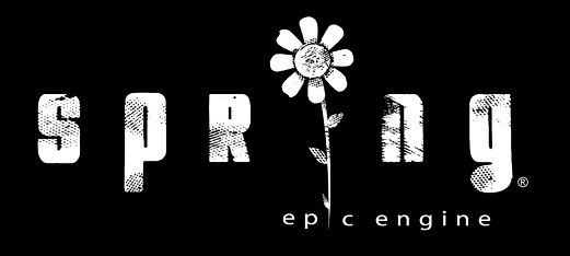
2 is better, but I'd still like to see the roughed up text with the flower one (see my last post) make it's way into things somehow.
User avatar
Vadi
Posts: 446
Joined: 03 Jan 2008, 14:51

Re: Identity, and Identity Guidelines

Post by Vadi »

1 or 2, but neither really cuts it.
User avatar
rattle
Damned Developer
Posts: 8278
Joined: 01 Jun 2006, 13:15

Re: Identity, and Identity Guidelines

Post by rattle »

1, if you move the sun out of the center and use it for the missing dot on the i
User avatar
Neuralize
Posts: 876
Joined: 17 Aug 2004, 23:15

Re: Identity, and Identity Guidelines

Post by Neuralize »

[Moved to latest post, page 1]
Last edited by Neuralize on 14 Apr 2008, 21:52, edited 4 times in total.
User avatar
Hobo Joe
Posts: 1001
Joined: 02 Jan 2008, 21:55

Re: Identity, and Identity Guidelines

Post by Hobo Joe »

I like 1 and 7 the best.
Warlord Zsinj
Imperial Winter Developer
Posts: 3742
Joined: 24 Aug 2004, 08:59

Re: Identity, and Identity Guidelines

Post by Warlord Zsinj »

4 or 7 here. I like the idea of the dot for the i, but it is perhaps a little too twee, whereas 4 is more sleek.
User avatar
SinbadEV
Posts: 6475
Joined: 02 May 2005, 03:56

Re: Identity, and Identity Guidelines

Post by SinbadEV »

I really like 4 and 5, I could live with 6 or 7 if it was a beefier font... Like the one in the current logobar, with a nice strong capital S... and if you move the i's dot off center of the sunburst that would help it look less like a boob... bridging "prin"... really I guess I just want to see your take on the way it's showing up in the current logobar...
User avatar
ILMTitan
Spring Developer
Posts: 410
Joined: 13 Nov 2004, 08:35

Re: Identity, and Identity Guidelines

Post by ILMTitan »

I like 6, but I like the interaction between the p, the g and the sun in 7.
User avatar
aGorm
Posts: 2928
Joined: 12 Jan 2005, 10:25

Re: Identity, and Identity Guidelines

Post by aGorm »

The "i" needs it's dot.... I keep reading it "sprung" when its not there. I say 7, with not capital "s".... Or maybe all caps and a lower case i...

Bit like this?
Image
User avatar
Hobo Joe
Posts: 1001
Joined: 02 Jan 2008, 21:55

Re: Identity, and Identity Guidelines

Post by Hobo Joe »

That's not consistent, though. You've got all-caps except for the 'i', and it makes it look really awkward.
Post Reply

Return to “Art & Modelling”