Well, I'll just have to put myself diametrically opposite to you, swift.
I think it perfectly suits the project. Even the mods that aren't inherently gritty - say, Kernel panic, have elements of warfare in them which even then align themselves (in my mind) with 'gritty' attributes.
But eh, I'm happy to see what else Neuralize comes up with. But I still think the flower was a very clever approach, and works really nicely.
Identity, and Identity Guidelines
Moderators: MR.D, Moderators
-
Warlord Zsinj
- Imperial Winter Developer
- Posts: 3742
- Joined: 24 Aug 2004, 08:59
Re: Identity, and Identity Guidelines
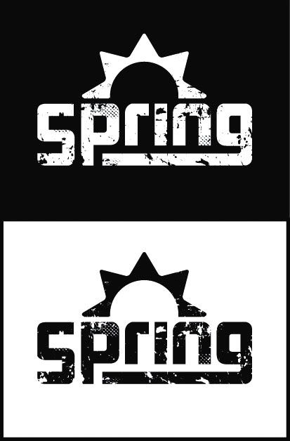
I always saw the "sun" as a mechanical gear, to be honest. Well, half a gear. 
A gear represents a lot about Spring actually, as its a great, yet abstract symbol for all things "mechanic", really a lot of what Spring is about is "mechanic" in some way.
E.g.
We call Spring a game "engine". Gears are also associated with "engines"; the engines you see in real life. A gear if you look at it that way isn't too much of a stretch.
Most of our mods are about giant robots and/or vehicles fighting each other, whether it be *A mods or s44 or IW. Even KP could relate to it in an vague sense... Anyways, how could not that be mechanical? :) Again a gear is a great symbol.
Personally, my suggestion is to keep the current logo, but make it more "gear-ish". But you see, gears are.. gritty. lol.
But grit in my/this sense is about stability, reliabilty, not "style over substance", but doing good hard work... a gear turning round and round, churning day in day out. Haha, enough with the imagery, but perhaps you see my point?
-
Warlord Zsinj
- Imperial Winter Developer
- Posts: 3742
- Joined: 24 Aug 2004, 08:59
Re: Identity, and Identity Guidelines
I always thought of Spring as the season, not the gear. As in, the season that comes after a winter and heralds the coming of the summer, typically associated with rebirth and renewal - just like Spring was in relation to TA, and RTS in general.
Re: Identity, and Identity Guidelines
Gritty => war games
Flower => creation
That's what I associate the flower logo with.
Flower => creation
That's what I associate the flower logo with.
-
Warlord Zsinj
- Imperial Winter Developer
- Posts: 3742
- Joined: 24 Aug 2004, 08:59
Re: Identity, and Identity Guidelines
Yeah, Neuralizes gritty flower logo is definitely made of win
Re: Identity, and Identity Guidelines
Hrm. I feel like we picked the sun over the flower like... a year ago? Two? and to be rehashing this again doesn't seems too productive.
-
SwiftSpear

- Classic Community Lead
- Posts: 7287
- Joined: 12 Aug 2005, 09:29
Re: Identity, and Identity Guidelines
Yar...Erom wrote:Hrm. I feel like we picked the sun over the flower like... a year ago? Two? and to be rehashing this again doesn't seems too productive.
-
Warlord Zsinj
- Imperial Winter Developer
- Posts: 3742
- Joined: 24 Aug 2004, 08:59
Re: Identity, and Identity Guidelines
Well, if there's still a pretty clear split then 'we' wasn't a particularly inclusive group...
I don't remember it ever coming to a vote, or there being any other then someone simply making an executive decision. Which wasn't a bad thing, sometimes spring needs someone to get things moving, and the route chosen wasn't awful so I didn't say anything.
But there is discussion now, seeing as you have asked, and I don't feel that the design being presented is particularly good.

Re: Identity, and Identity Guidelines
My problem with my flower logo is that is does not work well for small applications, it loses much of it's detail, and therefore grittiness. I've never felt super strong about it, and currently I feel stronger about the logo I just released. That said, the flower logo is something to look at if we want to go for a particular feeling, and from what I can tell, the consensus appears to be that we want a warlike, destructive feeling. I put up a poll just to be sure. 
This probably means that I'm going to go back to the drawing board, but this time around I'm only going to involve myself in the process and seek out individual community members who've I've observed to be deft in explaining visual language and ask them for input. Although, I enjoyed working in a public format because it did get some dialogue rolling which was productive. I will keep the sun logo, and then apply whatever feeling the community agrees that a spring logo should convey.
This probably means that I'm going to go back to the drawing board, but this time around I'm only going to involve myself in the process and seek out individual community members who've I've observed to be deft in explaining visual language and ask them for input. Although, I enjoyed working in a public format because it did get some dialogue rolling which was productive. I will keep the sun logo, and then apply whatever feeling the community agrees that a spring logo should convey.

Re: Identity, and Identity Guidelines
thing is, can't we modify the logo also? I have seen some companies do that with their logo. like you take the EA logo and make it look like bolted on metal plates, would that not still have the logo yet keep the branding in place.
Re: Identity, and Identity Guidelines
Yeah, that is a possibility, but companies usually only do that after they have secured a base logo that needs a reason for variation.
Re: Identity, and Identity Guidelines
Honestly, I think maybe a sharper font may work better. Not something as crazy as the dark crystal font but maybe something with some hard edges. I think the rounded font of the prior one may make it feel really soft and gentle. Maybe something that has really strong angles?
-
Warlord Zsinj
- Imperial Winter Developer
- Posts: 3742
- Joined: 24 Aug 2004, 08:59
Re: Identity, and Identity Guidelines
I like it.
It's till the same reasonably wussy font, and the flower/sunrise/screw still has rounded edges, but it's all counterpointed by the rough treatment, which makes the wussiness (ok, I'm being mean, it's not really wussy, but hopefully you catch my drift) seem intentionally contrasting. I'm still not a big fan of the extended line of the g, but it doesn't work against this design too much.
My major concern is how well something like that will scale across multiple sizes. The sun/flower/spring is barely touched by the grime at all - which works perfectly fine on the size you've got there - but how would it work in say, a situation where the symbol itself is being used alone, possibly on an icon?
Perhaps you could rework the flower thingy a little bit to work it in with the grimey theme; how you do this is up to you, of course. Maybe a stencil art approach?
What brush settings do you use (if any)? A treatment like that could work nicely when I'm doing my texturing.

Re: Identity, and Identity Guidelines
I like it. Start getting it on things immediately.

Re: Identity, and Identity Guidelines
Two thumbs way way up. I can read this easily to. Nice and clear.
Darren
Darren
Re: Identity, and Identity Guidelines
Yeah, that's nice. Good work!
Re: Identity, and Identity Guidelines
Yeah that's better

Re: Identity, and Identity Guidelines
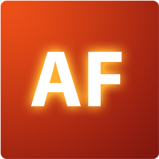
AF's logo is still my favorite. It's simple enough to be iconised (unlike the flower logo), and to fit any mod (unlike gritty logos). It doesn't look like clothes or 70's logo, but like a software logo. Plus I like that color.

Re: Identity, and Identity Guidelines
404, but thats satiriks version which is somewhat different, here is a better example:zwzsg wrote:AF's logo is still my favourite. It's simple enough to be iconised (unlike the flower logo), and to fit any mod (unlike gritty logos). It doesn't look like clothes or 70's logo, but like a software logo. Plus I like that color.

or the settings icon:

My red version of the logo could do with a set of minor updates to bring it more up to scratch and to unfuzzy the blurry sun logo so its much clearer, for example something using more of this style but with a sun logo instead of 'AF':
In the mean time I think perhaps I shall show one of my concepts I was toying with:

Click for a larger version (2542px ├âÔÇö 1979px)

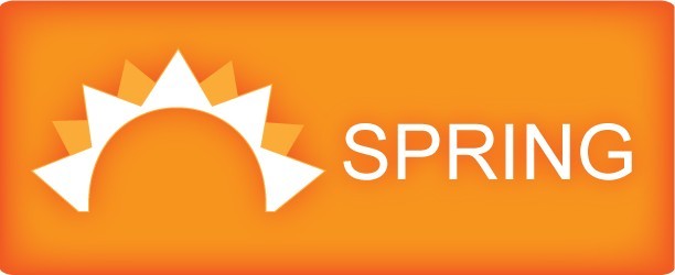
All of which are vector based images created in adobe illustrator with no rasterized elements. I'm also of the opinion that rather than putting 'spring' in the logo we should be putting 'spring engine' in the logo.
These orange logos are not finalised and I'm more likely to use them as a special case alternative view of the primary logo due to it looking very nice when its big but with most of the details dissapearing when reaching 32x32 sizes, at least until I take some time to devise a solution for that.


However once I have figured out that small size issue I could very well roll out a slew of banners buttons icons t-shirts coffee cups pens badges and guidelines on how to use and reproduce the logo as well as what special case modifications are allowed and versions of the logo for special needs such as monochromatic banners.
I can also see the question of text could arise, to which I say that the logo should not need the spring engine text underneath and the text should not take primary focus however I would be willing to take requests as I spent ages looking for the right font and had to settle for next best, but ideally it should not be some obscure font nobody has or people will not use the correct font when reproducing the logo.