Yeah, we are advertising an engine, but that engine is quite clearly to do with warfare.
I don't know how happy I'd be putting that on my IW shots. It's just wussy...
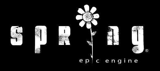
I prefer the current logo in use at the top of the website over this proposed one.
Identity, and Identity Guidelines
Moderators: MR.D, Moderators
-
Warlord Zsinj
- Imperial Winter Developer
- Posts: 3742
- Joined: 24 Aug 2004, 08:59

Re: Identity, and Identity Guidelines
the sun never looked like a sun to me, more of an explosion.
Re: Identity, and Identity Guidelines
I second warlordzsinj on the 60s hippy aesthetic. It'd look fine on a scooby doo camper van but doesn't convey the clashing of armies very well.
Also don't like the extended g or the font. The logo with the flower is fantastic, but the current logo is also much better than those latest suggestions. In my opinion.
Also don't like the extended g or the font. The logo with the flower is fantastic, but the current logo is also much better than those latest suggestions. In my opinion.

Re: Identity, and Identity Guidelines
Hmm. Slowly beginning to work a few things out here. Zsinj got my mind working. Solid feedback. I wasn't thinking about colors when I did those comps. While we may not be able to convince the general spring population of changing the logo. I think I can redesign the current logo with a more destructive feel. Although, what if someone wants to use spring for a nonviolent application, such as general AI research? Do we really want to pigeonhole ourselves into conveying that we are advocates of destruction? Should I bring the logo into a 3d rendering program and give it a new shiny car feel?
Re: Identity, and Identity Guidelines
I do not feel that a full 3d treatment is really needed just something subtle.

Re: Identity, and Identity Guidelines
YES!Neuralize wrote:Do we really want to pigeonhole ourselves into conveying that we are advocates of destruction?
Re: Identity, and Identity Guidelines
That's what 99%+ of users and developers will be looking for. People wanting to use an engine designed for wargames for AI research shouldn't be put off by the trappings of war, I imagine?
-
SwiftSpear

- Classic Community Lead
- Posts: 7287
- Joined: 12 Aug 2005, 09:29
Re: Identity, and Identity Guidelines
I personally prefer a bit of the shiny car feel... Like I say, mods will adapt the logo to their own needs. Adding scarring and weatherwearing isn't that hard to do... but I do agree with WZ about the colors, and I agree that the rounding being applied is I think a little too much. I'm not sure if I want none... but it does have a little more of a soft look then I'd want if I were trying to apply it to a gritty environment.Neuralize wrote:Hmm. Slowly beginning to work a few things out here. Zsinj got my mind working. Solid feedback. I wasn't thinking about colors when I did those comps. While we may not be able to convince the general spring population of changing the logo. I think I can redesign the current logo with a more destructive feel. Although, what if someone wants to use spring for a nonviolent application, such as general AI research? Do we really want to pigeonhole ourselves into conveying that we are advocates of destruction? Should I bring the logo into a 3d rendering program and give it a new shiny car feel?
-
Warlord Zsinj
- Imperial Winter Developer
- Posts: 3742
- Joined: 24 Aug 2004, 08:59
Re: Identity, and Identity Guidelines
Keep the logo 2D and vector-based. 3D logos are very limited in their application. We can always take your 2D logo and make it 3D later.
My preference is with gritty, but shiny can work as well. It's much easier to pull off gritty then shiny succesfully, though. Shiny can often come off as cheap or cheesy - though done well it can also look very nice.
My preference is with gritty, but shiny can work as well. It's much easier to pull off gritty then shiny succesfully, though. Shiny can often come off as cheap or cheesy - though done well it can also look very nice.
-
SwiftSpear
- Classic Community Lead
- Posts: 7287
- Joined: 12 Aug 2005, 09:29
Re: Identity, and Identity Guidelines
Gritty is too hard to adapt to cartoony, shiny holds middle ground. It's relitivly easy to adapt shiny to gritty, or cartoony.Warlord Zsinj wrote:Keep the logo 2D and vector-based. 3D logos are very limited in their application. We can always take your 2D logo and make it 3D later.
My preference is with gritty, but shiny can work as well. It's much easier to pull off gritty then shiny succesfully, though. Shiny can often come off as cheap or cheesy - though done well it can also look very nice.
-
Warlord Zsinj
- Imperial Winter Developer
- Posts: 3742
- Joined: 24 Aug 2004, 08:59

Re: Identity, and Identity Guidelines
And yet it features a flower... are you purposely contradicting your opinions? The sunburst can be as gritty as you want itWarlord Zsinj wrote:Again, this one is very succesful as a gritty logo, imo
Re: Identity, and Identity Guidelines
It's an ironic flower, a budding hope in a ravaged universe that could be rudely trampled underfoot at any time.
I just like flowers, really.
I just like flowers, really.
-
Warlord Zsinj
- Imperial Winter Developer
- Posts: 3742
- Joined: 24 Aug 2004, 08:59
Re: Identity, and Identity Guidelines
... I see no contradiction, the flower is treated in a gritty manner and is highly ironic. It's obviously a logo that has been thought out quite cleverly.
Also, I never stated I hated the sunburst - quite the opposite. I just said in the context of the previous logo it wasn't working.
Also, I never stated I hated the sunburst - quite the opposite. I just said in the context of the previous logo it wasn't working.
Re: Identity, and Identity Guidelines
the flower was all scratched up and damaged. which gives me an idea for a logo treatment. STUPID WORK eating up my day  .
.
Again, the starburst for me has always been either a sun or an explosion, both of which are fine IMO.
I think the logo was very nice that neuralize did but it did not feel right in that it was too clean. which is why I suggested the transparency. It needed some noise, or some kinds of holes in it to make it feel like it was part of the image. As it stands now, I tried slapping the logo down and it felt very corporate sticker so I am hoping for a revision. The logo needs to feel more gamer.
-
bobthedinosaur

- Blood & Steel Developer
- Posts: 2702
- Joined: 25 Aug 2004, 13:31
Re: Identity, and Identity Guidelines
for some reason i always thought of 'spring' as a mechanical spring in a machine, and not the happy flowers and rainbows spring.
Re: Identity, and Identity Guidelines
+1bobthedinosaur wrote:for some reason i always thought of 'spring' as a mechanical spring in a machine, and not the happy flowers and rainbows spring.
Re: Identity, and Identity Guidelines
Fully agree, it's got something unique compared to all the others.Warlord Zsinj wrote:Again, this one is very succesful as a gritty logo, imo
-
SwiftSpear
- Classic Community Lead
- Posts: 7287
- Joined: 12 Aug 2005, 09:29
Re: Identity, and Identity Guidelines
Ok, fine, rather then restating again and again that we're not going to use it. I just really don't like that logo. The problem is that it pigeon holes the project. Spring is not a "gritty" place, it's not a "gritty" engine, it's just a game engine, and being a game engine, many different games come out from it. The spring logo should be easy to create derivatives of, and should not contradict the setting of any given on the engine. That logo would look good on a frontpage, but it lacks any expandability past that, plus I just really don't think it fits the project at all.rattle wrote:Fully agree, it's got something unique compared to all the others.Warlord Zsinj wrote:Again, this one is very succesful as a gritty logo, imo

Re: Identity, and Identity Guidelines
Now show that flower logo to your friends and have them go "wtflol is this shit".