Ehm... that's a side shot. Moreover, it's half-scale- I play at 1600/1200. Bear that in mind.
I designed everything so that it's quite clear from OTA view:

There's a clip from actual rez- it's quite clear that this is the Blue Team, especially if you're looking at it next to Red Team or Green Team or whatever.
If you're asking for me to dump more teamcolor on the skins, especially to accommodate the small minority who uses side-views as their default, I'm not going to do that. I hated SupCom's "dump teamcolor everywhere" approach, and I'm not going there.
If players are too stupid to know where their units are, with all of the ways there are to keep track of them... I don't have a lot of sympathy. Most of the time, in a real game, I don't think this will be a real problem, tbh.
That said... if somebody would make the LUA Widget I was describing a few months ago, where it'd be like the Platters Widget up close (but slightly more clear, and ground-hugging- the clipping was ugly), then become an animated icon with distance... that'd be sexy, and totally take care of this issue, for this game and others.
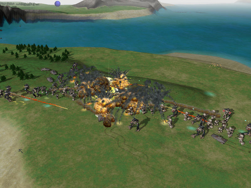
Here's a really direct shot of this. Please tell me that you cannot instantly tell who's Red and who's Blue... and this is probably the most subtle of the units, in terms of teamcolor.


