ACK, no mod names on banners!
Mod names should be on the big images only! Sorry NOiZE I didn't realize you wer talking about the top banners. Maek remove.
Updated site layout ready?
Moderator: Moderators
-
Forboding Angel

- Evolution RTS Developer
- Posts: 14673
- Joined: 17 Nov 2005, 02:43

Re: Updated site layout ready?
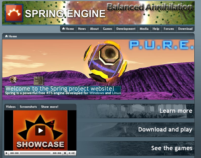
My vote would be for no mod / game names on banners. Welcome images, definitely yes. If that's not allowed, I'm not going to participate and I'm withdrawing my content, because that would essentially defeat the purpose of the new 'site design, which is supposed to help us market our games more effectively...Hmmm i just uploaded some BA banners... Hmm perhaps i should get rid of the Balanced Annihilation text.
Meh. I'm sorry you don't like them, but beyond the border issue, which I agree I should fix... that's tough. Make ones you do. Welcome to Open Source.Argh, of course there need to be some "aesthetic standards" to make the website coherent and not inconsistent as it is with the new banners and images. Also...
Well, pretty much what AF said.
Once there are a lot of banners made, I think it'll look less and less "incoherent" and will just be... how it is. Like this:
Personally, I like that- lots of pretty pictures, with a background that's not trying to intrude much. If you don't like that, well, make stuff that you think works better, and if other people agree with you, then... the 'site will just end up looking like you want. Doing it verbally isn't going to work, though. I'm not listening to the peanut gallery on this, especially when they are as rude and disrespectful as AF's comments.
[EDIT] NOIZe, I thought Fnordia said not to use PNG... something about breaking rendering of the page in IE... you might want to fix that. [/EDIT]
-
Roflcopter

- Posts: 47
- Joined: 24 Dec 2006, 21:09
Re: Updated site layout ready?
A website is not only made with "pretty pictures". The image you posted doesn't look good. And I don't think your banners with will help you market your game more effectively.
I already did banners that I personally think that work better, and people liked them. In fact, they are one of the reasons this new website exists.
But whatever, I guess I'm always wrong and I have no idea of how to make things right.
Good luck with this.
I already did banners that I personally think that work better, and people liked them. In fact, they are one of the reasons this new website exists.
But whatever, I guess I'm always wrong and I have no idea of how to make things right.
Good luck with this.
-
Machiosabre

- Posts: 1474
- Joined: 25 Dec 2005, 22:56
Re: Updated site layout ready?
how bout you just restrict input to welcome images? 
and make the banners just things to make the site purty ,to be filled in by the guys making the website?
I don't see why you need 20 welcome images and banners for every mod.
and make the banners just things to make the site purty ,to be filled in by the guys making the website?
I don't see why you need 20 welcome images and banners for every mod.
Re: Updated site layout ready?
How about no mod or game names anywhere, but if you click on the image (either banner or welcome) it links you to the game page of the mod that the image is from?
The million logo thing just looks bad. There you have spring project and balanced annihilation and pure and I'm thinking wtf, and I know what they all are already.
The million logo thing just looks bad. There you have spring project and balanced annihilation and pure and I'm thinking wtf, and I know what they all are already.
Re: Updated site layout ready?
Banners have been fixed, to use proper borders and colors.
Banner001, the one with the duplicated logo, is gone.
And RoflCopter... meh... I wouldn't have snapped back, except that I think you're asking for something that's incredibly unlikely to work in practice. If Fnordia didn't want to see a healthy competition to produce new banner images, he wouldn't have designed it this way. I wouldn't be completely averse to seeing somebody make 10-20 really awesome banners that we all decided represent Spring best... I just don't see that ever happening. I'd prefer productive anarchy to static doldrums, myself. Maybe after awhile it'll get to the point where we can do a "best of" contest, or whatever, but that time is not now.
You do... but we're not doing that for you. We're doing it for people who are new to Spring.How about no mod or game names anywhere, but if you click on the image it links you to the game page of the mod that the image is from?
The million logo thing just looks bad. There you have spring project and balanced annihilation and pure and I'm thinking wtf, and I know what they all are already.
Re: Updated site layout ready?
That's what I mean, it'd be even worse for them, at least I know where to look to get the content most immediately relevant.
Some new users will glance at that, go too much information and click back on the browser.
What about the image linking idea? Let the image look pretty and sell the mod without introducing the huge competitive branding exercise thing.
Edit: I'm personally a lot more likely to click on a pretty screenshot than ******* ANNIHILATION PLAY ME PLAY ME PLAY ME ME ME ME text.
Last edited by Crayfish on 24 Jul 2008, 21:39, edited 4 times in total.
Re: Updated site layout ready?
I think the top bar should really be consistent with the rest of the site layout. More subtle changes like the two title bars Roflcopter created are better suited there in my opinion. Mod advertising gets quite a big bit of room even without rotating title bars, with the big welcome picture and videos and screenshots.

Re: Updated site layout ready?
ok, made the banners GIF and the welcome msg, JPG
Argh i "used" your blue box, i hope you don't mind, if you do let me know, and ill remove it.
Argh i "used" your blue box, i hope you don't mind, if you do let me know, and ill remove it.
Re: Updated site layout ready?
Well, then we need very exact rules for what "consistant with the rest of the site layout" means, imo. Which means a virtual death of visual diversity. I can understand wanting to not allow explicit advertising, but my plan was to make a bunch of banners featuring imagery from different games / mods, I just started with P.U.R.E. because it's my baby. But I'm not lifting a finger if it's not incredibly clear what we're doing with that- just removing the work I've already done will flush several hours of work down the toilet, and I don't have a lot of time left to give this this weekI think the top bar should really be consistent with the rest of the site layout. More subtle changes like the two title bars Roflcopter created are better suited there in my opinion. Mod advertising gets quite a big bit of room even without rotating title bars, with the big welcome picture and videos and screenshots.
No, they won't. The most successful modding 'site I've participated in, Lancer's Reactor, had a 'site front-end that looked like a visual train-wreck of stories and pictures. It had hundreds of thousands of visitors a month, coming to look at mods for an engine with zero modding support from the publisher. Trust me, it won't make a single bit of difference, and will mainly encourage people to return to the front page to see what's on it today, etc.Some new users will glance at that, go too much information and click back on the browser.
Won't work, imo. People rarely click on images that don't have text that gives them an idea of what's going to happen when they click on it.What about the image linking idea?
I'd be in favor of having a hotspot in the upper-right corner that would go to a mod's Wiki URL or something. Then people who don't want a big logo could just have an understated square, or whatever, and people who want to explain to would-be players that there are lots of games, and they have different names... can do otherwise.
That's totally fine with me, and if you come up with something that looks sexier, I'm game to borrow right backArgh i "used" your blue box, i hope you don't mind, if you do let me know, and ill remove it.
Re: Updated site layout ready?
Made new bar behind the text, to blend in with the rest of the layout, and edited everything. If people like it enough, I'm game to hand out the PSD, etc., let me know. Gotta go for awhile, I have other things I need to do.

Re: Updated site layout ready?
one thing, make the letters on the welcome image like the BA one with the rockets, they do not disturb the picture while your blue square doesArgh wrote:Made new bar behind the text, to blend in with the rest of the layout, and edited everything. If people like it enough, I'm game to hand out the PSD, etc., let me know. Gotta go for awhile, I have other things I need to do.
Re: Updated site layout ready?
The blue square's what I was talking about. Go refresh the page, you'll see what I did. Looks better, and I made it a bit bigger, so that hopefully it's the right size for Linux browsers.one thing, make the letters on the welcome image like the BA one with the rockets, they do not disturb the picture while your blue square does
Re: Updated site layout ready?
That looks better yes, mind sharing the psd with me, so i can updated the BA ones =)
Re: Updated site layout ready?
i stil prefer no blue square, but its alot better now, dunno if its ok on linux i have windowsArgh wrote:The blue square's what I was talking about. Go refresh the page, you'll see what I did. Looks better, and I made it a bit bigger, so that hopefully it's the right size for Linux browsers.one thing, make the letters on the welcome image like the BA one with the rockets, they do not disturb the picture while your blue square does
Re: Updated site layout ready?
That gradient needs to be a bit gentler, imo. It's completely eradicating some of the banners. Just let a bit more of the image show through on the right.
-
Forboding Angel
- Evolution RTS Developer
- Posts: 14673
- Joined: 17 Nov 2005, 02:43
Re: Updated site layout ready?
Blue bar looks EXCELLENT argh, nicely done 
Re: Updated site layout ready?
Meh, it's just a beveled rectangle with a gradient. Took maybe 2 minutes to make. I should anti-alias the corners a bit by hand, for perfection, but I'm too lazy right now.
And meh... on the gradient... maybe like this?
And meh... on the gradient... maybe like this?
- Attachments
-
- logo2.png
- (80.09 KiB) Downloaded 10 times