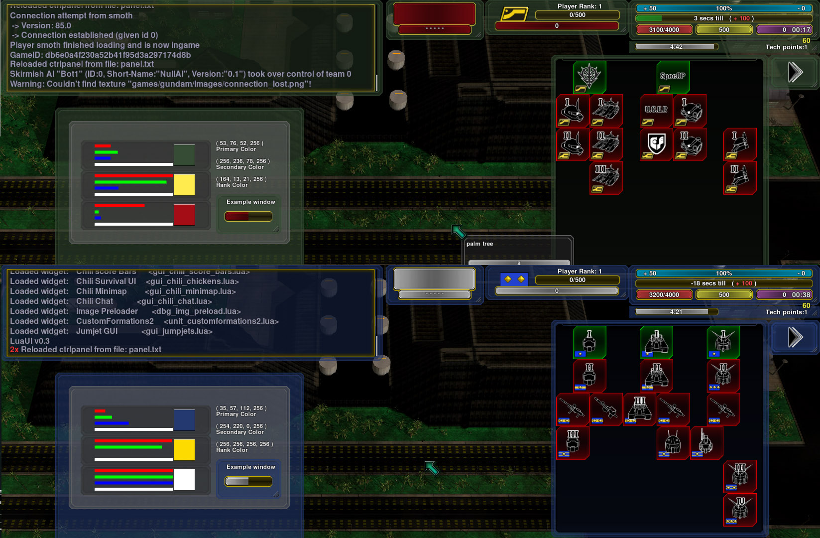
For one thing, the tooltip has half of the last line cut off. I thought maybe you had cropped the picture but it happens for me too.
Then I do not understand why minimap and buildmenu are connected by this half-transparent empty space?
Maybe supposed to "group" the free-floating elements a bit but is just waste of space.
RedUI resource bars are imo very similiar to default ones, so no idea what use they have.
Playerlist:
I prefer /info
It has no silly buttons that one can accidently click on and is more compact. Also shows "catching up ping" when someone reconnects.
Otherwise looks ok to me.
My GUI looks like this:
Everything "as full as it ever gets" except ally res-bar (since it was SP)
Also some explainations why I prefer the "old" default UI over other fancyness, like the one in zK.
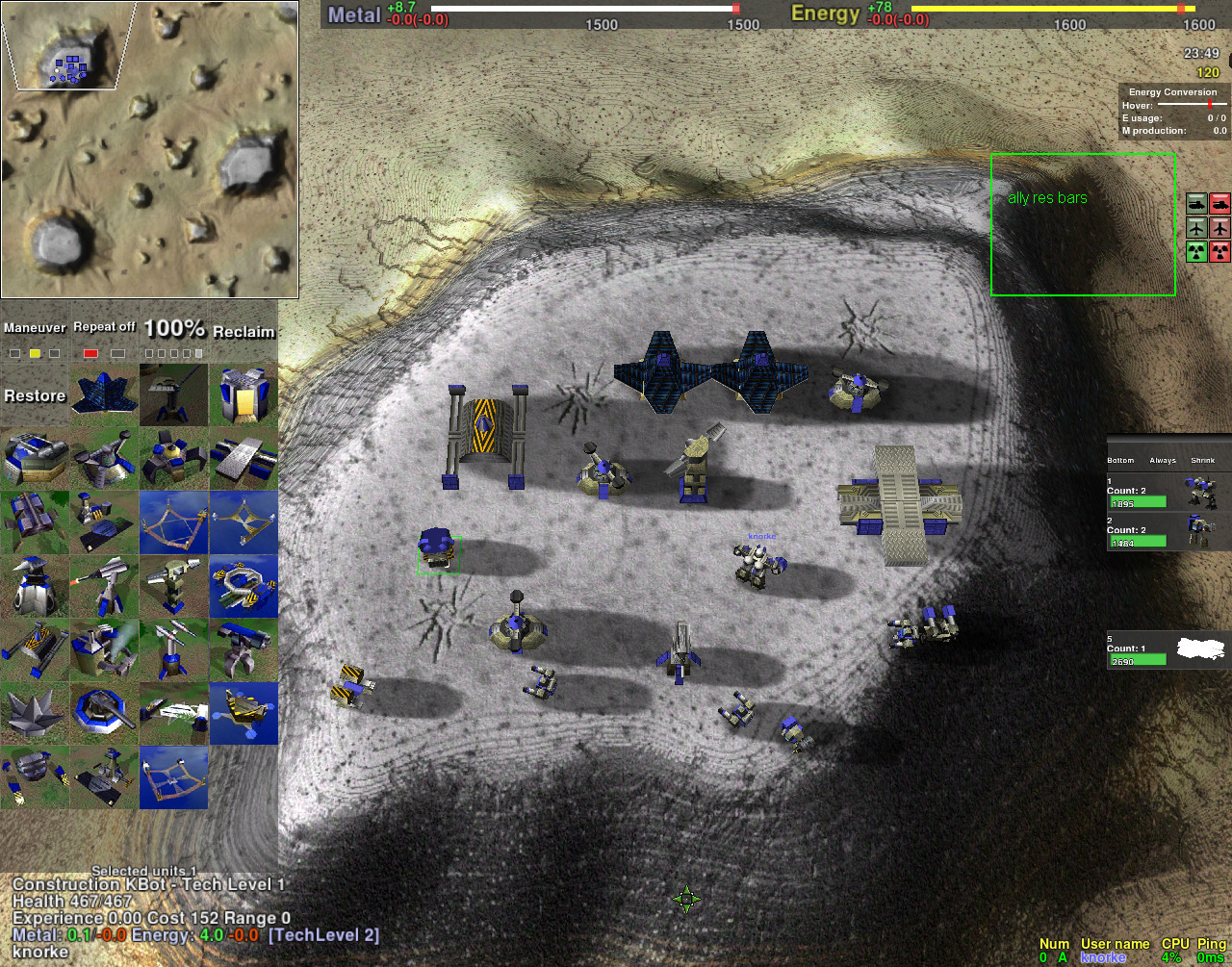
-"hide commands" widgets to hide never-clicked buttons like "dgun", "move", "stop" etc. Only keep the state-toggle things.
(actually dunno why reclaim&restore is there)This allows for...
-buildmenu big enought that most cons can show all options on same page.
In zK there are 6 or so tabs, so there is a 5-out-of-6 chance that you are in wrong tab when wanting to build something. Yes hotkeys, but if was un-lazy enough to remember hotkeys for all buildings I would not use a graphical menu at all.
-If buildmenu expands to two pages, toggle with , & . keys.
Or just , key because it circles.
-If no unit is selected, the command-menu disappears complety!
For example in zK there always stays some black box with nothing in it, what use is that?
-chat is just default one, because it is click-through and can not accidendently get in one. (same as playerlist)
-unitgroups thing on right side, only reccently started to use that. Not sure if like.
wrt design, round corners or straight lines or whatever:
Basically there is not much GUI anyway. Any "design" that gets added is just clutter.
In TA-style RTS there is minimap, buildmenu, some resource-thing. Yet some UIs make even these few things feel so cluttered and unuseful.
This also fits to interface design I think:
http://i.imgur.com/WntrM6p.gif


