Page 1 of 1
Quanto's at it Again!
Posted: 15 Apr 2006, 00:40
by Quanto042
Alright, here it is, my first map using L3DT. It does use an OTA Heightmap, but heavily modified. The rivers and large rolling hills i did in photoshop and a few filters, the smaller hills are actually OTA Greeworld hills. Screenshots and Linky below

Screenshots! W00t!
Posted: 15 Apr 2006, 00:43
by Quanto042
Posted: 15 Apr 2006, 02:21
by Decimator
Consider doubling it's size and make a new version, we could use more large maps like this. Also, DON'T USE SOLID ARCHIVES! It makes the minimap take forever to load.
Posted: 15 Apr 2006, 02:25
by Forboding Angel
ok my huge bitches with it.
Textures do not line up well. They look really really wierd going from barren to lush green like that.
Also, You uploaded to fileuniverse in the wrong section. Read the news on FU. It's been there for a while, and it tells you how to get your map into the maps section automatically.
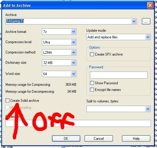
3rd, you compressed it as sd7 as a solid archive. Fix this asap. DO not compress as a solid archive.
On a side note, great layout. The rivers should be crossable.
On a second side note I'm considering auto nuking maps which are not uploaded in the right section and are compressed incorrectly. These things do nothing but cause confusion for users, especially new users. Meh.
Posted: 15 Apr 2006, 06:05
by Quanto042
Oi, when i uploaded, i pulled down and selected TA:Spring
and also selected the maps section
I have no idea why it didn't go where it is supposed to. Also, i want to know what you mean by solid archive.
Posted: 15 Apr 2006, 06:21
by Decimator
Posted: 15 Apr 2006, 08:45
by Das Bruce
Looks like it might play quite nicely, but the texture needs alot of work.
Posted: 15 Apr 2006, 14:43
by Min3mat
i dunno if the rivers are uncrossable you will need transports or planes, the slopes look very steep
Posted: 15 Apr 2006, 18:46
by AF
hmm, the minimap looked nice, but then the screenshots below just looked dull in comaprison.
I wish we had bright maps, instead we have the murky yilith type maps with colour in the extremeties in places, and maps like this. Otherwise the brightest maps are whtie ones such as cold place remake etc..
Posted: 15 Apr 2006, 19:00
by Forboding Angel
AF wrote:hmm, the minimap looked nice, but then the screenshots below just looked dull in comaprison.
I wish we had bright maps, instead we have the murky yilith type maps with colour in the extremeties in places, and maps like this. Otherwise the brightest maps are whtie ones such as cold place remake etc..
they can be brightened with a custome detail texture, but that's a pretty crappy way of doing it imo, but atm it's about the only thing that works. Changing sunlight and atmospherics doesn't do anything as far as the texture is concerned.
Posted: 15 Apr 2006, 19:03
by NOiZE
well the map has a nice concept, but the texture needs to get a lot better!
Posted: 15 Apr 2006, 20:08
by Quanto042
Posted: 15 Apr 2006, 21:17
by Guessmyname
I likey
Posted: 15 Apr 2006, 21:24
by IceXuick
me2
Posted: 15 Apr 2006, 22:04
by Forboding Angel
ABSOFUCKINLUTELY BEAUTIFUL!
Daddy like :D
Posted: 15 Apr 2006, 22:18
by mongus
*me complains its dark*
Posted: 15 Apr 2006, 22:36
by LathanStanley
is it just me... or is there alot of geothermal?
it prolly still plays well... but thats a FAST L2 rush...

Posted: 15 Apr 2006, 22:48
by SwiftSpear
mongus wrote:*me complains its dark*
Oh god, I remember when that started a flamewar with mother...
I'd have to disagree there though, the color of light that the ground is reflecting looks like the same color that the sky is, which is exactly what a good map should do.
Posted: 16 Apr 2006, 02:24
by Das Bruce
When all I have left to complain about is that it seems to dark, you know you're on the right track.
Posted: 16 Apr 2006, 02:53
by DavetheBrave
The left side needs about 4 more ways to cross for it to be fair.