Page 1 of 10
ZK Logo
Posted: 19 Jul 2010, 17:01
by Saktoth
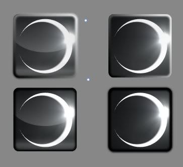
ZK logo. Left has glass, top has glassy borders, while top left and bottom right bleed over their borders.
Which elements do you prefer?
Re: 0k Logo
Posted: 19 Jul 2010, 17:16
by Petah
I don't particularly like any of them. I think you should simplify it a little, use clean lines and less gradients.
Re: 0k Logo
Posted: 19 Jul 2010, 17:27
by Satirik
yeah don't stack photoshop tutorials/filters like you know who !
Re: 0k Logo
Posted: 19 Jul 2010, 17:30
by Saktoth
Photoshop... tutorials?
Except for the background this is all vector graphics.
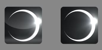
Here is the plain, no border versions:
Re: 0k Logo
Posted: 19 Jul 2010, 17:39
by Satirik
Saktoth wrote:Photoshop... tutorials?
Except for the background this is all vector graphics.
Here is the plain, no border versions:
it is not nice, and a logo is a shape, and sometimes a color scheme, look at Electronic Arts' logo, it changes for every game ...
Re: 0k Logo
Posted: 19 Jul 2010, 17:53
by MidKnight
I agree with most of what petah and sat have said here, especially that a logo's really a shape. also, if you're going to combine a vector and a bitmap like in this pic, you may want to apply some antialiasing to the vector.
Thirdly, one thing I notice about the eclipse logo is that, standing independently, it has terrible symmetry. Maybe it'll look better if you add something to the left side.
Lastly, looking at some examples might help you get the glass effect down. I know it helped me.
From Joomla's website:


From a Photoshop tutorial:

Re: 0k Logo
Posted: 19 Jul 2010, 18:03
by Jazcash
Re: 0k Logo
Posted: 19 Jul 2010, 18:12
by Neddie
If you rotate the logo until the flare is oriented toward a corner, you'll probably receive fewer complaints. Definitely none of the borders you added look acceptable, but as I don't use clear borders in vector graphics I have no better recommendation there. The trailing pixels from the overlap of the two circles looks lazy to many people, and it doesn't work out in a vector context - if you could round or clip those ends, it would look cleaner.
Don't be discouraged, the worst thing you can do is abandon the attempt. I'm sure we both know this well.
Re: 0k Logo
Posted: 19 Jul 2010, 18:13
by Satirik
with a small star it would look way better !

Re: 0k Logo
Posted: 19 Jul 2010, 18:17
by manolo_
Re: 0k Logo
Posted: 19 Jul 2010, 20:51
by scifi
LOL
epic now make that spring main logo and we can atract osama bin ladens folowers into spring
Re: 0k Logo
Posted: 19 Jul 2010, 20:57
by Gota
As long as you don't post Muhammad pictures we will do fine.
Re: 0k Logo
Posted: 19 Jul 2010, 22:55
by Coresair
This offends midknight.
Re: 0k Logo
Posted: 19 Jul 2010, 22:57
by SeanHeron
I like bottom left and top right - I'd probably need to see in context, but I think they're quite okay looking logos (I'd even go so far as to say I like them

).
Re: 0k Logo
Posted: 19 Jul 2010, 23:03
by rattle
all terrible
Re: 0k Logo
Posted: 20 Jul 2010, 00:12
by Hobo Joe
No glass effect please. Jaz's icons are an exception but personally I never thought of those as 'glassy'. I friggin hate icons that people try to make shiny. SHINY DOES NOT EQUAL GOOD.
Re: 0k Logo
Posted: 20 Jul 2010, 01:51
by JohannesH
rattle wrote:all terrible
gotta agree with this

its just such a totally generic shape
Re: 0k Logo
Posted: 20 Jul 2010, 02:03
by SirMaverick
Image if trolls in RL would misinterpret symbols...
A Farewell to Arms
We called the White House to find out the genesis of the nuclear summit logo because, I guess, our phones work. You hit nine, and you get an outside line. Anyway, they said that the inspiration for the logo is actually the Rutherford-Bohr Model of the atom that we all learned about in high school. So it turns out, it's worse than we thought. It turns out the people at the White House are not secret Muslims, they're nerds.
http://mediamatters.org/research/201004150063
For those who don't know, the origin of 0k Logo is a solar eclipse.
Re: 0k Logo
Posted: 20 Jul 2010, 11:03
by rattle
besides...


Re: 0k Logo
Posted: 20 Jul 2010, 11:08
by Wombat
scifi wrote:LOL
epic now make that spring main logo and we can atract osama bin ladens folowers into spring
more regrets? trans + rage and selfd :D