Page 4 of 10
Re: ZK Logo
Posted: 23 Jul 2010, 19:28
by CarRepairer
Neddie wrote:Ecce Machina was my idea, not Quantum's. It was passed over because, if I recall, Falco had a track of the same name at some point.
Falco? Wow, no that's not why.
Ecce Machina
http://gov.caspring.org/index.php?limit ... traclink=1
Robocracy
http://gov.caspring.org/index.php?limit ... traclink=1
Machina
http://gov.caspring.org/index.php?limit ... traclink=1
Eclipse
http://gov.caspring.org/index.php?limit ... traclink=1
Quantum Wars
http://gov.caspring.org/index.php?limit ... traclink=1
Zero K (0 Kelvins) http://gov.caspring.org/index.php?limit ... traclink=1
There are several more polls of names I never even heard discussed but they can be viewed here...
http://gov.caspring.org/
So as you (AF and others) can see we've been over and over it. Name has been decided.
Re: ZK Logo
Posted: 23 Jul 2010, 19:43
by Neddie
That was Saktoth's explanation, and I asked for no elaboration at the time. I forgot that many decisions are nominally - if not always actually - made by voting these days.
Re: ZK Logo
Posted: 23 Jul 2010, 23:03
by rattle
all the names suck and so do your logos
Re: ZK Logo
Posted: 24 Jul 2010, 00:11
by Hoi
A logo is NOT a photoshop layer effect.
That sounds like a troll, and it is.
--- You need to put effort in the design instead of the effects. A thing that's supposed to look like a moon, that doesn't even look like a moon, with some plastic glow is not a very good logo. Layout first, effects second.
Re: ZK Logo
Posted: 24 Jul 2010, 00:45
by CarRepairer
Hoi wrote:A thing that's supposed to look like a moon,
No it's not!!! It's a solar eclipse. Read the thread.
Re: ZK Logo
Posted: 24 Jul 2010, 00:59
by Hoi
Either way, I have a valid point. It does not look like that at all and the bad effect only makes it worse.
Re: ZK Logo
Posted: 28 Jul 2010, 21:33
by 1v0ry_k1ng

this thread in one second
Re: ZK Logo
Posted: 29 Jul 2010, 02:40
by Saktoth
You got some vendetta against our art efforts, Hoi? Jesus give it a rest. Photoshop was not involved in this in the slightest those gradients are made using vector graphics. Have you even used photoshop? None of its effects look remotely like that.
IK: Nice, would you release that under a permissive license so that we can use it?
Re: ZK Logo
Posted: 29 Jul 2010, 11:52
by Hoi
Saktoth wrote:You got some vendetta against our art efforts, Hoi?
What art efforts? The art efforts from other people not related to your project? The art efforts you take from them and abuse to make them into 400 different units that all look the same?
Saktoth wrote:Jesus give it a rest.
So if I dislike something I shouldn't try to help?
Saktoth wrote:Photoshop was not involved in this in the slightest those gradients are made using vector graphics.
Photoshop does that too

Saktoth wrote:None of its effects look remotely like that.
Sure? I could make exactly the same logo with photoshop in 5 minutes.
Saktoth wrote:Have you even used photoshop?
More than you.
Re: ZK Logo
Posted: 29 Jul 2010, 15:52
by Pxtl
Hoi, I agree the logo needs work but you don't have to be a dick about it.
Re: ZK Logo
Posted: 30 Jul 2010, 14:51
by Sabutai
Keep your logo simple, you can always add effects later on.

Re: ZK Logo
Posted: 30 Jul 2010, 15:08
by scifi
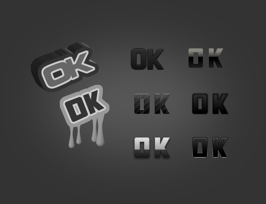
Sabutai wrote:Keep your logo simple, you can always add effects later on.
I like these ones
still id prefer more color, and they could be inserted in a background box or cylinder to give depth
Re: ZK Logo
Posted: 30 Jul 2010, 15:10
by Jazcash
I thought it was 0K, not OK?
Re: ZK Logo
Posted: 30 Jul 2010, 15:24
by Sabutai
Re: ZK Logo
Posted: 30 Jul 2010, 15:52
by scifi
^^ some wip fun i had with photoshop

Re: ZK Logo
Posted: 30 Jul 2010, 15:57
by Hoi
Yeah, keep it simple. I like Sabutai's 1st and 2nd logo. For a logo to work you need to be able to make it in 2/3 flat colors and it should still be clearly visible at that point. Look at the core logo, and at the arm logo. They are basic shapes that deliver some sort of a message.
Re: ZK Logo
Posted: 30 Jul 2010, 16:27
by Jazcash
Re: ZK Logo
Posted: 30 Jul 2010, 16:48
by oksnoop2
i like the striped on in the middle.
EDIT: I wanted to try to make one too. Came out homely though.

Re: ZK Logo
Posted: 30 Jul 2010, 16:53
by Pxtl
If you're going to write 0 K as the actual logo, I'd go with a slashed zero so it doesn't look like you're just saying okay.
Re: ZK Logo
Posted: 30 Jul 2010, 17:07
by Sabutai
My final offer :D