Page 2 of 10
Re: 0k Logo
Posted: 20 Jul 2010, 11:53
by FireStorm_
Ah yes, logos and icons, communication by a single stylised image; isn't it great?. Always like to browse trough here for inspiration.
http://logopond.com/gallery/
oh and I like the plain no border versions best, but I think it kinda depends on their background really.
Re: 0k Logo
Posted: 20 Jul 2010, 15:18
by Pxtl
Ignore the haters. It ain't perfect, but it ain't bad. Go with the black border, no glass, hard edge. Roll with it. Better to have an imperfect logo than no logo at all.
Re: 0k Logo
Posted: 20 Jul 2010, 17:13
by AF
The glass effect would be better if it was 20% more transparent, and the flare bit on the moon was removed. You should be able to get away with the glass being the only gradient on the entire thing.
Re: 0k Logo
Posted: 20 Jul 2010, 17:39
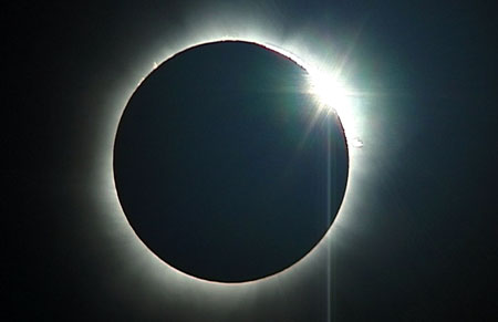
by Licho
Problem is its not a moon, its supposed to be a solar eclipse. But low contrast, too wide "moon" shape and glass break it.
Otherwise I too prefer black hard edges and no glass.
Re: 0k Logo
Posted: 20 Jul 2010, 18:03
by Pxtl
Licho wrote:Problem is its not a moon, its supposed to be a solar eclipse. But low contrast, too wide "moon" shape and glass break it.
Otherwise I too prefer black hard edges and no glass.
I agree - for the "eclipse" thing, the arc needs to be narrower. The inner circle being used to blot out the light should be the same size as the outer circle.
Re: 0k Logo
Posted: 20 Jul 2010, 23:06
by rattle
scifi wrote:LOL
epic now make that spring main logo and we can atract osama bin ladens folowers into spring
...800px-Flag_of_
Turkey.svg.png
OH NO TURKS THAT SELF DESTRUCT... actually I like that idea
Re: 0k Logo
Posted: 21 Jul 2010, 01:53
by Licho
Re: 0k Logo
Posted: 21 Jul 2010, 02:07
by jK
a fast experiment:

Re: 0k Logo
Posted: 21 Jul 2010, 02:39
by Petah
Nice JK
Re: 0k Logo
Posted: 21 Jul 2010, 02:44
by Saktoth
I was just using the 0k website one, trying to turn it into a button. I thought it was quite good actually, because its very simple and looks great at low resolutions:

We can go with a new icon though, even ditch the eclipse entirely if we dont like that. I admit the muslim thing is a bit of a pain but IMO not serious.
Oh, and here is an icon design i know will be popular with everyone:

There, that will work for PR. Perhaps licho was right afterall that the storyline should be robot space vixens.
Re: 0k Logo
Posted: 21 Jul 2010, 05:30
by MidKnight

So I tried my hand at this logo-making thing.
The design's basis is, obviously, a thermometer.
Re: 0k Logo
Posted: 21 Jul 2010, 09:56
by hoijui
there is a half moon on the Turkish flag.
solar eclipse != half moon != Turkish flag != Islam != terrorism & bombs & THE axis of evil
in case you fail to see, consider this to get healthy again:
- throw your TV out the window
- start banging your head against the wall
- whenever you hear or read a word matching "terror.*", go "LAAA LA LA LAAA LA LA LAA...", holding your eyes and ears shut, while thinking on ice-cream
if it does not get better after three months, please consult your local psycho-analyst.
Re: 0k Logo
Posted: 21 Jul 2010, 10:33
by Licho
jK's picture look really great for big icon!
I like the color toning too.
Re: 0k Logo
Posted: 21 Jul 2010, 10:36
by Wombat
i vote for this

Re: 0k Logo
Posted: 21 Jul 2010, 12:13
by SirArtturi
What are these logos for? 0k? what is that?
Well, I figured right away that it was solar eclipse and not a moon. If I'd had to pick some of those, I'd pick either one of the two first above. Which means one with glass borders, soft edges, glass button and one with glass borders, hard edges, plain button?
Anyway if you want it to be more eclipse, why dont you move the moon more to the center so that the eclipse forms a full circle while making the circle flare a bit more?
Re: 0k Logo
Posted: 21 Jul 2010, 15:02
by manolo_
i love wombats pic, it makes me so happy, therefore i want to quit playing wargames and start combing lil ponys
Re: 0k Logo
Posted: 21 Jul 2010, 15:04
by JohannesH
you mean combombing lil ponys I think
Re: 0k Logo
Posted: 21 Jul 2010, 17:57
by MidKnight
hoijui wrote:there is a half moon on the Turkish flag.
solar eclipse != half moon != Turkish flag != Islam != terrorism & bombs & THE axis of evil
in case you fail to see, consider this to get healthy again:
- throw your TV out the window
- start banging your head against the wall
- whenever you hear or read a word matching "terror.*", go "LAAA LA LA LAAA LA LA LAA...", holding your eyes and ears shut, while thinking on ice-cream
if it does not get better after three months, please consult your local psycho-analyst.
full agreement here.
Re: 0k Logo
Posted: 21 Jul 2010, 18:20
by Pxtl
SirArtturi.
0k is the name of the TAIP-free future of Complete Annihilation.
Re: 0k Logo
Posted: 21 Jul 2010, 19:37
by SeanHeron
Huzzah to that!