Random WIP 2018 / 19 / 20

Random WIP 2018 / 19 / 20

Share and discuss visual creations and creation practices like texturing, modelling and musing on the meaning of life.

Moderators: MR.D, Moderators

Post Reply
User avatar
TurBoss
Jauria RTS Developer
Posts: 89
Joined: 27 Jan 2014, 01:04

Random WIP 2018 / 19 / 20

Post by TurBoss »

Hello:

This is something I'm slowly working on with the help of my friend "Lordtaim"

Image

https://youtu.be/BAnIfDjWgcw
Attachments
Crabe.png
WIP CRABE
(168.77 KiB) Not downloaded yet
Last edited by TurBoss on 02 Jan 2018, 20:53, edited 1 time in total.
User avatar
azaremoth
Cursed Developer
Posts: 549
Joined: 17 Feb 2005, 22:05

Re: Random WIP 2018

Post by azaremoth »

Dragoon style! The big gun clearly improves the design. 8)
LordMuffe
Posts: 286
Joined: 13 Mar 2005, 15:39

Re: Random WIP 2018

Post by LordMuffe »

omg that looks menacing, very cool :D
Methuselas
Posts: 17
Joined: 27 Nov 2017, 07:42

Re: Random WIP 2018

Post by Methuselas »

Image
SpikedHelmet
MC: Legacy & Spring 1944 Developer
Posts: 1948
Joined: 21 Sep 2004, 08:25

Re: Random WIP 2018

Post by SpikedHelmet »

why is that a MWO locust
Methuselas
Posts: 17
Joined: 27 Nov 2017, 07:42

Re: Random WIP 2018

Post by Methuselas »

SpikedHelmet wrote:why is that a MWO locust

It's a low poly model I did as a portfolio piece, originally intended for Mechcommander 2, but the limitations of the engine prevented that and I ended up here looking for a substitute.
SpikedHelmet
MC: Legacy & Spring 1944 Developer
Posts: 1948
Joined: 21 Sep 2004, 08:25

Re: Random WIP 2018

Post by SpikedHelmet »

yeah but that's literally a poly-for-poly duplicate of the Mechwarrior Online Locust in 1V configuration

Image
Methuselas
Posts: 17
Joined: 27 Nov 2017, 07:42

Re: Random WIP 2018

Post by Methuselas »

What part of "It's a low poly model I did as a portfolio piece, originally intended for Mechcommander 2" did you miss exactly? I used the concept art to create the piece. Of course it's based off the 1V model, as that was the original variant or "Prime" from the 3025 Technical Readout?
NeverLoseGuy
Posts: 9
Joined: 22 Mar 2018, 16:16

Re: Random WIP 2018

Post by NeverLoseGuy »

First post on this forum and it's a series of renders for my models. Opinions are welcome, perhaps it could use some improvements.

Image
Image
User avatar
FLOZi
MC: Legacy & Spring 1944 Developer
Posts: 6240
Joined: 29 Apr 2005, 01:14

Re: Random WIP 2018

Post by FLOZi »

Looks like you are using many polygons where fewer will do (e.g. barrels & text on tank, missile cones on the jet) and too few where more would lend a sleeker look (turret, cockpit & wings)
User avatar
ThinkSome
Posts: 387
Joined: 14 Jun 2015, 13:36

Re: Random WIP 2018

Post by ThinkSome »

NeverLoseGuy wrote:First post on this forum and it's a series of renders for my models. Opinions are welcome, perhaps it could use some improvements.
...
That tank has a long barrel, meaning it is designed for high muzzle velocity long-range precise projectiles => anti-tank warfare. Yet the front armor does not have a very low slope to deflect energy from incoming projectiles. The same goes for the turret. Also there is no ERA to be seen anywhere.

The jet's missile tubes are silly. Not only do they add unnecessary weight, but the missile itself already has a body designed to whitstand 10 times the stress and velocity of the jet, yet each is contained in its own tube?!
NeverLoseGuy
Posts: 9
Joined: 22 Mar 2018, 16:16

Re: Random WIP 2018

Post by NeverLoseGuy »

When it comes to military weapons I'm not the best at making it realistic. As long as "it makes sense" aka possible, I'm fine with it. Thanks for pointing out though.
User avatar
yuritch
Spring 1944 Developer
Posts: 1018
Joined: 11 Oct 2005, 07:18

Re: Random WIP 2018

Post by yuritch »

The plane missiles would look ok if we assume they are missile pods. Like that: https://ru.wikipedia.org/wiki/%D0%A1-8# ... le:B-8.jpg
NeverLoseGuy
Posts: 9
Joined: 22 Mar 2018, 16:16

Re: Random WIP 2018

Post by NeverLoseGuy »

I'm looking for some feedbacks here.

Here's a render of each faction's MBTs. Ideally I want to make them distinct from one another, so I came up with visualisation of each tanks.

Image

From the left, the first tank has a pointy turret, signifying the faction's superior mobility.

The second has a big turret, supposedly to indicate firepower and strength.

The third has a rigid, blocky turret to tell you it's a descendant of a nokia 3310.

The fourth is a small tank, which informs you that it sucks at all 3 factors but has other areas made up for it e.g. nationalism and gadgets.
User avatar
MasterBel
Posts: 271
Joined: 18 Mar 2018, 07:48

Re: Random WIP 2018

Post by MasterBel »

Disclaimer: I'm totally not qualified to give high quality fedback, so I'll keep it simple.
NeverLoseGuy wrote:From the left, the first tank has a pointy turret, signifying the faction's superior mobility.
Imo it looks more of a sniper-style tank, because of its long turret and the squareness/stability/balance of the body. The turret is also placed very far forward, maybe move it back a bit?

NeverLoseGuy wrote:The second has a big turret, supposedly to indicate firepower and strength.
I like this tank, and I think it conveys that feeling well. The only thing is that the cannons look weakly attatched and may fall off. (Is this the colour, though?)
NeverLoseGuy wrote:The third has a rigid, blocky turret to tell you it's a descendant of a nokia 3310.
I love this tank; it looks the most powerful and reasonably mobile. I am missing the flag/whatever on it, though, but apart from that it looks great!
NeverLoseGuy wrote:The fourth is a small tank, which informs you that it sucks at all 3 factors but has other areas made up for it e.g. nationalism and gadgets.
This may be my favorite tank out of the three – the gadget looks terribly out of place but this one looks especially mobile, partially because its somewhat? shorter turret, and how lightweight it appears.

I love how similar but different all these tanks are. Are you planning on having multiple classes of tanks per faction?

Do keep in mind that even metal has a texture, these models look cool but with the relative (attempted) realism of the average SpringRTS map, these units may look out of place. Of course, custom made maps may make that not be an issue. I'd suggest testing in game and providing some images. Also keep in mind that Dark gray generally looks better than black and works better with shadows (Black can't get any darker, while 70% grey looks almost black but can.) That especially pertains to model #2, but also model #1.
NeverLoseGuy
Posts: 9
Joined: 22 Mar 2018, 16:16

Re: Random WIP 2018

Post by NeverLoseGuy »

Image

Alright, this is probably the first public concept with arts and what not. Just to clarify, this set of units belongs to a branch of a faction that literally gives a middle finger to the realism, so any criticisms about it will likely be irrelevant.

Now anyway, the tank in the center is Brood Mother, basically the "Mother" of the family. It has a rather pathetic damage when compared to other units, but has a decent armour and for speed, well forget about it.

The smaller tank of the left is what it spawns when it dies. 4 of them will appear upon its death. These "Hatchlings" will have even weaker damage output and armour, but will likely be faster compared to its mother.

The smallest tank/wheeled IFV is what it spawns when a hatchling dies. 2 of these will appear upon death. Now these "Parasites" won't be an issue to anyone, but if left for too long, particularly with its fellow parasites, it could still make some dents to your fleets.

And yes, I haven't adjusted the colour scheme yet. I'm not sure if it's really necessary to do so, considering all factions have a rather similar colours in some ways.

Is there anything I should make a change about this?
User avatar
MasterBel
Posts: 271
Joined: 18 Mar 2018, 07:48

Re: Random WIP 2018

Post by MasterBel »

NeverLoseGuy wrote: Is there anything I should make a change about this?
I notice the smaller two are missing the red arrows adn that makes me sad :(
(they do look a tad plain but that's very okay on the smallest given its size. As for the models themselves I love them!)
JacintoGi
Posts: 1
Joined: 30 Apr 2018, 11:43

Re: Random WIP 2018

Post by JacintoGi »

MasterBel wrote: 27 Apr 2018, 14:57
NeverLoseGuy wrote: Is test link there anything I should make a change about this?
I notice the smaller two are missing the red arrows adn that makes me sad :(
(they do look a tad plain but that's very okay on the smallest given its size. As for the models themselves I love them!)
Those models look pretty good, NeverLoseGuy. I would add a couple of more red parts on the smaller models. Just to look a bit more like the bigger one, even though you did a good job with that. You can tell it's a similar design and it makes sense for those vehicles to belong to the same faction.
Last edited by JacintoGi on 24 May 2022, 10:35, edited 1 time in total.
User avatar
azaremoth
Cursed Developer
Posts: 549
Joined: 17 Feb 2005, 22:05

Re: Random WIP 2018

Post by azaremoth »

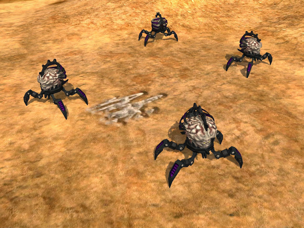
Because I always wanted this little beauty in my game! :twisted:

The Think Tank Spiderdemon! There will be no plasma or vulcan gun attached. I am rather thinking about a mid-randed semi-artillery mindblast-styled weapon. This could make a nice support unit out of that little guy.

Image
User avatar
PicassoCT
Journeywar Developer & Mapper
Posts: 10452
Joined: 24 Jan 2006, 21:12

Re: Random WIP 2018

Post by PicassoCT »

Flying PSI-Tentacles as CEG?
Post Reply

Return to “Art & Modelling”