Page 1 of 1
New Map - Trinity
Posted: 04 Feb 2007, 18:20
by cafecomleite
Posted: 04 Feb 2007, 18:40
by Sheekel
Cool!
Posted: 04 Feb 2007, 19:04
by Aurora
Awesome, though I wish it was less symmetrical.
Posted: 04 Feb 2007, 19:31
by j5mello
looks good and i love ur back story... poor penguins

Posted: 04 Feb 2007, 20:26
by ralphie
Needs more thought put into the metal map imo. There seems to be little point in controlling half of your own island, let alone encouraging any "contested" areas. Liberal amounts of metal towards the middle is a fairly simple method of getting players to fight for territory.
Unless of course your intent was a porc map :p
Posted: 04 Feb 2007, 21:56
by Forboding Angel
ralphie wrote:Needs more thought put into the metal map imo. There seems to be little point in controlling half of your own island, let alone encouraging any "contested" areas. Liberal amounts of metal towards the middle is a fairly simple method of getting players to fight for territory.
Unless of course your intent was a porc map :p
THis qupote right here is the reason that most maps suck.
Heavy metal in the middle is bad. I have proven this time and time again for over a year.
However, you do need metal in the water. ATM it will generally turn into an arty war
There are a lot of problems with this map. A lot of small and large flaws that would just bog down a game.
So I have uploaded a fixed version, and sent you the link via email and pm flamesrock.
Major problems were:
Height (reset height differences to -100 and 250. That way amphibs will be useful, and it didn't stretch out the texture as badly)
No start settings (you'll have to set these yourself. I Hate doing start spots)
fog distance set waaay to low (actualy it was at default, which is bad, because you didn't have the tag defined in your smd).
For the smd, I simply replaced yours with the one I used for Evad River Confluence. Go ahed and fiddle with it some, however, you might wanna leave the lighting alone, as those colors accurately (to a point) reflect shadows the same way taht shadows appear in real world.
BTW just so you know... SMFED.exe is a tool that will let you open up your smf file and change the height without recompiling.
Anyway, check your pm's
Posted: 05 Feb 2007, 02:28
by genblood
I like the map concept, but it needs a little work. The smd file needs
starting positions. Also, the TerrianType needs to be fixed too.
I agree with FA about the height of the map. The metal placement
should be redone too.
This is my opinion on this map.
1. fix the height map
2. redue the metal map
3. redue the main texture
4. add trees and grass
5. (optional) rocks and proper terrian types ..
Posted: 05 Feb 2007, 03:25
by genblood
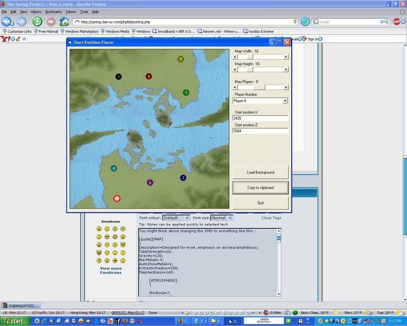
You might think about changing the SMD to something like this :
[MAP]
{
Description=Designed for 4vs4, emphasis on air/sea/amphibious;
TidalStrength=18;
Gravity=130;
MaxMetal=.9;
AutoShowMetal=1;
ExtractorRadius=200;
MapHardness=140;
[ATMOSPHERE]
{
MinWind=7;
MaxWind=18;
CloudColor=0.9 0.9 0.9;
CloudDensity=0.15;
SkyColor=0.1 0.15 0.7;
SunColor=1.0 1.0 1.0;
}
[WATER]
{
WaterSurfaceColor=0.4 0.6 0.8;
WaterPlaneColor=0.4 0.6 0.8;
WaterBaseColor=0.4 0.6 0.8;
WaterAbsorb=0.004 0.004 0.002;
WaterMinColor=0.1 0.1 0.3;
}
[TEAM0]
{
StartPosX=2507;
StartPosZ=1409;
}
[TEAM1]
{
StartPosX=5833;
StartPosZ=6619;
}
[TEAM2]
{
StartPosX=5980;
StartPosZ=2228;
}
[TEAM3]
{
StartPosX=2261;
StartPosZ=6128;
}
[TEAM4]
{
StartPosX=4063;
StartPosZ=1393;
}
[TEAM5]
{
StartPosX=4129;
StartPosZ=6865;
}
[TEAM6]
{
StartPosX=5702;
StartPosZ=508;
}
[TEAM7]
{
StartPosX=2425;
StartPosZ=7684;
}
[TERRAINTYPE0]
{
name=Soft-Terrain;
hardness=3;
tankmovespeed=0.6;
kbotmovespeed=1;
hovermovespeed=0.9;
shipmovespeed=0.8;
}
}
The map is nice, but a few fixes will make it better. Also, here is a
screenie with the new start position.
Also, I won on my Super Bowl square ...

Posted: 05 Feb 2007, 04:41
by smoth
neat map, but the texture needs a lot of work and the heights are TOO high.
Posted: 05 Feb 2007, 04:53
by Goolash_
people seem to have given you all the criticism you need, i agree with some and i disagree with some but i'll tell you this:
For a first map this is impressive, Kudos and keep up the good work. This is light years better than my first map (and i guess some people will say that it's light years better than my new ones

).
I hope you take all the criticism thrown at you in good spirit and that it doesn't discourage you in any way from making more maps in the future. Good job.
Posted: 05 Feb 2007, 10:43
by AF
Can we see sideways images, a minimap isnt a lot to go on sometimes.
Posted: 17 Feb 2007, 19:12
by keithjr
I really like the concept of this map, there is symmetry but it is at the same time almost natural-feeling. I do agree that more water metal would make an interesting touch, but beyond that, great work!
Posted: 18 Feb 2007, 00:33
by 1v0ry_k1ng
it would play better left V right imo
Posted: 20 Feb 2007, 21:58
by Comp1337
OH FOR THE LOVE OF SWEET GOD MY EYES, THE LOD IT BURNS
Cant wait to play this
Posted: 21 Feb 2007, 13:18
by Daan
Yeah this is an awsome map


