Page 1 of 1
Put the "orders menu" AT THE END YOU EVIL..> PE
Posted: 26 Aug 2006, 15:27
by Caydr
Build buttons should come first, then orders. Better yet put a proper switcher thing between the two. It's about time, now that there appears to be some part of the new GUI coming into play.
Posted: 26 Aug 2006, 23:26
by LordMatt
+1 Also it would be awesome if some keys got bound to the buttons that page through the menus. Even cooler if they got bound to mouse 4 and 5 (the forward and back buttons on a five button mouse).
Posted: 27 Aug 2006, 00:50
by Caydr
LordMatt wrote:+1 Also it would be awesome if some keys got bound to the buttons that page through the menus. Even cooler if they got bound to mouse 4 and 5 (the forward and back buttons on a five button mouse).
Those are already bound.
Posted: 27 Aug 2006, 01:13
by AF
I think it'd be nicer if we used horizontal scrolling for that, or if we used the normal scroll wheel over the menu it'd scroll through otherwise it'd do zooming if on the map
Posted: 27 Aug 2006, 06:17
by Optimus Prime
i would prefer 2 menus. One for orders and another one for building things. The Order menu should have smaller pics, but more different style than now (they all look the sam, so that they have to be big, so you can see what it is). Foe example a red crosshair for attack could be 1/4 as big as it is now, so that you could use most of the space for the build menu.
Posted: 27 Aug 2006, 12:57
by trepan
DELETED
Posted: 27 Aug 2006, 13:44
by Soulless1
AF wrote:I think it'd be nicer if we used horizontal scrolling for that, or if we used the normal scroll wheel over the menu it'd scroll through otherwise it'd do zooming if on the map
I like

though trepan's stuff looks pretty cool too, I'll have to look into that a bit more and make sure I understand it first before commenting though...
Posted: 27 Aug 2006, 19:34
by SinbadEV
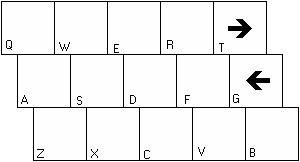
I' would prefer if the overlay was like this, with the slight offset and the acctual keypresses overlayed over the buttons.
Otherwise I really like this idea but I would prefer if there was a way to not have to switch between menues at all when giving any orders but building... and have the build menu come up when you press B or something...
or using your system...
pressing the build button would populate Q,W,E,R,A,F,Z,X,C, and V as build pics and s and d would become a button to go to the next or previouse build menu, t or g at this point would send you back to the standard orders menu view.
edit:sorry I keep changing my post...
Posted: 27 Aug 2006, 21:02
by Acidd_UK
AF wrote:... if we used the normal scroll wheel over the menu it'd scroll through otherwise it'd do zooming if on the map
+1
Posted: 28 Aug 2006, 00:24
by trepan
DELETED
Posted: 28 Aug 2006, 00:57
by Dragon45
I am a big fan of the keyboard. I made my own very useful selectkeys.txt with even more crazy utilization of keyboard sequences and letters; i woudl hope that i can still use the mouse to navigate the menus if i need to, and if can shift the keyboard's "builder item" keys to, say, Insert/Home/PgUp/Delete/End/PgDown (two ros of three on my keyboard) if i need to, and use the letter keys for something else (such as the custom commands i already use it for).
Posted: 28 Aug 2006, 02:36
by Caydr
That's all well and good, but will there be chicken?
Also it'd mean remapping the A and D keys, arguably the coolest functions in the game. S, also, but it'd not so cool.
So, can we have orders on its own page or not? I want orders on its own page more than I want a new GUI or scripting system or hitbox support. Seriously. I'm really hungry.
Posted: 10 Sep 2006, 12:47
by colorblind
In the next release build options will come before other commands.
Although seperate (build / command) pages like in OTA does sound nice, I doubt it would have any real advantages. You can already browse through the pages with "." and ",", and real pros of course know the keyboard shortcuts :).
Posted: 10 Sep 2006, 15:29
by FireCrack
^Does the next version have that zany "hold spacebar and all build orderes come up in the middle of the screen" thing? I realy liked that one...
Posted: 10 Sep 2006, 16:15
by Sheekel
New GUI?
Posted: 11 Sep 2006, 07:06
by Das Bruce
Sheekel wrote:New GUI?
Revamped more like.
Posted: 11 Sep 2006, 11:01
by Ishach
To be honest I dont think i've ever clicked one of the things from the order menu since I was a 2 Chevron.