Page 1 of 3
New tournament map: Ganymede V1
Posted: 12 Oct 2009, 00:41
by Beherith
Fun 18*18 ccr style map. Mirrored for tourney play.
Made for 1v1 and large team games.
World machine+Carrara

 http://www.springfiles.com/show_file.php?id=2323
Re: New tournament map: Ganymede V1
Posted: 12 Oct 2009, 03:12
by Das Bruce
Looks kind of boring.
Re: New tournament map: Ganymede V1
Posted: 12 Oct 2009, 07:13
by MidKnight
REQUEST: Run CCR's heightmap through Carrara with these settings.
Re: New tournament map: Ganymede V1
Posted: 12 Oct 2009, 07:53
by Neddie
Why? We have a dozen CC and CCR. I want other space maps.
Re: New tournament map: Ganymede V1
Posted: 12 Oct 2009, 09:23
by hunterw
looks like a bigger moonq20x...1v1 on 18x18?

Re: New tournament map: Ganymede V1
Posted: 12 Oct 2009, 09:43
by Neddie
Hey, in CA you can do anything.
Re: New tournament map: Ganymede V1
Posted: 12 Oct 2009, 10:17
by Argh
Good heightmap, non-obvious mirror, but the texture feels... IDK, something's missing (imo, of course).
Maybe treat the craters a bit more realistically, give them some color variation vs. higher zones (assuming we're talking an airless moon)? The places where the gray cuts the rust-red suddenly look a bit machine-made. Don't really want to get super-specific about it- it's a nicely-done concept, I like it overall, it just doesn't feel quite right yet.
Re: New tournament map: Ganymede V1
Posted: 12 Oct 2009, 11:15
by SirArtturi
Cmon people? Compared to CCR it's far as being boring looking... You wanted big CCR and now you got it? Excuse me, but what did you expect if this doesn't feel right?
Moon maps ain't supposed to look vivid, right?
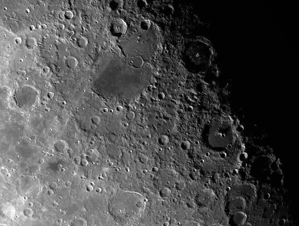
http://images.astronet.ru/pubd/2005/07/ ... gal_c2.jpg
Re: New tournament map: Ganymede V1
Posted: 12 Oct 2009, 14:54
by Beherith
Heres CCR ran through the same render:
Do what you want with it, Im not remaking ccr.
I feel the main lacking on ganymede is insufficient distortion of craters. They look too uniform.
WARNING! CLICKING ON PIC GIVES YOU FULL 22MB JPG.

Re: New tournament map: Ganymede V1
Posted: 12 Oct 2009, 15:06
by Beherith
Hmm, added displacement makes it much nicer:

Compare to old one:

Only possible in a few clicks with world machine


Re: New tournament map: Ganymede V1
Posted: 12 Oct 2009, 15:20
by smoth
cool
Re: New tournament map: Ganymede V1
Posted: 12 Oct 2009, 15:30
by 1v0ry_k1ng
cool, a 14x14 version would be good for 1v1
Re: New tournament map: Ganymede V1
Posted: 12 Oct 2009, 15:41
by Beherith
New texture; anything else i should tweak?

Re: New tournament map: Ganymede V1
Posted: 12 Oct 2009, 15:42
by 1v0ry_k1ng
those crease lines look kinda artificial
Re: New tournament map: Ganymede V1
Posted: 12 Oct 2009, 16:07
by Beherith
Something along these lines?

Re: New tournament map: Ganymede V1
Posted: 12 Oct 2009, 16:23
by Otherside
bottom one looks awesome the crease lines did look a bit artificial
Re: New tournament map: Ganymede V1
Posted: 12 Oct 2009, 17:15
by MidKnight
Bottom one indeed does look awesome. Nice job, best space map I've seen yet.

Re: New tournament map: Ganymede V1
Posted: 12 Oct 2009, 17:38
by Beherith
Compare previous to: (disregard shadows being on in prev render, they have to be off for final)

Re: New tournament map: Ganymede V1
Posted: 12 Oct 2009, 17:44
by Beherith
Bit less bumpiness on flats:

Re: New tournament map: Ganymede V1
Posted: 12 Oct 2009, 18:02
by Gota

The less pronounced craters in red in the middle means the craters in the middle on which i pasted craters from Sir's picture of the moon.
IMO there are a bit too many of the big craters.
Its a bit confusing and the eye cant catch the terrain.
I think would be better if their amount was reduced.
I think if you add just a few,like 2 bigger shapes like the less pronounced craters jsut to draw the eye and allow the brain to easily remember the map's structure and divide it into subsections around certain objects.
The map looks too uniform and i think will suffer the same unplayability as other very nice maps such as sir artturi's green hilly map and eye of horus.
A map with a uniform color and many objectes and lines and a very packed with detail heightmap is hard to play...
There is another such map that doesnt get played althought it appears to be awesome.
the one Hunter made with the very elaborate heightmap filled with detail...