Page 1 of 7
Remove the Sperm
Posted: 22 Jul 2005, 14:49
by aGorm
Can we please remove this site logo and use somthing better??
I'd be happy to do one myself, but im 1 going on holiday, and two no-one will prob want mine anway.
it needs to go cause it looks so unpro.
Do you agree?
aGorm
Posted: 22 Jul 2005, 17:49
by AF
Put the word spring and the new logo infront of a good screenshot
Posted: 22 Jul 2005, 18:15
by AF

Such as the abov eimproovement. I knocked that up in 2 minutes.
Posted: 22 Jul 2005, 18:53
by zwzsg
Too TAish.
Posted: 22 Jul 2005, 19:07
by Tim Blokdijk
I made a 3D version of the Spring logo before in blender.
Source file:
http://www.timblokdijk.nl/spring/logo/blenderlogo.blend
Posted: 22 Jul 2005, 19:39
by Tim Blokdijk

Source file:
http://www.timblokdijk.nl/spring/logo/logobar.xcf
I don't like the statement that the goal is to use copyrighted material but I can't change that just now.
Posted: 22 Jul 2005, 19:46
by AF
I dont like it. *goes to look for spring screenshot without TA units in it*
Posted: 22 Jul 2005, 19:55
by Min3mat
im loving tims. its sooooooooo much better than the current sperm ^^.
Posted: 22 Jul 2005, 20:53
by aGorm
Hi tim, could you save that in another format like cob, 3ds, dfx, obj? Any of those i can open! I dont have blender (or should i say i cant make it work... )
aGorm
Posted: 22 Jul 2005, 21:38
by aGorm
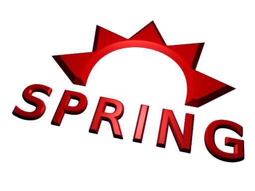
I was thinking somthing like this...

aGorm
Posted: 22 Jul 2005, 21:47
by Kixxe
I like it! but add a TA unit atleast! Like a peewee facing the you or something. Or something from the ''bruce zues'' screen shot...
Posted: 22 Jul 2005, 22:35
by AF
I dont think ti looks right either, more like those corny train leaflets from wales.
Posted: 22 Jul 2005, 22:38
by Kixxe
Hmm.. try a picture with springs reflecktive water a shadows... Or just a reall cool battle pic.
Posted: 22 Jul 2005, 23:06
by Neuralize
Posted: 22 Jul 2005, 23:30
by aGorm
possible (open in new window) CLICK THE LINK BELOW
http://www.onebob.co.uk/darren/pics/title.html
However the background pic in taht can be replaced with whatever is wanted by genral consensos, and I will add a pre loader. (if needed)
aGorm
::EDIT:: If it moves to much for your taste, try clicking it to see what happens
:: EDIT AGAIN :: THE PINK CATS RULE
:: FINAL EDIT :: Bronze is teh word your looking for, or would be if i could speel bronze. It looks miss spelt...
Posted: 22 Jul 2005, 23:30
by AF
pink cats?
edit:: And whats with all this brown!! it's horrible
Posted: 22 Jul 2005, 23:48
by Min3mat

CATS!!! AWESOME!!! THAT ONE! :D
Posted: 23 Jul 2005, 00:05
by Zoombie
Nah... i like the 0ne with the tanks, just get rid of the health bars and the selecti0n b0xes.
I rem0ved all my 0's and replaced them with zer0s!!!!
Posted: 23 Jul 2005, 00:12
by Buggi
I like tim's best so far.
-Buggi
Posted: 23 Jul 2005, 00:13
by zwzsg
So far
Tim Blokdijk's one is the one I like best.


