Page 1 of 1
New Map ... Paridise-Flats-V1 ...
Posted: 06 Oct 2007, 19:12
by genblood
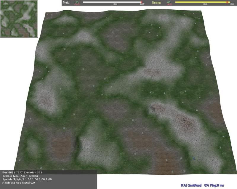
A new map I've made ,,,
Here are some screen shots of the map.

You can download the map from the link below:
http://www.unknown-files.net/3599/ParidiseFlatssd7/
Have fun .... Download it and try it out ...

Posted: 07 Oct 2007, 00:56
by smoth
this seems like a step in the wrong direction for you genblood. It is just a slightly hilly field with nothing on it.
Posted: 07 Oct 2007, 01:00
by Snipawolf
Like the texture, but the map does look boring.
Posted: 07 Oct 2007, 02:41
by AF
You need a design, a premise for your map before you begin, otherwise your going to end up wandering with no sense of direction.
Also the south of this maps layout is identical to a map you made ages ago but with a blue ground and beige hills. It was very very similar to this one.
huh
Posted: 07 Oct 2007, 02:43
by rcdraco
I really like it, looks like a great tactics map. If you have it on select start, this would be a great map. Just a little question, what size is this map?
Posted: 07 Oct 2007, 02:51
by genblood
I hate to say, this is what my target goal was for this map.
My goal was small to mid size hills with no trees with average
metal.
It's different from the last one I did ...
Looks like, I'll try something different next time ..
rcdraco:
The map size is 16x16 ...
Posted: 07 Oct 2007, 03:30
by Ifein
DZHIBRISH wrote:[...]many players would appriciate it if you could make some maps which range from 16x16 to 20x20,almost flat with small hills but the hills should be to big.[...]
from:
http://spring.clan-sy.com/phpbb/viewtopic.php?t=12117
Posted: 07 Oct 2007, 04:04
by AF
The flat map market is greatly over saturated and isn't particularly innovative either.
Posted: 07 Oct 2007, 04:06
by Neddie
AF wrote:The flat map market is greatly over saturated and isn't particularly innovative either.
Why don't you say something constructive or relevant? This map is not flat, and while there are others like it, the effort put into it cannot be dismissed so easily.
Posted: 07 Oct 2007, 04:45
by AF
Neddierow, you cant deny what is said isn't true. Even genblood has said that's what he was aiming for.
And I was not being dismissive. Genblood is not finished, a good dose of depth could change the maps dynamic a lot with the same texture and layout.
Posted: 07 Oct 2007, 10:35
by Hellspawn
Map actually look okish to me (then again I like open-fast expanding maps). I would just add some trees. Will try how it plays a bit later.
Posted: 07 Oct 2007, 11:20
by Pressure Line
genblood wrote:Looks like, I'll try something different next time...
you mean it looks like you should ignore AF, he has done nothing but bitch all week.
tbh, if the map does what you want it to (which it seems it does), and there arent any obvious glaring errors (which there dont appear to be), who is anyone to say that anything you do is no good?
Posted: 07 Oct 2007, 11:20
by DZHIBRISH
My concern was more about the metal maps on flat maps.. making metal maps that involve only a few strategic spots with metal while the rest of the map is just place to maneuver/flank and what not..
Dont foget though that part of what makes a map fun to look at is the texture as well.a map can be simple but have a very appealing texture..
Posted: 07 Oct 2007, 11:24
by Pressure Line
DZHIBRISH wrote:My concern was more about the metal maps on flat maps.. making metal maps that involve only a few strategic spots with metal while the rest of the map is just place to maneuver/flank and what not..
thats more or less the design brief for S44 maps, try Spiked's 'Road To Rome' map, i think thats the kind of map layout you are looking for.
amd in this respect i agree with Dzhi, need more maps with 1/2-1/3 the number of metal spots, but making the spots more productive to compensate. tie the fighting to strategic points.
Posted: 07 Oct 2007, 13:01
by genblood
I've been thinking .... an before you know it ... I smell smoke ..
an the smoke detector .. is buzzing ...

... OH !!!
It's morning ... An my toaster F$#KED up ,, my bread got
jammed ....

My 2 slices of white toasted ... is a little
dark ... So, after 4 or 5 cups of java ... with dark toasted
bread ...

I decided to take the time to revamp that
last map ...
Here are the changes:
+ added trees
+ changed the heights
+ changed the mex decals
+ redone the main texture
+ increase the gravity to 177
+ reduced the metal extraction area
Things I might change if some requests it :
+ add water ...
+ reduce metal deposits by half , but in increase metal output from 1.6 to 2.4
+ add more trees and a few Geos
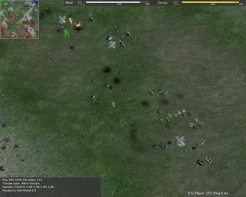
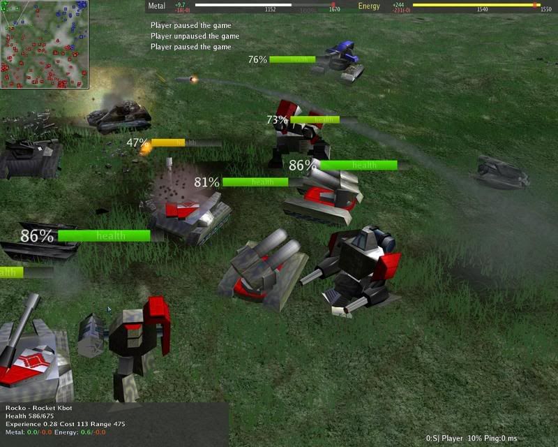
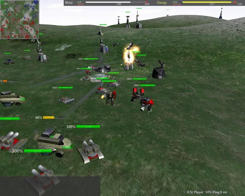
For now I've did my changes ... Here are some screen shots
of the new look...


Post your comments ....
Posted: 07 Oct 2007, 17:58
by AF
The green is too bright ad the default trees are murdering it. Smoths trees would look far better, or even the snowy trees lathan made.
Increase the height difference of the hills a little and make the gray extend out some more. Add some more blue/gray into the green and put some of the snowy trees from severnaya onto the hills.
If your going to go for flat open terrain you cant have repeating textures for grass etc or itll look too obvious, you need to break it up a little here and there as there're no major terrain differences or features like ponds or buildings to break things up for you.