Page 1 of 8
The New Spring Site
Posted: 02 Jun 2007, 02:34
by AF

Thats with the changes aGorm suggested minus the change from green.
To start us off I ask:
- What colour other than green would be best?
- Would you prefer a forum with dark on white rather than white on dark?
Posted: 02 Jun 2007, 04:04
by Dragon45
Pure CSS, no tables, I hope?
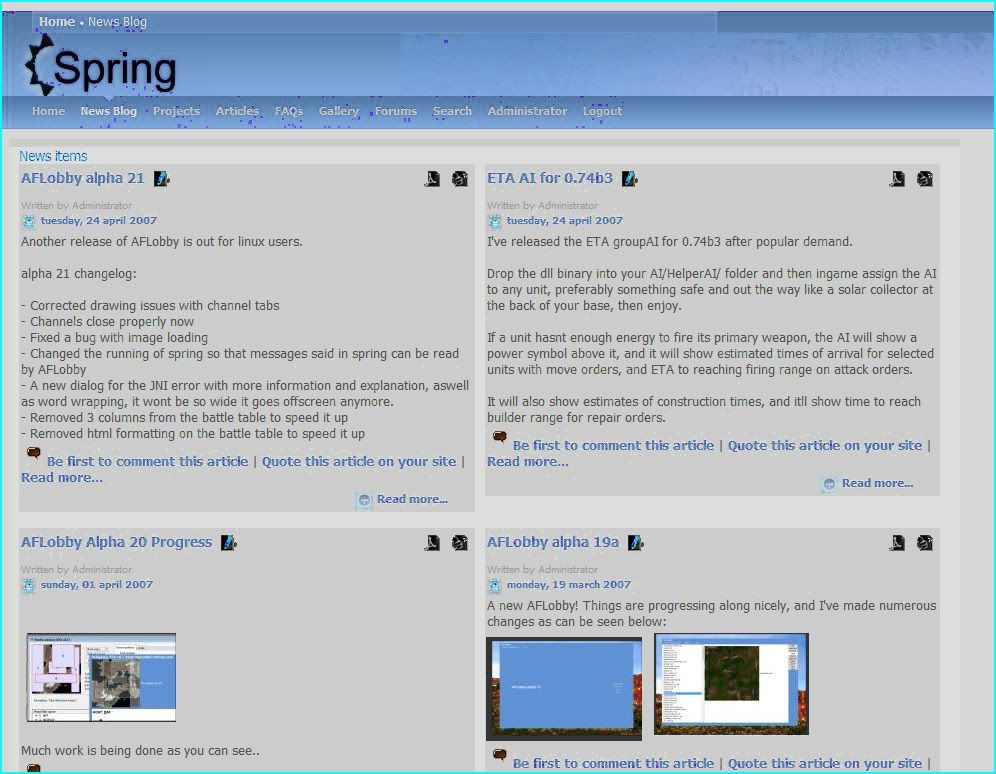
Oh, and IMHO the main News section should be "straight-line"/"linear", not in the 4-corners format you put it in. News items happen one right after another. The remaining space should be used for screenshot-of-the-day / Last Ladder Match Details and other promotional stuff. Really, the site needs to be oriented around pimping Spring from the instant one arrives at it. News shoudl not be alone on the front page, in fact, it should onyl be about half the page IMHO. The site is the greatest promotional tool available to us; we should be showcasing latest progress, pretty screens, and general try adn give the impression of very active area.
Why not just use this as a skin for a Drupal backend or something? (Not Wordpress, it doesn't have the flexibility for this)
Posted: 02 Jun 2007, 06:39
by Warlord Zsinj
Looks a bit busy with each of the four elements equally vying for attention; it is also more of a community-focused site, whereas I think the community elements should be smaller and less important, because we know where to find them. The frontpage should be more about having cool pictures of spring and getting across that it's a gorgeous free, Open Source RTS Engine, with an active online community and numerous mods. I don't think your design really accomplishes that.
The front page is first and foremost a gateway for people interested in Spring, and should be designed to catch their attention and keep it immediately, as well as quickly convey exactly what we're on about. It is only secondary as a point of orientation for people wishing to explore the community, find out about AI's, etc. Which is not to say that they shouldn't be present on the frontpage, because they should, but there is no way that "AI is being updated!" should be anywhere near the visual focus of "lookie at these sexy battles! DOWNLOAD IT HERE FOR FREE!", if you get what I mean.
Posted: 02 Jun 2007, 07:09
by Zoy64
Warlord Zsinj wrote: lookie at these sexy battles!
If you know what i mean, if battles were sexy, everyone would be in bikinis and speedos and that would drive off all the people interested in downloading Spring.
Posted: 02 Jun 2007, 10:07
by Comp1337
Zoy64 wrote:Warlord Zsinj wrote: lookie at these sexy battles!
If you know what i mean, if battles were sexy, everyone would be in bikinis and speedos
Thats just your weird fetish.
On a serious note, the forntpage should have the news in one column like it is now. Also i prefer light text on dark bg, its easier on the eyes.
Posted: 02 Jun 2007, 10:59
by aGorm
SO have none of you noticed taht he's not on the home page, but teh news blog?
Anyway, much better with the content areas blocked out in lighter grey.
I'll let you know what colour i think later when I have decided....

aGorm
Posted: 02 Jun 2007, 15:37
by AF
OK... your all commenting on darkstars.co.uk...
Right now thats just the template work in progress applied to the existing darkstars site. It isnt the frontpage (
http://www.darkstars.co.uk as you can see here), and I've other plans for the spring frontpage.
Right now I havent gotten into layout specifics such as how news is laid out etc because they're not specific to the template itself, which is what I'm currently working on. Right now the questions are, should it be this colour, should the menu be down the side or at the top, should there be a big footer, do text look good like that, what about this header.
Untill I've sorted out the theme and I'm sure itll do fine, then I'll set out about sorting out content and stuff.
Posted: 02 Jun 2007, 16:05
by TradeMark
I dont like dark pages, light colors are good: gives trusted and professional feeling.
Also yellow/ light green is not good... it gives feeling that the site is some commercial purpose or some fun page...
Light grayish colors are good, as how they are in the current layout.
Posted: 02 Jun 2007, 21:36
by Machiosabre
I'm with trademark, the current colour scheme is perfect, tbh I think the layout is fine as well, it's just the content that needs changing really.
edit: whoops this post probably would have fit better in the regular site update thread

Posted: 02 Jun 2007, 23:16
by AF
Thats the point, that is not the content of the spring site, thats darkstars with the proposed theme applied. The theme is what I'm working on and the theme is the only thing you can give feedback on because theres no content yet there's no site structure, just the theme and a general technical plan.
Once again I shall make ti plain and clear, the green is neutral, aka I dont know what colour ti is and I'm waiting for a long parade of posts saying 'use this colour instead'. Its like pointing a colour picker at red and being told 'this isnt blue'.
How many people agree with the white background? Should I start again using dark text on a light background?
Once again, no comments on content, there is no content to comment on yet
Posted: 03 Jun 2007, 00:02
by Zoy64
maybe instead of a whole new layout, just make it a skin people can just choose if they want.
Posted: 03 Jun 2007, 00:39
by Warlord Zsinj
My apologies, AF, I misunderstood.
Posted: 03 Jun 2007, 01:27
by AF
Because underneath the site is changing. This site isnt themable or skinnable, but my new proposed site is.
Posted: 03 Jun 2007, 02:59
by very_bad_soldier
I like this color-scheme with green and black background. It has some sort of style. Its maybe true that brighter pages look "more professional". But I think that spring should not look too "technical" like it does at the moment. It should look a bit more like fun.

Posted: 03 Jun 2007, 06:25
by SinbadEV
I like your theme AF, but I agree with those who are saying "less garish colours" too...
I think I like the current colour scheme of the page... hum... looks like 50% better just by inverting the colours
Posted: 03 Jun 2007, 07:11
by Dragon45
AF, so what I understand is you're basically showing us nothing?
I've seen Darkstars and you're a good webdesigner, can you please show us something to rate besides a color scheme?
Posted: 03 Jun 2007, 17:36
by Lindir The Green
Yeah, I think the layout should be decided before the color scheme.
The color scheme looks good (if a little garish... maybe add some gray to the green), but I can't really know until I see it with a layout.
Posted: 03 Jun 2007, 19:15
by AF
I know about the colour scheme, but nobodies suggesting a replacement for the green yet.
Posted: 03 Jun 2007, 19:40
by SinbadEV
Posted: 03 Jun 2007, 19:44
by TradeMark
What the hell is wrong with that image? its crap quality, and it takes 200kB
And there is some crap in the file:
Code: Select all
<x:xmpmeta xmlns:x="adobe:ns:meta/" x:xmptk="3.1.1-111">
   <rdf:RDF xmlns:rdf="http://www.w3.org/1999/02/22-rdf-syntax-ns#">
      <rdf:Description rdf:about=""
            xmlns:dc="http://purl.org/dc/elements/1.1/">
         <dc:creator>
            <rdf:Seq>
               <rdf:li>Tom</rdf:li>
            </rdf:Seq>
         </dc:creator>
         <dc:format>image/jpeg</dc:format>
      </rdf:Description>
      <rdf:Description rdf:about=""
            xmlns:tiff="http://ns.adobe.com/tiff/1.0/">
         <tiff:artist>Tom</tiff:artist>
         <tiff:Orientation>1</tiff:Orientation>
         <tiff:XResolution>960000/10000</tiff:XResolution>
         <tiff:YResolution>960000/10000</tiff:YResolution>
         <tiff:ResolutionUnit>2</tiff:ResolutionUnit>
     </rdf:Description>
      <rdf:Description rdf:about=""
            xmlns:exif="http://ns.adobe.com/exif/1.0/">
         <exif:DateTimeOriginal>2007-06-02T00:22:58Z</exif:DateTimeOriginal>
         <exif:PixelXDimension>996</exif:PixelXDimension>
         <exif:PixelYDimension>774</exif:PixelYDimension>
         <exif:ColorSpace>-1</exif:ColorSpace>
      </rdf:Description>
      <rdf:Description rdf:about=""
            xmlns:xapMM="http://ns.adobe.com/xap/1.0/mm/"
            xmlns:stRef="http://ns.adobe.com/xap/1.0/sType/ResourceRef#">
         <xapMM:DocumentID>uuid:D26743B5C812DC11B94CC822805CF4E5</xapMM:DocumentID>
         <xapMM:InstanceID>uuid:C683504CC912DC11B94CC822805CF4E5</xapMM:InstanceID>
         <xapMM:DerivedFrom rdf:parseType="Resource">
            <stRef:instanceID>uuid:CE6743B5C812DC11B94CC822805CF4E5</stRef:instanceID>
            <stRef:documentID>uuid:CE6743B5C812DC11B94CC822805CF4E5</stRef:documentID>
         </xapMM:DerivedFrom>
      </rdf:Description>
      <rdf:Description rdf:about=""
            xmlns:xap="http://ns.adobe.com/xap/1.0/">
         <xap:CreateDate>2007-06-04T13:27:49-05:00</xap:CreateDate>
         <xap:ModifyDate>2007-06-04T13:27:49-05:00</xap:ModifyDate>
         <xap:MetadataDate>2007-06-04T13:27:49-05:00</xap:MetadataDate>
         <xap:CreatorTool>Adobe Photoshop CS2 Windows</xap:CreatorTool>
      </rdf:Description>
      <rdf:Description rdf:about=""
            xmlns:photoshop="http://ns.adobe.com/photoshop/1.0/">
         <photoshop:ColorMode>3</photoshop:ColorMode>
         <photoshop:History/>
      </rdf:Description>
   </rdf:RDF>
</x:xmpmeta>
lol