Page 5 of 6
Re: Kernel Panic Logo Title
Posted: 29 Nov 2010, 15:51
by Tim Blokdijk
Re: Kernel Panic Logo Title
Posted: 29 Nov 2010, 16:36
by Jazcash
dat ass
Re: Kernel Panic Logo Title
Posted: 29 Nov 2010, 17:07
by FireStorm_
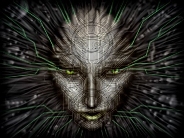
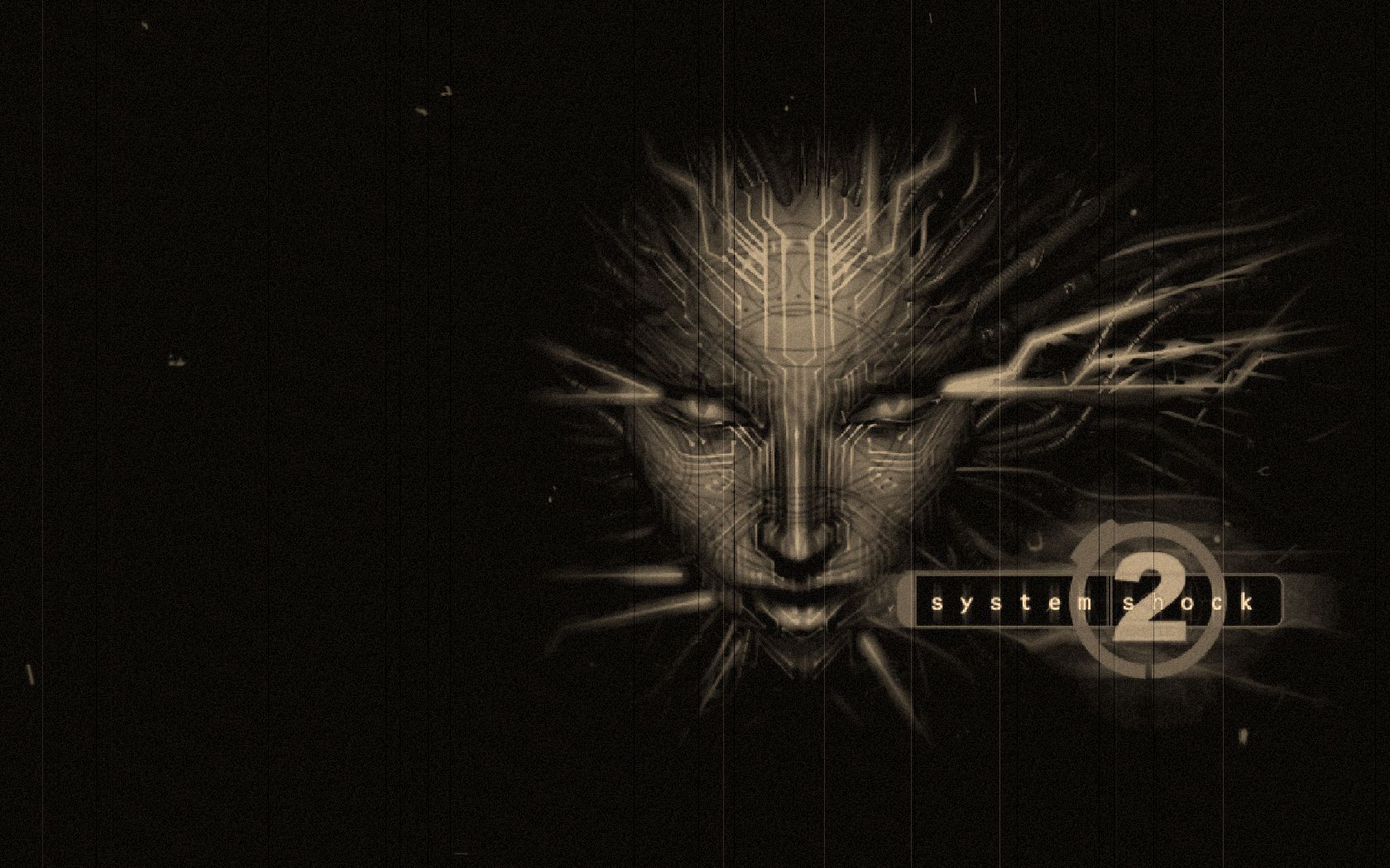
Maybe it is a fun idea to let every faction be represented by a single face. Like blizzard did with sc boxes.
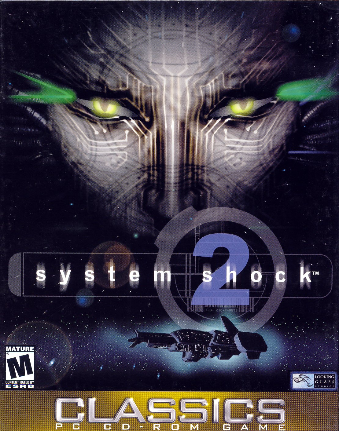
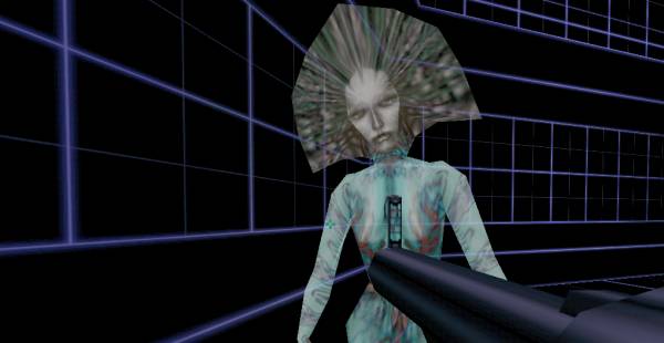
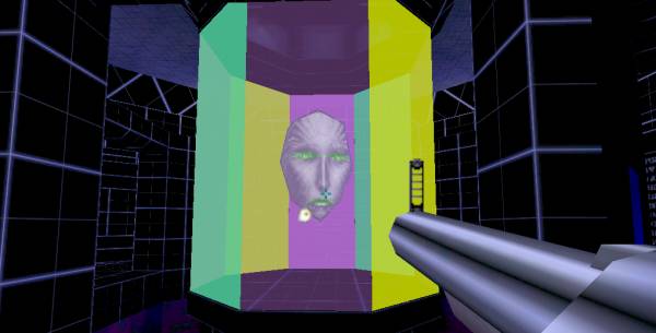
Also: Systemshock

. gave me some fond memories. (Some scary ones too

)
Re: Kernel Panic Logo Title
Posted: 29 Nov 2010, 20:18
by PicassoCT
Dont you ask marketing people about faces on boxxes, or in logo designs. They can go for hours. Like we see faces in clouds and stones on foreign planets, its a human bug, and it upgrades every thing into a "emotional, living beeing, due to our mirror neurons going overdrive"
Notice how you feel sympathy for the linux penguin, while when you think of microsoft - this guy pops out.

You cant avoid mascotts and faces, sooner or later they will come to your product (even to a abstract one like spring), better you choose now while still in controll, instead of letting destiny go rand.
Re: Kernel Panic Logo Title
Posted: 29 Nov 2010, 20:33
by Jazcash
Works for me. I blow a load every time I see Mr Gates.
Re: Kernel Panic Logo Title
Posted: 29 Nov 2010, 20:49
by KaiserJ

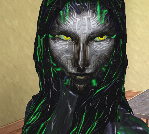
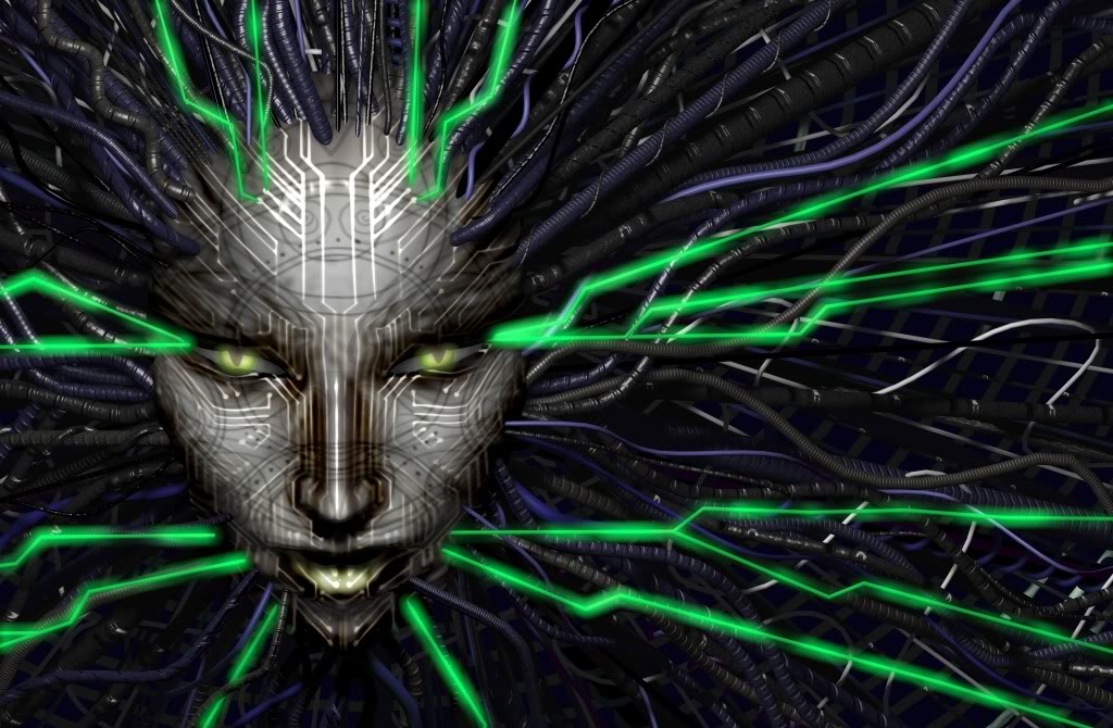
?!?! is that not this
Re: Kernel Panic Logo Title
Posted: 29 Nov 2010, 21:34
by PicassoCT
Lol. Li is stoned shodan. Haxxors can do to your sourcecode things you never thought yourself.
Re: Kernel Panic Logo Title
Posted: 21 May 2011, 20:51
by Tim Blokdijk
It took half a year or so.. but in the meantime I took a 16 hour Blender training from
Dolf "Macouno" Veenvliet, a real official Blender Foundation Certified Trainer. Whooo!!
Technically I understand Blender
a lot better, still need another training to become more creative.

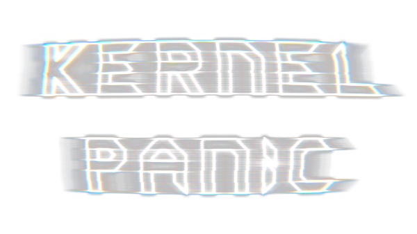
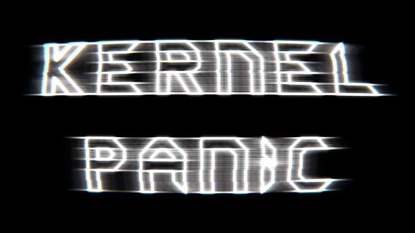
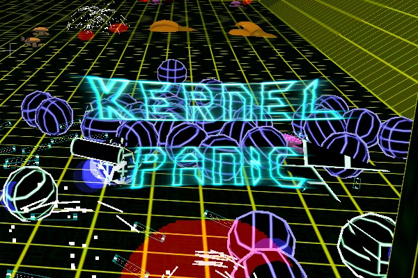
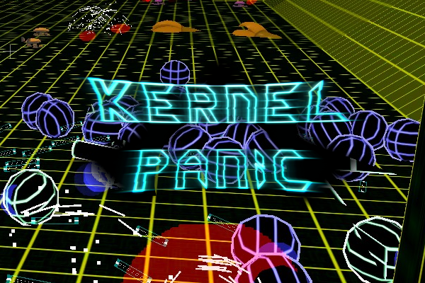
I mainly tried to push that CRT idea. I have a scanline effect now unfortunately it's not visible on scaled down renders. Also added a little displacement to the excising lens distortion. And the alpha channel is working correct now.
The compositor had a bit more complexity added, still each node has its purpose so I can't simplify it.
Anyway's.. let me start with the different colours, I really don't know what combination would be good. Decided to pick four basic colours and mix them. (click for bigger picture)
Transparent background:
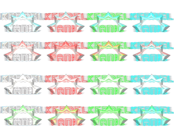
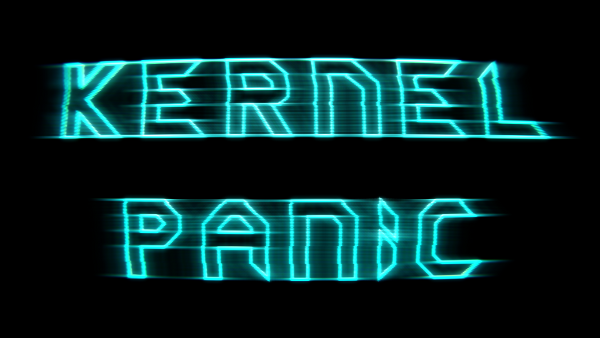
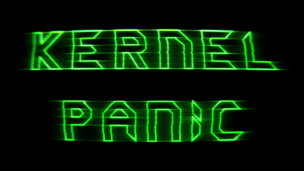
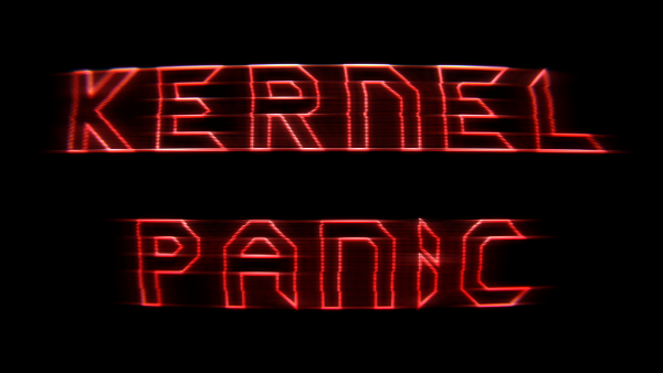
Black background:
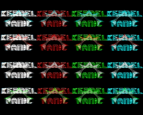
Screenshot background:
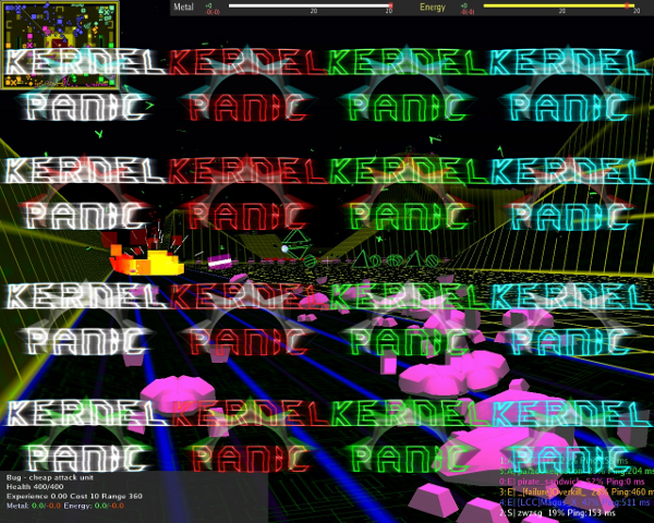
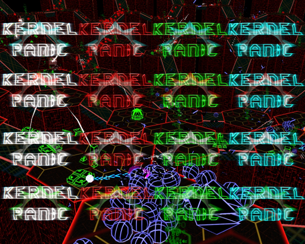
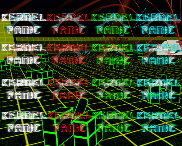
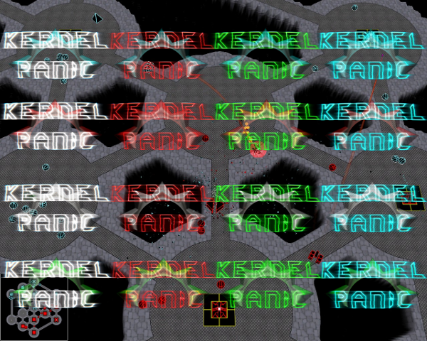
I also made reders without the Spring logo:
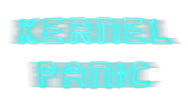
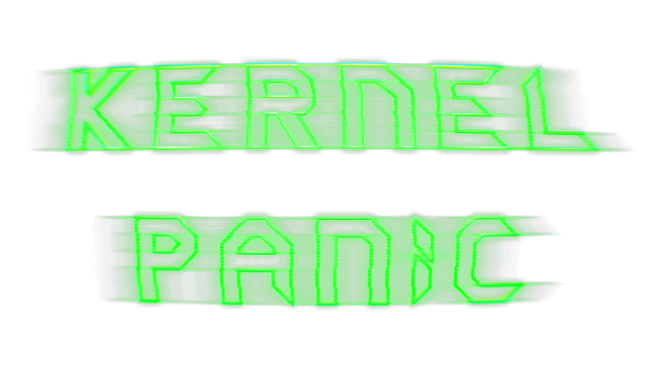
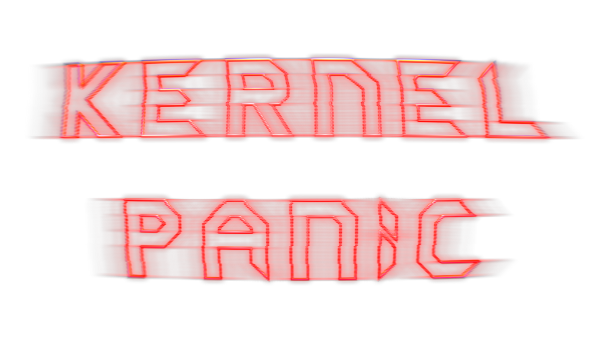
Black background:
It's also possible to change the shape/intensety of the text:
Options, options. Now that I have a better grip on Blender I can really pull of some fun stuff. I could even animate it.. would take some time.
I also updated the Blend file to 2.5
Blender 2.57b file:
http://timblokdijk.nl/spring/Kernel%20P ... nel9.blend
The file is free to use for any purpose, but I do like to steal improvements so post your source (blend) file when your into that.
Re: Kernel Panic Logo Title
Posted: 22 May 2011, 15:01
by PicassoCT
Why not cheet slightly by darkening the backgroundpicture behind and around the logo?
Re: Kernel Panic Logo Title
Posted: 22 May 2011, 15:29
by Tim Blokdijk
Well, feel free to give it a shot.
Re: Kernel Panic Logo Title
Posted: 23 May 2011, 08:16
by MidKnight
Good Stuff!
One suggestion:
Could you perhaps number the logo versions in the future, so that we could say stuff like, "I really like #3, but it's blurry. #4 has nice highlights," etc?
Re: Kernel Panic Logo Title
Posted: 23 May 2011, 19:31
by zwzsg
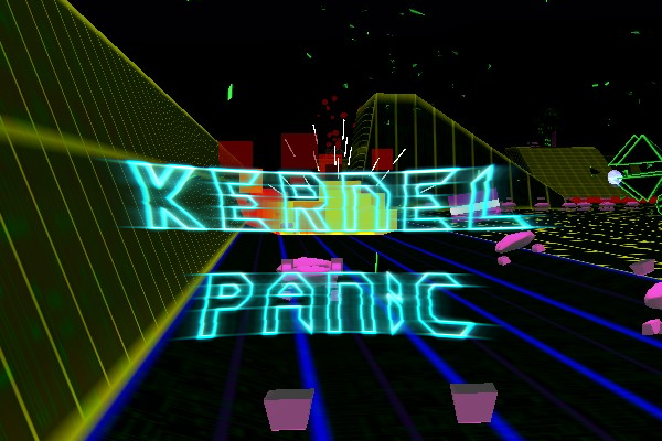
I hope you already saw how much
hoiju likes your logo?
http://springrts.com/phpbb/viewtopic.php?f=43&t=26056
hoijui wrote:wow.. that image is perfect!
that alone wants me to play KP. love the logo!
You should definitely put that picture everywhere where people might read about KP, and use the logo everywhere!
Re: Kernel Panic Logo Title
Posted: 23 May 2011, 19:35
by knorke
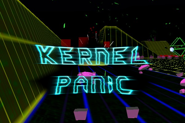
the logo looks good but the spring sun/star seems unnecessary and looks more like a misplaced watermark.
Re: Kernel Panic Logo Title
Posted: 12 Jun 2011, 23:23
by Tim Blokdijk
MidKnight wrote:... Could you perhaps number the logo versions ...
Maybe. You can also repost the version you like to give feedback on.
@hoiju, thanks.
@knorke, yhea.. the problem with leaving the Spring logo out is that with bright lines/colours in the background there is to little contrast with the 'kernel panic' logo text.
But you're right that a coloured spring logo behind the text isn't working. It more or less creates the problem I'm trying to prevent.
Which brings me to my next attempt as somewhat suggested by PicassoCT. A BLACK Spring logo, I know, it's brilliant.
Re: Kernel Panic Logo Title
Posted: 12 Jun 2011, 23:48
by Jazcash
Can barely see it all

Re: Kernel Panic Logo Title
Posted: 12 Jun 2011, 23:52
by PicassoCT

Moar Dark Background
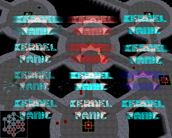
Would be even moar awesome if the picture was topdown, the kernelpanic title beeing part of the map. If those mappers werent so lazy!

Re: Kernel Panic Logo Title
Posted: 13 Jun 2011, 00:45
by MidKnight
How about some vector-y square around the text with a black background?
Re: Kernel Panic Logo Title
Posted: 03 Jul 2011, 13:11
by zwzsg
With regards to the thread:
Custom Icon & Caption for your game:
Would anybody makes me a 32x32 bmp KP logo that still looks good when shrunk at 16x16?
My attempt was a failure:

I was thinking, maybe, a Bit, over the Spring sun?

Still not that good:

Maybe lighter?

Bah, I'll stick to:

->

Re: Kernel Panic Logo Title
Posted: 03 Jul 2011, 14:07
by hoijui
it does not have to be BMP, can be PNG too, for example.
it can also be 32bit (including transparency), if you like.
maybe just a neon-green/-yellow K on black background?
As i see it, it does not have to be artistically, but it has to allow the user to instantly know what this thing in the task-bar is (without reading text even).
Re: Kernel Panic Logo Title
Posted: 03 Jul 2011, 14:48
by PicassoCT