Page 5 of 11
Re: Identity, and Identity Guidelines
Posted: 15 Apr 2008, 16:58
by Crayfish
Neuralize wrote:
I like that one. Only bit I'm not sure about is the words 'epic engine', but s'alright. RTS engine might be better.
Otherwise 5.
Re: Identity, and Identity Guidelines
Posted: 15 Apr 2008, 17:03
by Pxtl
Want to be careful with the wide, squished font or else it looks too much like this:

which is nice, but we don't want to buy shoes for our peewees.
http://www.myspringshoes.com/sharedpage ... ection.cfm
Re: Identity, and Identity Guidelines
Posted: 15 Apr 2008, 18:33
by Neuralize
Zpock, I might run one last poll, is there any chance I could get your vector art for your logo and modify it a bit? Or, if you're lazy just drop the font name.
Re: Identity, and Identity Guidelines
Posted: 15 Apr 2008, 18:43
by Zpock
Well, I couldn't find it so I manually modified the vectors heavily, I can email you the file or something if you want it.
Talking about fonts, did you try out some more interesting ones? I think the one you used is a bit too round and unblocky, I guess it could be a bad idea to use some really over the top font, but it would be nice to see some experimentation with this?

This one would be great wouldn't it, hehe.
Re: Identity, and Identity Guidelines
Posted: 15 Apr 2008, 18:59
by Neuralize
Springcraft! I kept the fonts more universal because I didn't want to imply that Spring has anyone one theme. Also a more universal font will work better in cases where people are pairing the Spring logo when their own mod's logo. Anyways, that'd be great if you could email it to me, Neuralize( at )yahoo.com.
Re: Identity, and Identity Guidelines
Posted: 15 Apr 2008, 19:00
by Vadi
No, it's hard to read = not easy to remember = pointless logo.
Re: Identity, and Identity Guidelines
Posted: 15 Apr 2008, 19:43
by Zpock
Re: Identity, and Identity Guidelines
Posted: 15 Apr 2008, 19:56
by Stealth870
Actually TA's font is called Haettenschweiler and it should be installed on Windows by default iirc.

Re: Identity, and Identity Guidelines
Posted: 15 Apr 2008, 20:16
by Zpock
That lazy genoius amateur Chris Taylor... At least they covered it up with that fancy metal plating texture. I think most of the game logos use letters that are custom drawn? It's a big part of the games personality
This wouldn't have quite cut it would it?
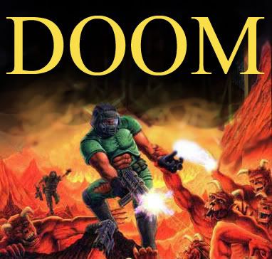
Altough ironically, the DoW does use something that looks like slightly (but very effectively) modified Times new roman...
Re: Identity, and Identity Guidelines
Posted: 16 Apr 2008, 01:52
by Vadi
Why are we looking at logos from very very old games?

Re: Identity, and Identity Guidelines
Posted: 16 Apr 2008, 02:11
by smoth
Zpock wrote:
This one would be great wouldn't it, hehe.

HAO DID YU DU THAT!?!
Re: Identity, and Identity Guidelines
Posted: 16 Apr 2008, 02:39
by Zpock
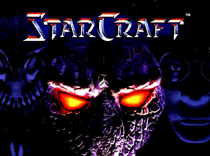
1. Google "starcraft font", to get the font, for example:
http://www.dafont.com/starcraft.font
Note that this is NOT actually 100% the same as the real starcraft font. Look at the S for example, in the real one its like a mirrored straight Z while this one is more curvy. The real one has 2 different kinds of T:s.
2. Photoshop layer styles, 2identical layers of the text in black, with the bottom one shown having fill 0% so its just the red stuff from the layer style that shows, on top of the other layer:

The "color overlay" was just to get a blue tint, was black text from the start in both layers.
Re: Identity, and Identity Guidelines
Posted: 16 Apr 2008, 03:30
by Radtoo
Actually, I also like Neuralize's sunflower logo best!

Re: Identity, and Identity Guidelines
Posted: 16 Apr 2008, 03:34
by SwiftSpear
We're not changing the logo.
Re: Identity, and Identity Guidelines
Posted: 16 Apr 2008, 04:18
by Neuralize
Well, currently there is no logo.

Just a million different similar logos. I posted a new poll. It will be the final poll. Unless someone has a good reason to convince me otherwise.
Re: Identity, and Identity Guidelines
Posted: 16 Apr 2008, 04:43
by SwiftSpear
I like #2. It has a retro feel and reminds me of gorm's old sperm eating avatar.
Re: Identity, and Identity Guidelines
Posted: 16 Apr 2008, 05:05
by Vadi
SwiftSpear wrote:We're not changing the logo.
Thank you.
Re: Identity, and Identity Guidelines
Posted: 16 Apr 2008, 05:13
by SwiftSpear
Vadi wrote:SwiftSpear wrote:We're not changing the logo.
Thank you.
We can tweak it or modify it, but it's staying the half sun.
Re: Identity, and Identity Guidelines
Posted: 16 Apr 2008, 10:11
by aGorm
Gota say 2 aswell, but maybe adjust teh font slightly? The idea is right, but the font isn't perfect.
Now... were the hells that avatar gone...
aGorm
Re: Identity, and Identity Guidelines
Posted: 16 Apr 2008, 14:37
by rattle
3 with the sun of 1 or 1 with the font of 3.