Page 30 of 64
Re: P.U.R.E. 0.55
Posted: 28 Mar 2008, 10:22
by HeavyLancer
Argh wrote: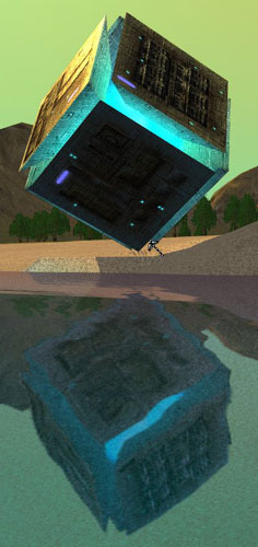
So that's where the Weighted Companion Cube is! I knew my cube wasn't incinerated, I just knew it.
Re: P.U.R.E. 0.55
Posted: 28 Mar 2008, 16:07
by KDR_11k
Mega tribble cube wants to be your friend! Let it hug you!
Re: P.U.R.E. 0.55
Posted: 28 Mar 2008, 20:09
by rattle
Attack of the clonepanels
Re: P.U.R.E. 0.55
Posted: 29 Mar 2008, 00:06
by AF
hmm Do you like this colour a lot argh?

Its not that great and its all over your models in almost every game universe you've tried to model for. Half the nanoblobz units have it on them somewhere too.
Re: P.U.R.E. 0.55
Posted: 29 Mar 2008, 14:53
by PicassoCT
That colour is great - and it is cool - keep it... it is quite a good way to show something has a highly energetic core - and the blue is in most western countrys a colour for something mysterious.. Just remember Unreal the blue glowing crystals, - the warcraft 3 Lichking - all those energy cores in most of the really good GAmes have this colour..
So why all of the sudden it shouldn`t fit?
CHARGE!!!!!
||||||||||||||||||||||||||||||||||||||||||||
Re: P.U.R.E. 0.55
Posted: 29 Mar 2008, 17:41
by Guessmyname
Incidentally, there is a kind of radiation that glows blue.
Re: P.U.R.E. 0.55
Posted: 29 Mar 2008, 18:17
by PicassoCT
Guessmyname wrote:Incidentally, there is a kind of radiation that glows blue.
Shame on me, i forgot to mention the ÄŒerenkov radiation .. thx Guessmyname for reminding.

However now i am unhappy with ARGHs Pure because i don´t like Mods which aim at pur-- completely realistic Graphics.
+ 1 for ARGH to change it into something unrealistic

Re: P.U.R.E. 0.55
Posted: 29 Mar 2008, 18:50
by Argh
And yeah, I like strong blue-greens. Heck, I like jewel colors, in general, and always have to make myself tone stuff down, because everybody else hates 'em, except on sports cars
In this case, though the color is supposed to communicate to players that "hey, something's going on in there, it might be important".
Re: P.U.R.E. 0.55
Posted: 29 Mar 2008, 19:08
by PicassoCT
Argh wrote:And yeah, I like strong blue-greens. Heck, I like jewel colors, in general, and always have to make myself tone stuff down, because everybody else hates 'em, except on sports cars
In this case, though the color is supposed to communicate to players that "hey, something's going on in there, it might be important".
Don´t do it... plz...
Man, look at all international Titles, look at starcraft, look at cc3 - just look - strong colours are good, strong colours are wanted, as long as you keep away from some strange biteing combinations ("indian colourtaste") - so don´t make that stylish wrong choice and go for european-american concrete greywaste style...
PLEASE- don´t do it. FinalFantasy sells worldwide. Gothic doesen´t. If grey is your personal taste, step away from it, like i did- give your Mod the chance to be loved by others(Chinese, Korean, Japanese, African, SouthAmericans), to whom Grey is just boring...
Colourschemes are differeng depending on which Lattitude your culture lifes... the concrete grey stripe is just no good orientation. All other cultures more north & south are longing for more colour...
Re: P.U.R.E. 0.55
Posted: 29 Mar 2008, 19:39
by Noruas
Somebody call Optimus Prime quick! We've got an infestation of Allsparks!
He has not been here in months.
Re: P.U.R.E. 0.55
Posted: 29 Mar 2008, 20:14
by AF
those sorts of shades of colour including the usual neon orange pink and yellow used on cheap posters and the default colours in the mspaint palette are huge no nos because the end user has had years of experience associating those colours with crap software crap websites and lazy arsed people who pick the default colours rather than picking a slightly different tone.
There are far better tones in the blue green spectrum than that.
Also if you want a glowy sort of thing you've made it worse because the centre of the glow isn't glowing its counter intuitive. If you look at a light bulb the halo glare is not as bright as the filament in the middle, but here you've removed the filament and put in the halo colour all the way through as a block colour.
Re: P.U.R.E. 0.55
Posted: 29 Mar 2008, 22:19
by PicassoCT
The glowing not on the borders is used if glow meets (virtual) fog and reflects on the Material - and it looks cool (set INT stubbornPicasso ON)
PS: @ ARGH below: None of the Great Mods shall escape the firery Baptism of a Colourflamewar - this is the
PINK vs.
RED-Reincarnation
Re: P.U.R.E. 0.55
Posted: 29 Mar 2008, 22:58
by Argh

Please don't tell me you guys are going to waste another page of this thread with arguments about a color, in an animation you haven't ever seen...
Re: P.U.R.E. 0.55
Posted: 30 Mar 2008, 03:04
by ralphie
Just AF, he doesn't like anything.
Re: P.U.R.E. 0.55
Posted: 31 Mar 2008, 03:38
by AF
But the colour is in units we've already had the chance to test on our computers for at least several months now and I think its fugly
Re: P.U.R.E. 0.55
Posted: 31 Mar 2008, 06:49
by rattle
You could have used a brighter or even white core and some variations in the radiosity there.
Re: P.U.R.E. 0.55
Posted: 31 Mar 2008, 06:58
by Argh
It actually varies quite a bit, in the animation... sorry, screens just don't show it very well... ah well.
Re: P.U.R.E. 0.55
Posted: 31 Mar 2008, 07:32
by SpikedHelmet
Argh, you've really got to learn the magic words. They've saved my life countless times making S:44.
"Fuck off, if you don't like it, make your own mod."
Re: P.U.R.E. 0.55
Posted: 31 Mar 2008, 07:34
by Argh
LOL, except when I say those words, I have to face page after page of nonsense. Better to just let critics be critics, imo, it does me no harm.
Re: P.U.R.E. 0.55
Posted: 31 Mar 2008, 08:36
by BlueTemplar
I like it.