Page 251 of 418
Re: Random WIP
Posted: 09 Jan 2010, 18:57
by SeanHeron
Engines of War is going to be pretty Anime influenced, so I'm inclined to disagree with that quote as well

. However, Masse did point out he was kidding....
Re: Random WIP
Posted: 09 Jan 2010, 21:18
by KaiserJ
wb masse, maybe its me, but it seems like you havent been around for a while. the robot looks pro.
and bob; you're a machine. will blood and steel models be featured in the new game? im a huge fan of the two-cannoned walker bot in particular.
Re: Random WIP
Posted: 09 Jan 2010, 21:47
by Tribulex
bobthedinosaur wrote:
Heavy flamer/incinerator from wz2100. Except more awesome.
I dont see enough praise for bob's work in this thread. just wanted to let u know bob if i was gay and you too we could... u no...
Re: Random WIP
Posted: 10 Jan 2010, 11:05
by Warlord Zsinj
Saktoth wrote:How? Make it less tall? Make it thinner? See then it just reverts to the same problem as before, its out of proption.
Anyway i've gone for the longer version,
which can be found here.
I think make the rear more square and less 'dagger' shaped would help, though if it could be avoided I do prefer the original longer version. Perhaps use some hackery and make it think it is wider then it really is so that it behaves a little better?
Re: Random WIP
Posted: 11 Jan 2010, 19:48
by KaiserJ


still working away at it. bumpmaps are cool; now i see what argh is always on about. looking for comments specifically on the bumpmap and the mex graphics. this will probably be complete sometime soon.
i like how it made the little doors look.
Re: Random WIP
Posted: 11 Jan 2010, 21:28
by Coresair
Breathtaking......I refused to believe that was spring for a few minutes.
Re: Random WIP
Posted: 11 Jan 2010, 21:43
by Argh
Lookin' good

Re: Random WIP
Posted: 12 Jan 2010, 04:28
by smoth
I presume this is a shot from max?
Re: Random WIP
Posted: 12 Jan 2010, 08:37
by Saktoth
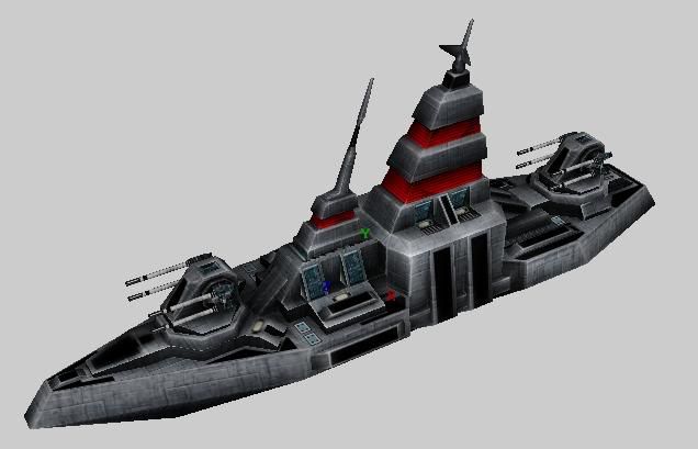
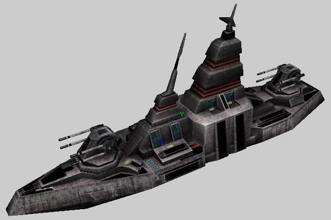
Which do people prefer?


Both regarding the red 'eye' areas, the colour, and the darkness/lightness/details/shading/etc.
Re: Random WIP
Posted: 12 Jan 2010, 09:03
by Das Bruce
A.
Re: Random WIP
Posted: 12 Jan 2010, 10:14
by Gota
Wait,how did those gigantic holes end up at water level?
Also I'd go with first but it probably needs more contrast.
Re: Random WIP
Posted: 12 Jan 2010, 11:18
by Saktoth
Gota wrote:Wait,how did those gigantic holes end up at water level?
Also I'd go with first but it probably needs more contrast.
You mean the black spots where the teamcolour goes?
Re: Random WIP
Posted: 12 Jan 2010, 11:41
by Gota
I thought the red was team color.
Re: Random WIP
Posted: 12 Jan 2010, 11:48
by Argh
I like A for overall clarity, but I like the "red eye" of B for the superstructure detail.
Re: Random WIP
Posted: 12 Jan 2010, 13:17
by Saktoth

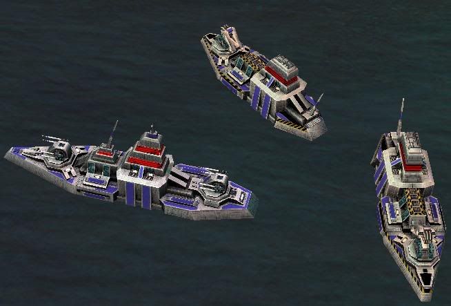
Edit of Cremuss's AA ship, to make a constructor out of it.
Re: Random WIP
Posted: 12 Jan 2010, 14:23
by 1v0ry_k1ng
it looks super awesome sexy up close but really needs a much less detailed, busy and multicoloured texture. When you zoom out on that it'll look like a mess

Re: Random WIP
Posted: 12 Jan 2010, 17:36
by Pxtl
@sak - the conboat needs more warning-hatching or something - all those boats look gorgeous, but they also look very similar. I'm worried about differentiating. Maybe lop off the redeye tower altogether.
Re: Random WIP
Posted: 12 Jan 2010, 17:44
by rattle
I can hardly make out the geometry... texture is too noisy
Re: Random WIP
Posted: 12 Jan 2010, 17:59
by Neddie
I assume the blue is teamcolour... it looks like it has been smeared on with a finger and is probably the primary problem with the texture. I would probably strip all the present teamcolour save for the paired vertical lines on the tower, then put a band around the vessel a little above the water line.
If you'll look at the ship on the left where I've mock redone the teamcolour, I think you'll see what I mean. The construction stripes would probably show up better with the alternate teamcolour scheme as well.
Re: Random WIP
Posted: 12 Jan 2010, 18:07
by Gota
Also try not to have too many different colors on the boats,it confuses the eye.
Add more "construction worker" textures on the conboat.
Try harder at emphasizing big stuff that pop out of the model as it is,like towers and cannons and parts that are messy and look alike and are of the same size height width,leave with the same color.
 . However, Masse did point out he was kidding....