Page 19 of 37
Re: smoth's junk.
Posted: 30 Apr 2013, 04:33
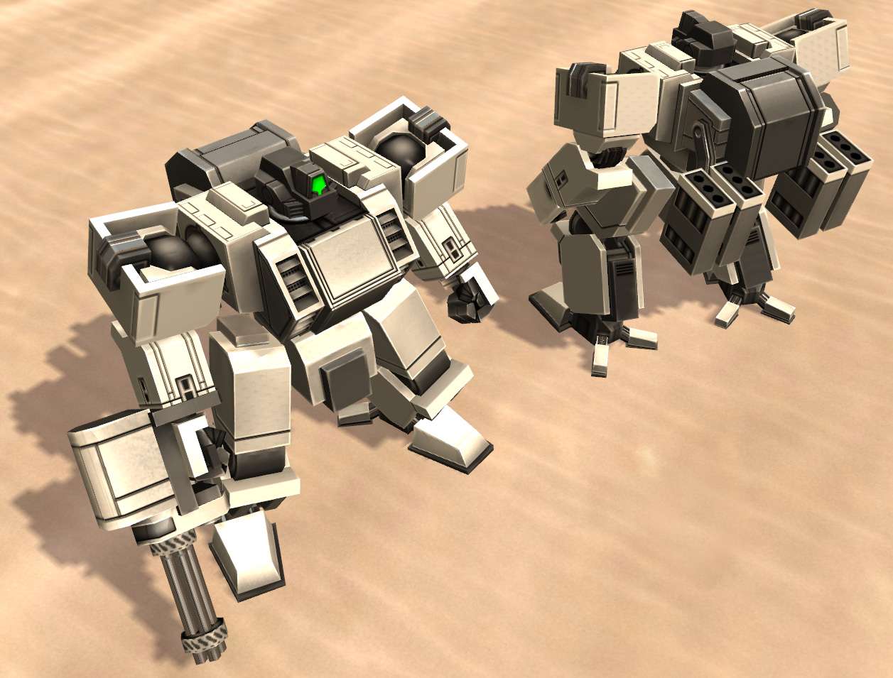
by smoth
 Click image for larger
ho ho, the new stuff looks 100% better(need to use a different thigh part tho and a few minor details..)
Re: smoth's junk.
Posted: 30 Apr 2013, 22:48
by rattle
right ones the new?
...oh forgive me my ignorance obviously the left
they're both looking good
Re: smoth's junk.
Posted: 30 Apr 2013, 23:26
by PicassoCT
This is one of those - all devs work looks half assed besides smoths mechas moment- i could coment on that, or give some envyspiked praise, but then.. no.. i have my pride and just let it pass..
Damn you post reflexes.
Re: smoth's junk.
Posted: 01 May 2013, 07:51
by smoth
 Click image for larger
I don't follow your critique picasso sorry.
updated the normal map
Re: smoth's junk.
Posted: 01 May 2013, 09:54
by PicassoCT
Awesome Rocket launchers intersect with the backpack.. revenge of the Detail obsessed, were real critique becomes impossible..
Re: smoth's junk.
Posted: 01 May 2013, 10:40
by smoth
No worries, I saw it but being that this is a test unit, I didn't feel obligated to fix that.
Re: smoth's junk.
Posted: 03 May 2013, 06:00
by smoth
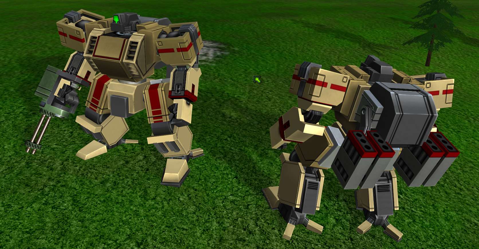 click image for larger
 click image for larger
I think I have the color setup that is better.
Re: smoth's junk.
Posted: 04 May 2013, 17:53
by Neddie
I would load out with that purple, but it needs something... maybe a pink or silver accent?
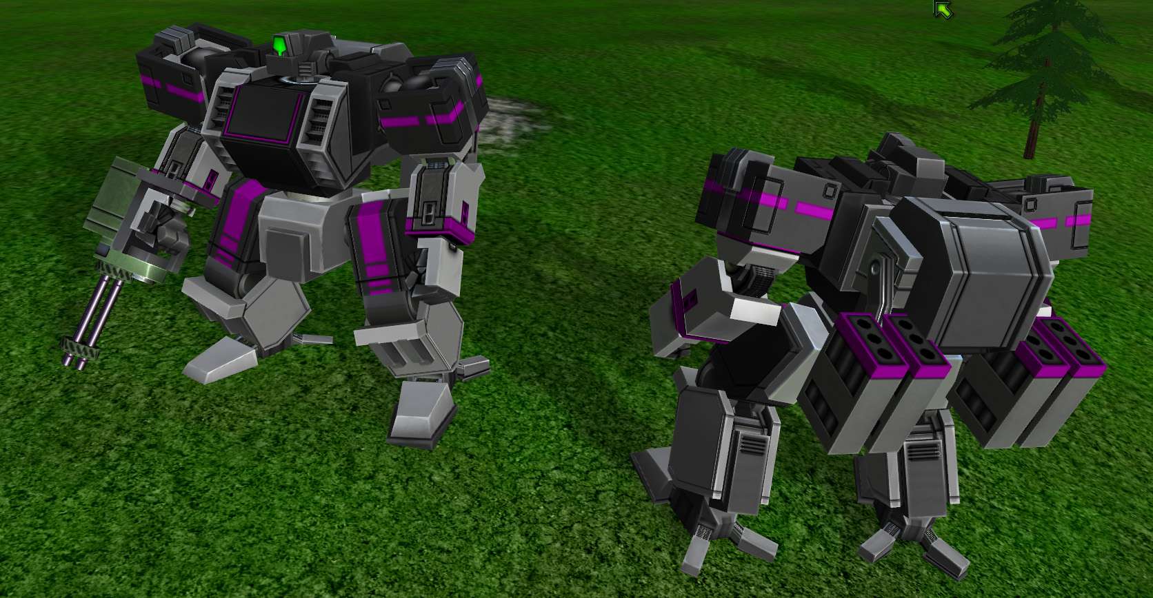
Re: smoth's junk.
Posted: 04 May 2013, 18:00
by smoth
smoth wrote:
click image for larger
click image for larger
I think I have the color setup that is better.
Neddie wrote:I would load out with that purple, but it needs something... maybe a pink or silver accent?
I have 1 channel left to use on the mech, so I waiver between adding a 2nd accent color, or using it to allow people to tint the metal.
Re: smoth's junk.
Posted: 04 May 2013, 18:13
by Neddie
Hurm... well, it has been a long time since I textured, but I think I would err on the side of tinting sections of the body metal, sort of a tint accent? Eh, that would probably lead to awkward colour muddle in the end.
Re: smoth's junk.
Posted: 04 May 2013, 18:24
by smoth
well essentially, it would be an accent color(like extra colors for vents) or something. OR it would be metal color/specular levels. So essentially you could do gold metalics or something.
Re: smoth's junk.
Posted: 04 May 2013, 19:46
by smoth
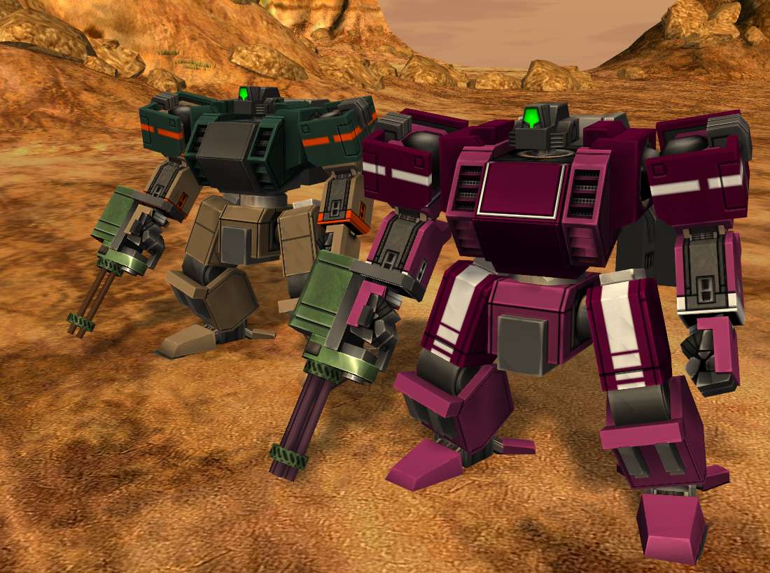 (click for larger)
Forgot that I didn't post a shot of the MKI chasis. woo. Oh and tweaked the texture some more.
Re: smoth's junk.
Posted: 04 May 2013, 21:15
by rattle
do you have a cleenex I just jizzed my underpants
Re: smoth's junk.
Posted: 04 May 2013, 21:37
by zwzsg
Those shoulders are super blocky. It's confusing to the eyes. Can't you remove the three outer shoulder plates?
Re: smoth's junk.
Posted: 05 May 2013, 19:43
by smoth
I think it works with the visual style I am going for with these guys, largely blocky with a combination of angular accents. from the top it really works with the blocky style I wanted to convey. From the front it gives them a very hyper-masculine appearance looking physically strong and stout. I wanted that feeling for this suit. I am not sure why that is visually confusing.
Re: smoth's junk.
Posted: 10 May 2013, 02:53
by bobthedinosaur
Are these player controlled units or AI? also what happened to all the what I assume are creeps you posted awhile back?
Re: smoth's junk.
Posted: 10 May 2013, 03:49
by scifi
i guess i havent stopped in this thread to say awesome sauce.
So here it goes.
AWESOME SAUCE.

On a side note i do enjoy those shoulders, style wise it fits well with the torso witch has a blocky apeal to it as well.
I find if you are going for rounded shoulders a Curved head and a more sphered torso looks better.
The heads could be more menacing and a bit bigger imo, they look a bit small.
Re: smoth's junk.
Posted: 10 May 2013, 17:55
by smoth
Bob: they are not getting uved right now as my kitbashes of the pather were sufficient to test what they needed.
Scifi, I'll look into scaling the heads a bit, the suits you see in the thread are fir tier suits so the have fairly primitive heads. Later tier stuff is going to have more gundam/transfirmer like heads.
At the moment I am occupied with getting the underlying code a bit stronger. I won't stsrt the real gane work until I get the core code more solidified
Re: smoth's junk.
Posted: 11 May 2013, 01:05
by smoth
 (click image for larger)
I don't like the larger heads, makes them feel chibi. I would rather keep the heads smaller like they were. this is only 120% larger
*edit* didn't like the end result, reverted
Re: smoth's junk.
Posted: 12 May 2013, 00:04
by rattle
Very manly.