Page 16 of 17
Posted: 24 Sep 2007, 08:36
by SwiftSpear
How long is the delay time before a news item posts from the community news to the frontage? Can it be removed please?
Posted: 16 Nov 2007, 13:39
by Satirik
so the new site is dead ?
Posted: 16 Nov 2007, 18:04
by AF
Tim said somewhere else he was unable to work on this due to his job and was taking a break from the site.
He also promised he would finish the site himself when his work dies down in january.
Posted: 02 Dec 2007, 03:54
by AF
Posted: 02 Dec 2007, 03:59
by LordMatt
Looks nice.
Posted: 02 Dec 2007, 04:56
by smoth
looks cool.
cool
Posted: 02 Dec 2007, 04:59
by rcdraco
I like it, few suggestions:
Borders on the 2 picture boxes.
A vibrant red-orange with a horizontal gradient on the top would really improve it, either to black, or grey, on the buttons side.
Posted: 02 Dec 2007, 05:13
by SinbadEV
Short, sweet, to the point... I think I like it... I'd like to see some concepts of what it would look like "inside"... also
I really like 1, your header... not sure on the color thinking something more camo-or khaki
I don't like 2, the "web 2.0" roundiness here... I think a drop shaddow for the stuff "on the top"
3 should be "shiny rounded" like you have 2 instead.
I would lik to see "drop shaddows" at 2 and 4 instead of just matte... it might be going too far though...
Posted: 02 Dec 2007, 05:21
by AF
I would have added drop shadows on the rounded boxes but I didn't know how in paint .net. Remember this isn't html+css it's mouse+paintbrush. I just wanted to show sort of what I had in mind, so don't treat it as a photographic representation.
So yah, the boxes need something on the edges like a shadow and a better detail on header and the menu bar/buttons need actual detail etc. That would be in the html version. But for now this is just concept art not work in progress.
Posted: 02 Dec 2007, 05:23
by SinbadEV
yeah... what you said was exactly what I was talking about...
Posted: 02 Dec 2007, 05:28
by AF
But still, just to be clear.
Posted: 02 Dec 2007, 14:25
by TradeMark
too big text
Posted: 02 Dec 2007, 16:10
by AF
That's sort of the point, it's a front page not a news column, so you want big eye catching text, and not much of it.
For example:
http://www.mozilla.com/en-US/
Something more like that would work much better for our front page than walls of text aligned in boxes with the odd thumbnail and emoticon.
The top banner I put as red because it matches the new logo artwork I did for the installer and the icons, and it serves as the highlight colour to the 2 shades of complimentary blues.
Posted: 04 Dec 2007, 23:59
by CarRepairer
I love it.
And good call not putting in the screenshot an LRPC made from bricks and mortar (complete with construction crew and a guy holding a clipboard)
Posted: 05 Dec 2007, 00:06
by rattle
Almost looks like a blog, no don't like that. Needs to be more individual.
Posted: 05 Dec 2007, 15:10
by clericvash
AF wrote: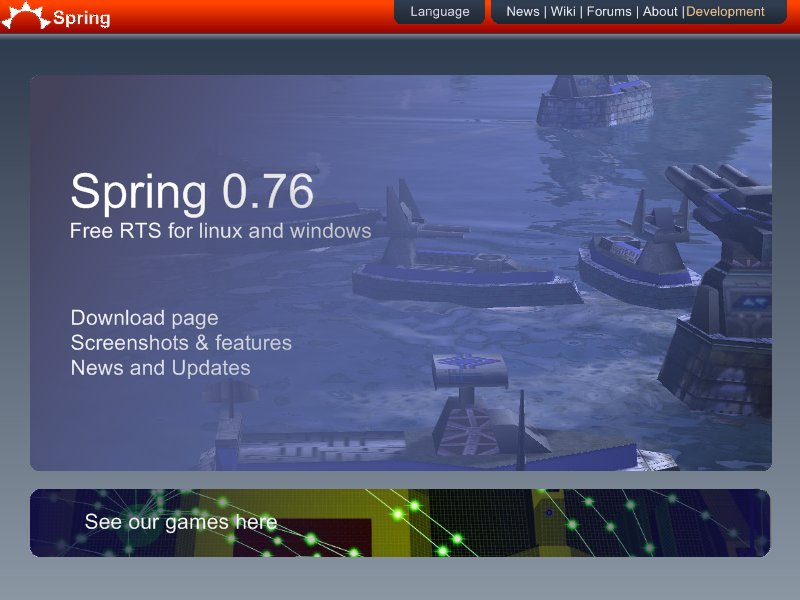
Love it.
Posted: 10 Dec 2007, 23:48
by BaNa
I made a more metallic-looking spring logo, instead of the big plain text. How U like?
http://www.unknown-files.net/spring/3854/Spring_Logo/
I like the design concept, but I'd rather put the three main choices in big buttons that are next to each other under the spring logo, and when I say big I mean BIG.
Posted: 11 Dec 2007, 00:06
by TradeMark
AF wrote:That's sort of the point, it's a front page not a news column, so you want big eye catching text, and not much of it.
Actually i dont read too big texts, because they are usually just useless ads on web.
Which is why i dont like it...
Posted: 11 Dec 2007, 00:23
by Complicated
Do a flash based website, include the second trailer. ;]
Posted: 11 Dec 2007, 00:27
by LOrDo
Pretty nice. Could use some improvement, reminds of the old gunbound.net interface. Except not 100% flash so it takes forever to load...