Page 15 of 20
Re: Updated site layout ready?
Posted: 28 Jul 2008, 23:12
by Argh
Mockup:
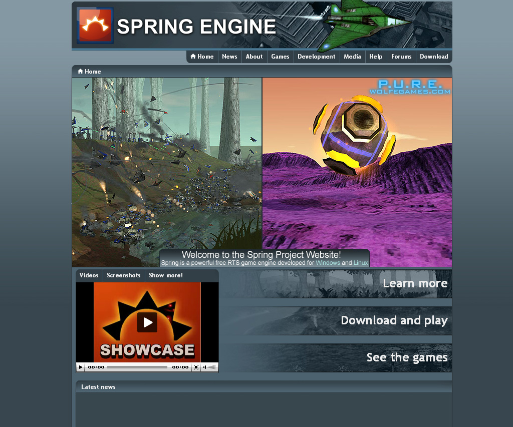
Note how the arrangement draws the eye right to the Welcome message, btw. Might work.
Re: Updated site layout ready?
Posted: 28 Jul 2008, 23:14
by Hoi
+1
Re: Updated site layout ready?
Posted: 28 Jul 2008, 23:16
by AF
I prefer the single wide banner.
Either way with the reduced text siz eon the P.U.R.E banners I think they're okay now. All these further compromises seems somewhat unnecessary, as if your trying to broker a deal with the person across the table even tho theyve already taken an offer and gone home.
Re: Updated site layout ready?
Posted: 28 Jul 2008, 23:25
by Forboding Angel
Look smoth, you aren't getting it. The mod pics on the front page are there for users that stumble on the website and know nothing about the project.
Spring is just an engine. By itself it is utterly useless. Same thing for our mods, they are utterly useless without the engine, same for the community, without that, all our efforts are in vain as well.
The 3 have to help each other.
That would be like if I opened the steam news page it had a neat picture, with no way to figure out what that was a pretty picture of.
Re: Updated site layout ready?
Posted: 28 Jul 2008, 23:31
by Argh
Either way with the reduced text siz eon the P.U.R.E banners I think they're okay now. All these further compromises seems somewhat unnecessary, as if your trying to broker a deal with the person across the table even tho theyve already taken an offer and gone home.
I wasn't under the impression that peace had broken out across the Western Front just yet. When people start concentrating on the things that actually need doing, like making more decent banners, I'll be happy to just happily declare victory and move on. Personally, I agree with that paragraph entirely- I think that the current status quo works, other than a lamentable lack of variety on the banners. But if we're still exploring alternatives, there's my take on this.
Re: Updated site layout ready?
Posted: 28 Jul 2008, 23:53
by Forboding Angel
AF wrote:Either way with the reduced text siz eon the P.U.R.E banners I think they're okay now. All these further compromises seems somewhat unnecessary, as if your trying to broker a deal with the person across the table even tho theyve already taken an offer and gone home.
Wait a sec... that was done a week ago...
CLEAR BROWSER CACHE FTW
Re: Updated site layout ready?
Posted: 28 Jul 2008, 23:55
by Argh
Yes. I swear, at least half of this angst is from people who aren't even really looking at the 'site, and have no fricking idea what's actually been going on

Re: Updated site layout ready?
Posted: 29 Jul 2008, 00:50
by smoth
Forb:
Forboding Angel wrote:Look smoth, you aren't getting it. The mod pics on the front page are there for users that stumble on the website and know nothing about the project.
So they cannot click on the SEE THE GAMES BUTTON?
Forboding Angel wrote:Spring is just an engine. By itself it is utterly useless. Same thing for our mods, they are utterly useless without the engine, same for the community, without that, all our efforts are in vain as well.
The engine by it's self is all most developers need. If anything this engine takes care of most of the dirty work. Most of the stuff here is rpg maker/click and create, only a few steps more complicated.
The Mods exist to utilize the engine. Ogre 3d is a shitty engine and it has games... oh lawd, so the makers of ogre owe the game devs for the creation of content? No. An engine exists as an engine, your game only helps it if the game is adding code to the engine. Even with all the stuff the devs have added that helped make gundam possible as it is now, the only thing I as the primary creator of gundam have added is the fire platform tag. In the past before open source engines you had to pay for an engine or spend years writing one. I do not respect any project, including my own more then I respect the spring engine. As someone who knows 2 different people who have developed engines and having worked with several in the past I DO UNDERSTAND how big an engine truely is. So again, you are standing on the shoulders of giants.
The community ... yeah we have a few nice guys here.
Forboding Angel wrote:That would be like if I opened the steam news page it had a neat picture, with no way to figure out what that was a pretty picture of.
yeah because all those adds on yahoo make it a better search engine.
Re: Updated site layout ready?
Posted: 29 Jul 2008, 00:57
by smoth
argh:
the new banners you did are fine, I like the smaller text, the background with the jet guys is good. I have no problem with your new background images, they look swell.
I am only trying to remind people that it IS an honor for us to have our images on the front page. Not an honor for the front page to have our images.
As I said earlier, I am fine with the 10 image limit. I am just not pleased with all the raging and attitude about how the spring engine owes us something for helping it when I 100% feel the other way around.
The spirit of open source, to me, was one that we all contribute as a community to the greater good. When I saw the shot of mr.ds models on beherith's map using my sky and trees, I was ecstatic. Here we had 3 different people working together making something really cool for no good reason, no egos, no pride or demanding attention, just something really cool. The same thing goes for noize's new map, trepan, jk, you, me, noize, all of us contributed. No banner was needed with all our names. I was PLEASED to have given something to help that vision come true.
Re: Updated site layout ready?
Posted: 29 Jul 2008, 01:29
by Warlord Zsinj
What follows is my opinion and nothing else. I have no leverage but where my design aesthetic is respected within this community, so people can take or leave what I am saying as they please:
I also prefer the wider single banner, two banners looks too busy. It's meant to be a sex shot, it's not a preview shot, and splitting that compromises it's intention.
I like roflcopter's game preview. I think that is a good compromise, as it gives a lot more information about the game, and frees up the banner to be free entirely of text. It would be nice if you could link the banner image presented to the 'featured game' area.
Re: Updated site layout ready?
Posted: 29 Jul 2008, 01:56
by smoth
I concur, the way it is is fine, no need to make it taller and make the site more busy.
Re: Updated site layout ready?
Posted: 29 Jul 2008, 02:25
by Forboding Angel
[Consider this a final warning]
Christ
@Smoth you are talking in circles. It's annoying.
http://www.youtube.com/watch?v=I11w-rl6 ... re=related
Re: Updated site layout ready?
Posted: 29 Jul 2008, 03:18
by Warlord Zsinj
Forb, there's no need to be aggressive or insulting. We're just disagreeing. Different point of views. And as I said earlier, we've got the same end goal anyway.
It's unlikely that we're going to get much further with the various ultimatums and threats being issued.
I think we've got two clear proposals here, argh's and roflcopters. Now, according to fnordia, who makes all the decisions, roflcopter's way goes. Which, as far as I'm concerned, is fair enough. But I would say that, because I like roflcopter's design.
So, in the interests of cutting this foolish debate off where it is (because really, I don't have the time to sit at loggerheads, and it seems in this place the louder you shout and the longer your posts the more right you are), why don't we just run a vote and see what people think?
I think rolfcopter's has enough elements that argh and forb found important, and argh's propositions have taken enough of my concerns into account that either way the poll goes it's not a disaster for either side.
Re: Updated site layout ready?
Posted: 29 Jul 2008, 03:30
by smoth
Forb, I was gone for the weekend and I looked at the pics before I left. I had to get ready for my weekend of airsoft, so I was gone to get ready for my trip oh... around 4-5pm last friday. Argh posted those pictures thursday.
So when I came home from work, packed my bags thursday night and DID NOT RIFLE THROUGH all the images while loading all my bags for the trip. So then I went to work the next morning and left as soon as I could that evening on friday. Yet I am an "idiot" for not posting that I liked the improved images.
Most inappropriate forb and uncalled for. So you know, I reported your post.
Re: Updated site layout ready?
Posted: 29 Jul 2008, 03:38
by Argh
I think rolfcopter's has enough elements that argh and forb found important, and argh's propositions have taken enough of my concerns into account that either way the poll goes it's not a disaster for either side.
Then let's just move on, shall we?
I think we're out of anything substantive to argue further about, tbh, and I'm just fine with RoflCopter's design as it currently is implemented, frankly- I only put up that mockup because I wasn't aware that so many people were still unaware how much had been done already. It's simply not productive to argue about the last small things, honestly.
Re: Updated site layout ready?
Posted: 29 Jul 2008, 03:40
by smoth
Like I said earlier, I wasn't trying to get in your way.
Re: Updated site layout ready?
Posted: 29 Jul 2008, 03:48
by Warlord Zsinj
To avoid confusion, when referring to roflcopter's design, I meant
this.
Re: Updated site layout ready?
Posted: 29 Jul 2008, 03:51
by smoth
the little featured game thing is a neat idea.
Re: Updated site layout ready?
Posted: 29 Jul 2008, 06:10
by Gota
will the banner be showing pics of SA?
Re: Updated site layout ready?
Posted: 29 Jul 2008, 06:13
by Forboding Angel
smoth wrote:
Most inappropriate forb and uncalled for. So you know, I reported your post.
Then you know what smoth, if you're not going to take the time to research and know what you're talking about then maybe you should keep quiet eh?
So has final consensus been reached, or do we start arguing again?
For those of you who don't understand the importance of ctrl+shift+del, you have no one but yourselves to blame.
[Consider this a final warning][
Once again you have failed to note who you are. Amusing and annoying at the same time, but no matter.
Smoth, I could give a crap what you reported. I wasn't even talking to you. Yet you yell from the high heavens without even knowing what you are talking about. You have contributed nothing to this, and you continually flamebait. I for one have a right to be good and pissed off about it. We are trying to accomplish something, but we have been held up for a week by people like you who seem to be unhappy with any outcome but your own. The meaning of a compromise is that 2 parties come to a common ground that they both can live with. We consented to a compromise. Now live with it like we have to. You don't get to force a compromise on the compromise.
@wz, I wasn't being aggressive towards you. Where did you get that idea???
Back to smoth... The games wiki page looks like crap, and currently afaik we cannot edit it. TBH it will probably always look subpar, because people like you cba to do anything with it, for all your yelling and screaming about the website stuff, I have yet to see you do anything to participate except flamebait.
Now, if you will excuse me, I have some posts to report.
@gota, I don't see why not.
@the rest of you. Has anyone realized that with all the *A mods, our pics willbe shown only rarely anyway?