Page 2 of 3
Posted: 24 Sep 2006, 20:05
by Optimus Prime
no i just want to show the history of this project.
After some more hours of work...


(18718 faces)
Posted: 24 Sep 2006, 20:07
by Zoombie
The words on the side look a little out of place/ But it does look improved, at least to my untrained eye.
Posted: 24 Sep 2006, 20:13
by rattle
And now it's an enormous space orange juice dispenser... these windows cry out loud to be changed to something not yellow and the beam needs a bright white core! Although the yellow windows make sense if that really was an orange juice dispenser...
Posted: 24 Sep 2006, 20:44
by BvDorp
I like it!

One question though, why is this not possible in Spring yet? Apart from the lightning part?
Posted: 24 Sep 2006, 21:12
by Optimus Prime
BvDorp wrote:I like it!
One question though, why is this not possible in Spring yet? Apart from the lightning part?
there are a lot of reasons:
1. you cant let units dock on other ships (like carriers)
2. the size of the ship isnt a square, so the groundbox of the unit would be buggish if the unit doenst look from north to south. The groundbox would be something like 40x4 (other units would be able to fly through it than).
3. i dont know if bumpmapping and the other light texture features are possible in spring (i dont think so)
4. the size of the unit would be too big. Fighters which would be loaded inside the ship would look like flies (but you will see that in a few more weeks in this thread

)
Posted: 24 Sep 2006, 22:00
by KDR_11k
Now it looks like a big mess. Texturing doesn't mean throwing a random bumpmap on the model. And why are you modeling the text if you could just paint it on?
Posted: 24 Sep 2006, 22:06
by Guessmyname
The bumpmap really does screw things up. The details merge and it turns into a white blob with black lines on it
Posted: 24 Sep 2006, 22:22
by jcnossen
It's probably much better if you blur it and reduce contrast of the bumpmap. Right now the lighting makes it look there is glowing white stuff all over it, and you can't see the actual geometry very well because of it.
The original model (without bumpmap) is very impressive for 6 hours of work though!
Posted: 24 Sep 2006, 22:33
by Dragon45
jcnossen wrote:
The original model (without bumpmap) is very impressive for 6 hours of work though!
Not much modeling experience I take it
Optimus, post this (meaning the original model renders as well as the laser-fight renders) over in the TAU Eyecandy forums. There's some extremely talented modelers around there who can give you extremely focused feedback.
Me - I'm just too negative sometimes >_>
Posted: 25 Sep 2006, 00:24
by Optimus Prime
thx dragon45, i will have a look on the forum later.
i just opened the dock and made some other smaller changes. Perhaps its just me, but i like the main texture. Also the contrast looks ok to me, but i will check how it will look with reduced contrast. It has something "borgish" now :D

Posted: 27 Sep 2006, 20:57
by Optimus Prime
scorpion fighter (wings in landing position)

scorpion fighter (wings in flight position)

Posted: 27 Sep 2006, 22:07
by Archiver
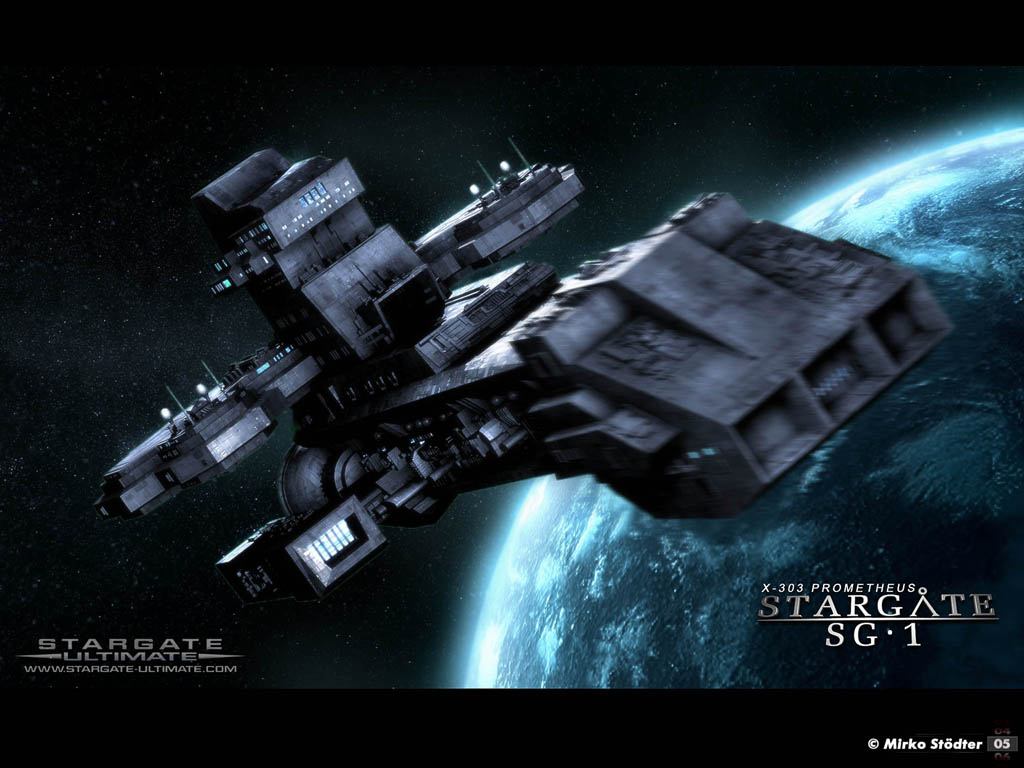
You might wanna distance yourself from the stargate SG1 series a little more...
http ://
www.thescifiworld.net/img/wallpapers/st ... 24x768.jpg
All those big numbers seem a little out of place, it looks like you've modelled the numbers on rather than textured them on as you should do (people paint numbers and letters onto ships and tanks and airliners, they dont get metal stencils and paint them black/white), they're simply too obvious and it doesn't come off well, and them all being different colours they clash.
And your lighting and windows and weapons fire look more like sprites. Perhaps if you decided on a single colour scheme such as bright white and pale blues, then tied that in with the background scenery for an overall colour scheme for highlighted objects, like a blue planet and blue sun...
And the metallic texture you've used across the entire thing in most places, it looks busy and complicated rather than detailed.... There needs to be a little more variation in colour else it'll just look the same throughout... Maybe if you had larger pieces like 'hull plating'.
And you need to make the insides of your cannons darker than the outside.
You might want a background to fit with your colour scheme should you have one.
http ://67.15.36.49/articles/Space/images/hameed_nawaz_pic2.jpg
http ://67.15.36.49/articles/Space/images/gary_tonge_pic1.jpg
You dont need to use a star scape a sun and a set of planets awkwardly close to each other to make a space scene.
Posted: 28 Sep 2006, 00:53
by j5mello
if that ship looks like anything it looks somewhat like a Battlestar. It lacks the vertical jump in shape of the Prometheus.
Posted: 28 Sep 2006, 01:00
by MrSpontaneous
I think you should smooth out the metal around the cockpit of the fighter, as it would most likly be solid steel (or some other material) beems, or the like.
Posted: 28 Sep 2006, 07:03
by LathanStanley
for the love of god... RADIOSITY that mess, and add raytraced reflections/refractions..

Posted: 28 Sep 2006, 08:19
by KDR_11k
I'd ask him to make a decent texture first.
Posted: 28 Sep 2006, 17:09
by LathanStanley
the texture isn;t that bad.. he just needs to scale it properlly...
Posted: 28 Sep 2006, 17:54
by rattle
The whole scenery needs some lighting, not strong but enough to make the darker sections not go totally unnoticed, they actually look a bit out of place.
About the the textures, they're a bit repititive. At least some brighter ones here and there don't hurt... and if this is going to be a war scene then you might want to add some more details such as scratches, hits or blown up parts with bent hull pieces and the like...
Posted: 28 Sep 2006, 19:28
by Optimus Prime
i think i already have too much details for a video when i want to render a movie in this life. For a 13 seconds video i needed 8 hours and now my scene is 25 seconds with even more fighters - so lets say 20 hours of rendering.
But i changed some parts here and there (like lightning and textures)

Posted: 28 Sep 2006, 23:51
by Dragon45
The lighting makes it look better. Nice job!