Page 2 of 4
Re: BattleHub Checkup
Posted: 23 Jun 2008, 08:41
by Warlord Zsinj
Reminds me a bit too much of the Battlefield Earth text, which should probably be avoided at all costs.
Re: BattleHub Checkup
Posted: 23 Jun 2008, 09:12
by AF
Its the same font as Homeworld 2 and the names on the star trek ships, it was also popular for technical documents in the 1970s.
Re: BattleHub Checkup
Posted: 23 Jun 2008, 09:34
by AF

much better, lets all have a hug
Re: BattleHub Checkup
Posted: 23 Jun 2008, 10:33
by Neddie
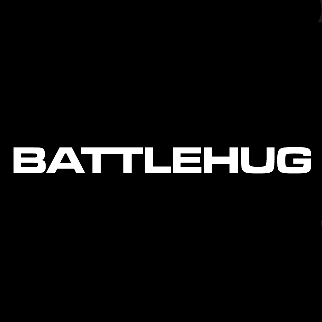
Which font is this? I might use it in the SpringZine.
Re: BattleHub Checkup
Posted: 23 Jun 2008, 10:42
by AF
Microgramma bold extended dbol
Re: BattleHub Checkup
Posted: 23 Jun 2008, 22:07
by Michilus_nimbus
I think the logo is overly simplistic.
Re: BattleHub Checkup
Posted: 23 Jun 2008, 22:25
by Forboding Angel
AF I think you should use the big orange spring logo thing with battlehub written underneath. That would look simplistic, nice and professional all in one shot.
Re: BattleHub Checkup
Posted: 23 Jun 2008, 22:43
by Machiosabre
it should be an orange, with a face painted on it, singing the theme to batman.
Re: BattleHub Checkup
Posted: 24 Jun 2008, 04:28
by AF
But using the orange logo would make no sense to the glest warzone2100 OTA and TA3D communities
Re: BattleHub Checkup
Posted: 24 Jun 2008, 07:08
by Tribulexrenamed
Warzone 2100? Awesomes.
Re: BattleHub Checkup
Posted: 24 Jun 2008, 11:53
by Forboding Angel
crap, you're right
Re: BattleHub Checkup
Posted: 24 Jun 2008, 20:44
by Decimator
Use a nice silhouette of a huge tower covered with weapons, perhaps?
Re: BattleHub Checkup
Posted: 24 Jun 2008, 20:46
by AF
I like my battlehub logo though....
Re: BattleHub Checkup
Posted: 24 Jun 2008, 20:49
by Machiosabre
well text is nice in a minimalistic way, but you could put something behind the text, maybe a nice picture of earth, would be classy.
Re: BattleHub Checkup
Posted: 24 Jun 2008, 20:53
by AF
The urge to add flashyness to the the logo is a strong one, but this is the logo in its purest form, and I think stuff like earth logos and towers filled with weapons should be on a per basis set up, and not an integral part of the logo in all its incarnations.
So perhaps you'll see a battlehub logo with earth in the background, or one with a big orange logo behind it, or where the hub is a collection of carefully arranged towers with AA guns ontop, but not all of them will have earth behind it, and not all of them with be orange and glowy, etc
Re: BattleHub Checkup
Posted: 24 Jun 2008, 21:04
by Crayfish
I'd be happy to give you some feedback on it at some point if you'd like. The logo looks fine, considering that you can tailor the background to each application. The font and name are nice.
Re: BattleHub Checkup
Posted: 26 Jun 2008, 00:16
by Tribulexrenamed
Make an animated logo with a picture of my head on it.
Re: BattleHub Checkup
Posted: 26 Jun 2008, 05:00
by AF
pintle, forb, yan/gota, regret, relative, posts, neddiedrow, aegis, tribulex, Roxas, and crayfish have offered to test.
Due to recent events regarding tasclient Im not going to hand it out to everyone, and Ill need to repeat this whole exercise again a month or two once the current test run is finished.
So far I am definitely putting the following people in the group:
Aegis - development reasons
Gota - tends to give good usability critique on tasclient
Neddiedrow - community stuff
Relative - has tested in the past
Foreboding - has tested in the past
Im not sure how active everyone else is although I know personally pintle is active so he's definitely in. I dont want too large a group though so Im not sure how many more people Id put in.
I'm currently making final adjustments, and I would expect copies via pm within the next 3 days.
Re: BattleHub Checkup
Posted: 26 Jun 2008, 05:14
by Tribulexrenamed
Count me out, I am on vacation. For 8 weeks.
Re: BattleHub Checkup
Posted: 26 Jun 2008, 11:04
by AF
8 weeks??? wow