Page 8 of 21
Re: Random WIP 2013+
Posted: 25 May 2013, 22:46
by Funkencool
AF wrote:An improvement yes, but not amazing. If you want to call a UI amazing, you cant base it in opinion, as it's not a matter of opinion. There are methods of testing these things and measuring various attributes
I can immediately see usability and UI design flaws, e.g. vertical text, font with near zero readability, mysterious white boxes that have no obvious purpose etc.
But aside from that, looking very pretty, with some nice improvements
Well, most flaws you see are incomplete ideas, just one of the many reasons BAR isn't released and why you won't find most my widgets on the forum.
I'm not trying to win best GUI award or anything either, bar's UI just needed an update visually and I happen to enjoy fulfilling that need. Besides its more about the G than the UI right now. It basically just does what the engine does, with a little extra and hopefully in a prettier fashion.
Re: Random WIP 2013+
Posted: 26 May 2013, 01:38
by smoth
@ AF, SILENCE NUMBER 2 >:D
Re: Random WIP 2013+
Posted: 26 May 2013, 17:44
by AF
Funkencool wrote:Well, most flaws you see are incomplete ideas, just one of the many reasons BAR isn't released and why you won't find most my widgets on the forum.
I'm not trying to win best GUI award or anything either, bar's UI just needed an update visually and I happen to enjoy fulfilling that need. Besides its more about the G than the UI right now. It basically just does what the engine does, with a little extra and hopefully in a prettier fashion.
hmmm I'd be interested in hearing more about these ideas, you've made steps in the right direction but I'm not going to patronise you by claiming it an article of perfection. Unlike Smoth suggestion, criticism is useful, and this is a subject where research has been conducted for decades, not everyone is aware.
For example, a lot of usability tweaks have direct impacts on how pretty a UI looks, e.g.:

Here, things would look nicer if the spacing between the buildpics matched the spacing with the container edges. It would also be easier on the eye. The same of the tabs, if the spacing on the side of the word was used at the top and bottom, and inbetween each tab, the title of the 'tab' would be a lot easier to read.
You could also improve it further by replacing the sidetabs with an accordion or expandable area. This would also have the benefit of acting as a heading, increase the size of the clickable area, allow horizontal text improving readability, reduce the clutter next to the boxes, giving more screen real estate for that UI, and allow for future improvements that show both orders and units at the same time
but do change the font, sometimes webfonts in Chrome look like that when they're broken =/ It looks kinda cool but it's not readable, and it has associations ( like certain shades of turquoise look very pretty but they remind me strongly of the hand towels in the bathrooms at University, not a good association ). The font in the player listing widget is fine already, just make everything match up with it.
Re: Random WIP 2013+
Posted: 26 May 2013, 18:14
by smoth
Accordian bad
Accordian = delayed acces
Plus how else am I to flaunt myy top poster status outside of rimind you that you are now #2
Re: Random WIP 2013+
Posted: 27 May 2013, 01:46
by AF
smoth wrote:Accordian bad
Accordian = delayed acces
Plus how else am I to flaunt myy top poster status outside of rimind you that you are now #2
So are tabs, and Im only 20 posts behind you, #1 is a privilledge I bestowed on you through choice I can still take it away with a bottle of wine and a quip at forb
Re: Random WIP 2013+
Posted: 27 May 2013, 02:26
by smoth
Tabs are not as delayed as accordion which is a tab with a delay before it shows what you clicked. I don't think they are a good ui element when the user has limited time. For something like an in game manual it would be potentially tight but for something where people are wanting it to be instant, the animation is a waste.
Re: Random WIP 2013+
Posted: 27 May 2013, 02:37
by Funkencool
Well, with accordion some features wouldn't work like selecting the tab as your mouse passes through, which having vertical tabs is also useful for. I also made the windows "scrollable" mousewheeling toggles through the tabs, which what I use most often and imo the quickest way.
In regards to layout and font... those are superficial and no where near final. I understand they aren't the best but I have a lot of widgets I'm working on, and as I figure out/learn new things I go back to older ones etc.. I don't want to put the "final touch" on anything until I get a better idea where I'm heading, so a lot of things are temporary.
Re: Random WIP 2013+
Posted: 27 May 2013, 02:41
by smoth
oh so there is a more dynamic element, that is pretty cool. Is this in the current bar?
Re: Random WIP 2013+
Posted: 27 May 2013, 03:09
by Funkencool
Sort of, I have most my widgets in the repo, but I have a lot of new stuff and widgets that are only local, I don't want to spam the commit log so I only commit when things seem fairly stable. I also removed some things as well until I get my options menu up and running.
Re: Random WIP 2013+
Posted: 27 May 2013, 03:16
by smoth
better not wait too long. you can always be one hd failure away from loosing weeks of work. as long as your code doesn't crash everything, it would be good to consider checking in and making note of what is not currently working.
perhaps you guys should develop a policy of some kind of tagging?
Re: Random WIP 2013+
Posted: 27 May 2013, 03:28
by Funkencool
I've had enough hd failures to take precautions, I have notepad++ backup all my work automatically on my dropbox. That also works nicely if I accidentally break everything and have no idea how, for example.
Re: Random WIP 2013+
Posted: 27 May 2013, 03:28
by AF
Feature/development branches are your friend
Re: Random WIP 2013+
Posted: 27 May 2013, 04:00
by Funkencool
AF wrote:Feature/development branches are your friend
I'm sure but imo the BAR branch is exactly that.
Re: Random WIP 2013+
Posted: 28 May 2013, 01:35
by AF
You can branch off of a branch, that's not a git/mercurial thing, ppl do it in svn too
Re: Random WIP 2013+
Posted: 28 May 2013, 02:31
by Funkencool
Ic, tbh I should probably just read up and get a little more comfortable with svn..
Re: Random WIP 2013+
Posted: 28 May 2013, 09:59
by PicassoCT
Look at this rudeists posting only text and gui pieces.. what sort of chatterboxxy is this?
Re: Random WIP 2013+
Posted: 28 May 2013, 20:09
by AF
Funkencool wrote:Ic, tbh I should probably just read up and get a little more comfortable with svn..
svn branches are just folders in an agreed upon convention, there's nothing stopping you branching from another branch instead of trunk
Re: Random WIP 2013+
Posted: 08 Jun 2013, 12:51
by FireStorm_
ARM Valiant, Millennium and Conqueror WIP
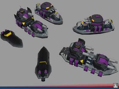 bigger
(It's though at times. Need to revisit them, but right now I need a break

)
Re: Random WIP 2013+
Posted: 08 Jun 2013, 14:28
by Beherith
Love them man, hope you are having fun with the atlas :)
Re: Random WIP 2013+
Posted: 11 Jun 2013, 18:30
by FireStorm_
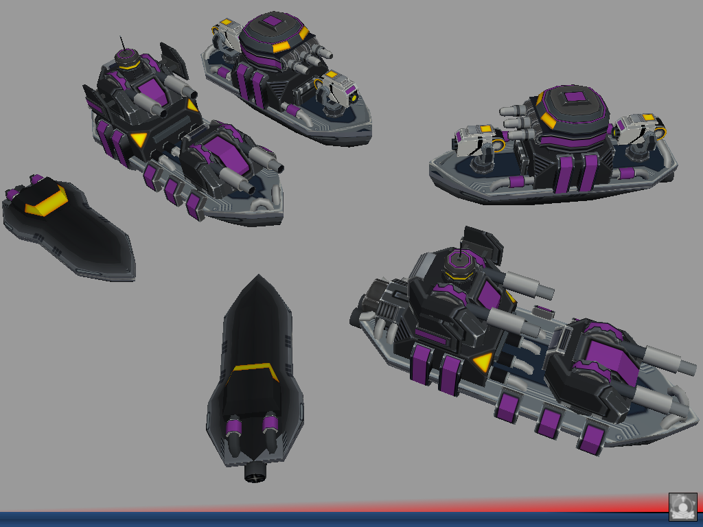
ARM Epoch and Archer WIP
 bigger
Ships coming along (sort of) nicely. Again, I think I have a lot of stuff to revisit.
(and yes, if I didn't had the nagging feeling my other work suffered so much, I'd had to say it's quite fun
)