The GUI should only show information on the first level that you genuinely need to be notified of. Player names dont change over the course of the game, and are displayed in tooltip info anyway (I am not sure that they even should be). Such information should be possible to check if you are curious, but not displayed all the time.
User info should be displayed when you press enter (lichos idea), which will also bring up expanded chat (like LOL does it). Otherwise you will probably just get little lag notification with a teamcoloured icon next to them, afaict thats the only information you really need to notified of, and even then, whats wrong with just pressing enter to check if someone is lagging?
Chicken status should probably be smaller (just showing minimal info, say anger, burrows and tech) and show more in-depth info on click or hover. It can probably go under the resource bar and be simple numbers next to icons.
Ceasefire doesnt need a gui, especially an absurdly bloated one as current. All you need is a simple button next to each players name in the player list, which shows one of four states: Enemies, you are offering ceasefire, he is offering ceasefire, and mutual ceasefire (like OTA did it in the lobby, actually). Clicking it toggles your offer. Team FFA can be handled by having a state icon for each of your allies (teamcoloured) next to each enemies alliance title, and buttons next to each enemy showing their offer state to your team. Ceasefires are handled via consensus vote between each team. Though really, ceasefires are not IMO a core feature and lead to more abuse than anything else. So there is no rush to code this. But it will all show up when you press Enter, and get expanded chat and player info.
Licho is of the opinion that given the horizontal aspect ratios, information should be vertical, along the sides of the screen. I can see the wisdom in this perspective, i can make some mockups of that if its helpful.
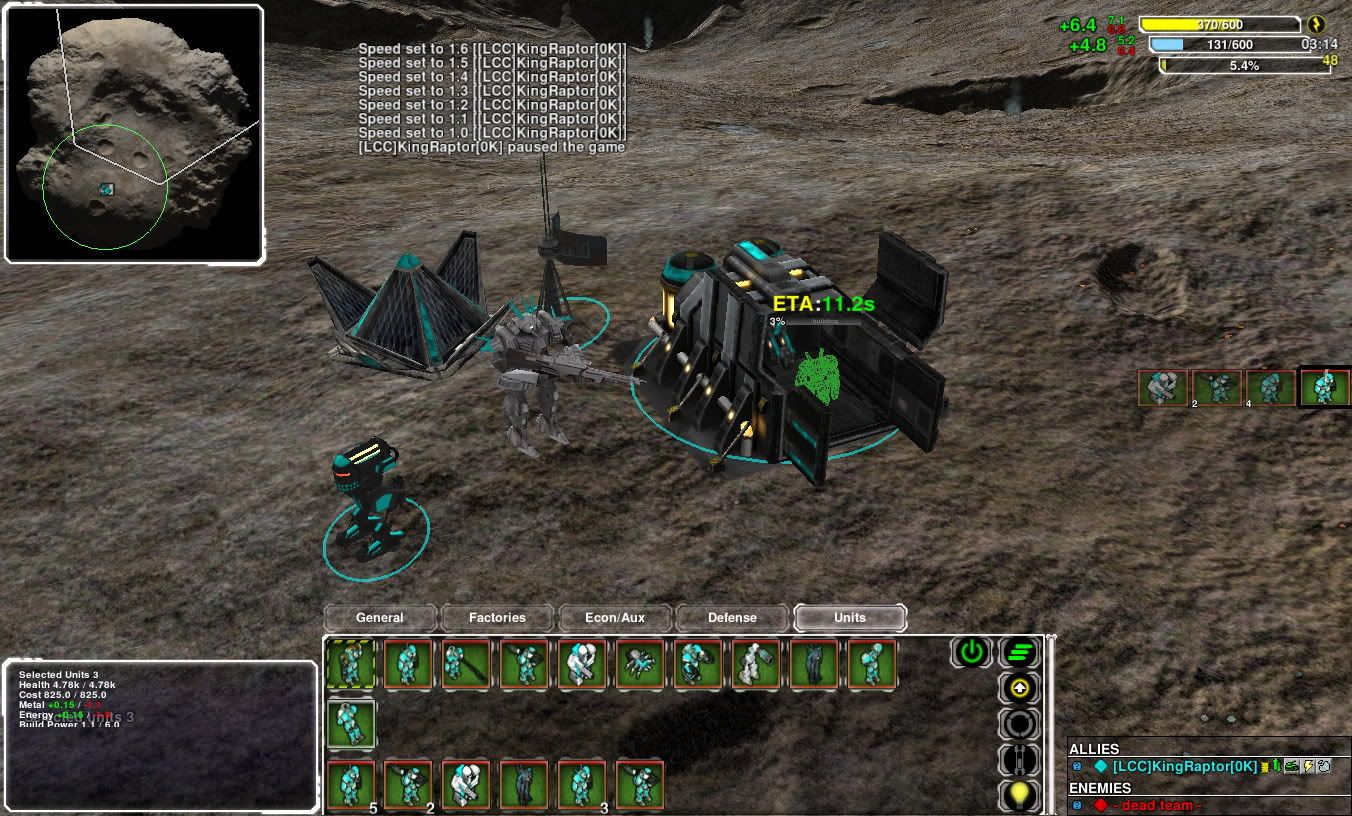
2) you are missing key stuff and your controls are smaller than needed - selections and command menus have more items than can fit there. Player list is missing.
Selections can overlap when you have too many of them,
like age of empires. Failing that we can have a scroll bar but i dont think its needed (starcraft uses pages). There is enough room for every command in the game (minus, perhaps, the morphs) in the final mockup) the white one). IMO we should go with this approach (square commands area) because then we can put the radial build menu in the same space when you use B or click Build.
3) Map has to be resizable, map is extremely important and usefull in spring because you can order units there and you see clear icons for unit types.
Granted, so some other element needs to be flexible in size. Probably the info panel.