
The second post was edited by an anonymous moderator, it was likely moved to the general forum.tzaeru wrote: EDIT: Wait, now I'm super-confused. Wasn't this BAR related in the first place? Now it's just a general UI topic?
UI discussion
Moderator: Moderators
Re: UI discussion
Last edited by Jools on 18 May 2015, 19:14, edited 1 time in total.

Re: UI discussion
Of course you never show off enough Smoth, you're a tease, you even create forum threads about your junk yet I've never seen so much as a hair..
Re: UI discussion
I don't think the current BAR UI will appeal to BA players and could hinder adoption of BAR
RedUI isn't exactly cosmetically pleasing but it is functional and efficient
if it is to be replaced replace it with something that will be familiar to BA players
I wonder if instead of releasing BAR as a separate game, it could be released to run alongside BA and both versions could connect to the same server
this could be like a transitional period
the loading screens of BA could be changed to advertisements for BAR
an extra column could be added to springlobby showing which game version players are using to connect (BA or BAR)
this could help peak player interest and speed up adoption
but BAR would need to be somewhat familiar to BA players, it is bad enough having to learn new unit models,
a completely different UI could be a step to far
that's not to say these things couldn't be changed in future
but priority one should be getting BA players playing BAR and you need to make the transition as painless as possible

Re: UI discussion
What can be done better?D2158 wrote:I don't think the current BAR UI will appeal to BA players and could hinder adoption of BAR
redui isn't it's widgets. I keep trying to tell people chili is not the ZK gui widgets. Redui as a framework is limited. What particular Redui gui elements do you like, because of the nature of spring and widgets, it should be possible to port them to chili and then make them available to the community.D2158 wrote:RedUI isn't exactly cosmetically pleasing but it is functional and efficient
if it is to be replaced replace it with something that will be familiar to BA players
That is an interesting idea but odds are it will depend on the hosts. Normally I would say rip the bandaid off and just outright replace it. HOWEVER, there will be bugs and having both available is a good idea!D2158 wrote:I wonder if instead of releasing BAR as a separate game, it could be released to run alongside BA and both versions could connect to the same server
this could be like a transitional period
Also an EXCELLENT IDEA!D2158 wrote:the loading screens of BA could be changed to advertisements for BAR
an extra column could be added to springlobby showing which game version players are using to connect (BA or BAR)
this could help peak player interest and speed up adoption
Thank you for the detailed post, kudos!
Re: UI discussion
I picked it for my game because the BA UI seemed closer to what I wanted, just needed filtering, spacing and facing buttons and a tooltip with more information. Picking a Chilli-based UI and moving back from it seems like lots more trouble (I have other priorities).D2158 wrote: RedUI isn't exactly cosmetically pleasing but it is functional and efficient
if it is to be replaced replace it with something that will be familiar to BA players
My tooltip doesn't even use Red UI..I just set the border and background to match. It's based on a simple text replacement widget from KP, that's why it has limited formatting. But i'd say it's pretty space efficient considering the font size isn't tiny.
One way to improve consistency in sizes is using icons. Icons need a tooltip explaining them (may mean more work). And if you need lots of different ones it can confuse new players (it's much easier to call something by its name than to describe the icon).
Using chili framework, there seem to be either :
A- proofs of concept or widgets for specific purposes (testing, design aid, etc. Smoth's examples look nothing like rts UI)
B- full UI implementations that differ significantly from *A game UI (ZK and EVO)
-
Forboding Angel

- Evolution RTS Developer
- Posts: 14673
- Joined: 17 Nov 2005, 02:43
Re: UI discussion
Lets try this again... viewtopic.php?f=86&t=33404
Re: UI discussion
Just to be clear, player feedback on what framework to use it not welcome. They're not technical enough to be making these kind of decisions or suggestions.
It's perfectly fine to complain about particular UIs though, but don't imply that chili has a certain unique look or interface, as you can pretty much do anything with it.
It's perfectly fine to complain about particular UIs though, but don't imply that chili has a certain unique look or interface, as you can pretty much do anything with it.
Re: UI discussion
You expect players to know how to separate the framework from the UI? Maybe you should explain the difference and also why feedback is not welcome for the framework. Imo feedback should always be welcome or you're doing something wrong (there are courses in how to handle non-constructive feedback).
Maybe a lot of the feedback is not constructive but it's also not constructive to shoot the messenger. The UI won't be better just because you kill off everyone who criticises it.
Maybe a lot of the feedback is not constructive but it's also not constructive to shoot the messenger. The UI won't be better just because you kill off everyone who criticises it.
Re: UI discussion
If you visit these forums, yep.Jools wrote:You expect players to know how to separate the framework from the UI?
Maybe you should google "framework".Jools wrote: Maybe you should explain the difference
See my previous post.Jools wrote: and also why feedback is not welcome for the framework.
Not really. Players should only comment on the game (product) as they see/use it.Jools wrote: Imo feedback should always be welcome or you're doing something wrong.
It's none of their concern how it's developed or designed, unless they're interested to participate in it, which doesn't make them just "players" anymore.
Re: UI discussion
Useless bullshit like this doesn't help devs make it betterD2158 wrote:bad ui
because why?D2158 wrote:replace with red ui please
No jools, users have zero say in the ui framework. If there is a bug hey great report it but the above 2 posts are the kind of stuff that is worthless.
Re: UI discussion
That's what they are doing and that's where you told them to not to give feedback on the 'framework'gajop wrote: Not really. Players should only comment on the game (product) as they see/use it.

Re: UI discussion
The problem is - you have games with organic growth.. things constantly change. So the classic approach of ui-design as seen in companys would not work in open source. You can do a great stair and benches in a cathedral.. you can do a great stair on a basar- but where it leads too might be in disarray next week, and gone by next month.
So a default gui in a open source project, is something that is auto-generated. Everything else is prone to ghost-townnism and bitter feelings due to wasted work.
So a default gui in a open source project, is something that is auto-generated. Everything else is prone to ghost-townnism and bitter feelings due to wasted work.

Re: UI discussion
Cremuss did this a few years ago - Just want to see what people think of it these days.
Re: UI discussion
Its minimalism done right
There are limitations to number and depth of menues..
Advanced Options must be hidden by default - with a Show advanced options checkbox.
Or they must be selectable via using a existing button as a "hold and move any direction submenue"..
http://www.cremuss.net/UI.html
Basically GUIs are for beginner, so complexity hiding is a art there.. and the standard gui is actually quite good at this. Basics only.. meaning buildoptions and standard orders.
Re: UI discussion
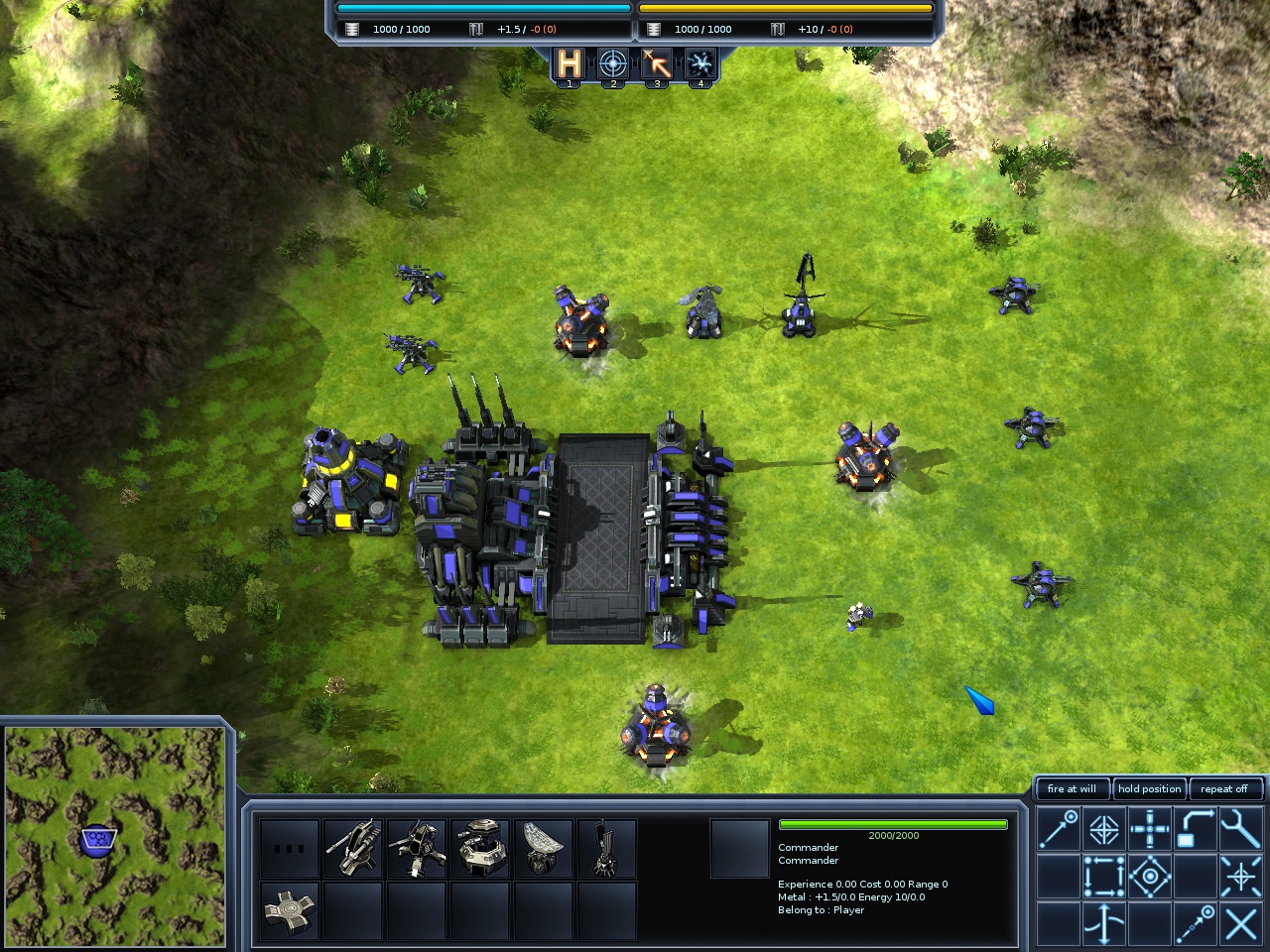
Can I just say that this screenshot is golden Jazcash?
But then it might be just because I have played Starcraft and ZK more than BA so I am more used to their layouts.
And to everybody saying that engine UI is good: yeah it is good for the 90s of the past century.
But then it might be just because I have played Starcraft and ZK more than BA so I am more used to their layouts.
And to everybody saying that engine UI is good: yeah it is good for the 90s of the past century.
-
Forboding Angel
- Evolution RTS Developer
- Posts: 14673
- Joined: 17 Nov 2005, 02:43
Re: UI discussion
That's not a screenshot. That is a shop that cremuss made when supcom 1 was still a new game.Orfelius wrote:Can I just say that this screenshot is golden Jazcash?
But then it might be just because I have played Starcraft and ZK more than BA so I am more used to their layouts.
And to everybody saying that engine UI is good: yeah it is good for the 90s of the past century.